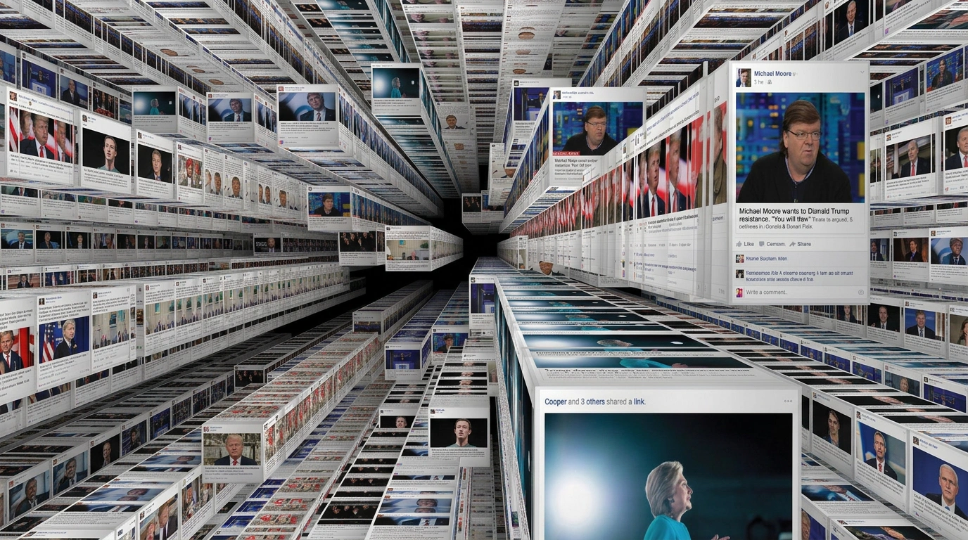
Digital Media & Publishers
Digital Media & Publishers photography increasingly has to serve two purposes on the same page — real editorial content, and labelled 'sponsored' branded content styled to look almost identical to it. On Visie, that craft spans editorial and branded content photography for marques like The Hollywood Reporter, WSJ, The New York Times, and Financial Times - HTSI Magazine.
This week's top Digital Media & Publishers projects
This week's top Digital Media & Publishers projects, carefully handpicked by Visie's expert curators, showcase the best in style and innovation.
climate journalism critic Brandmelder · Brand Identity
The brand identity for climate journalism critic Brandmelder was developed by design studio NEW STANDARD.S. The project establishes a distinct visual language for the digital publication, leaning into graphic motion graphics and clean typography to present editorial content and climate reporting analysis. Utilizing a bold palette of peach, blue, and black, the identity features prominent halftone patterns and dot matrix icons that appear across the digital interface and platform assets. The system integrates interactive tools, including a file-processing interface that applies textural dot filters to imagery, creating a cohesive aesthetic that spans both static layouts and animated design elements.
DAZED STUDIO · Parafaith: The Future of Youth Culture Report
Dazed Studio presents 'Parafaith: The Future of Youth Culture Report,' a documentary-style analysis of contemporary social dynamics. The production examines the intersection of digital algorithms and belief systems through a curated montage of social media feeds, protest footage, and urban settings. Utilizing mixed-media framing, split screens, and dynamic text overlays, the project explores the role of digital connectivity in modern identity. The work captures a fragmented view of current youth culture, blending live-action technique with cinematic pacing to document evolving social structures.
Nordstrom, WWW · Retail Therapy - Episode 1
Nordstrom and WWW collaborate on the Retail Therapy series, a digital media project featuring workplace narratives. Episode 1 depicts a professional office scene, utilizing a clean, corporate aesthetic to anchor the visual storytelling. The production leans into a live-action technique, capturing the interaction between subjects within a modern, sunlit workspace. The setting emphasizes minimalism and intentional composition, supported by After Avenue’s post-production and VFX work, with production management by Mateo Delgadillo.
Newsweek · Brand Identity
Newsweek’s recent brand identity refresh successfully bridges the gap between its nearly century-long heritage and the fast-paced demands of modern digital media. Executed with a sharp eye for corporate consistency, the project reclaims the publication's visual authority through an exercise in minimalist typography and high-contrast design. By weaving together a storied historical timeline of their iconic nameplate with contemporary UI illustration for mobile news distribution, the design team at 2x4 has effectively modernized the brand’s footprint. The visual system channels an intentional duality, balancing the clean, professional aesthetic required for real-time editorial output with the dramatic flair found in their cinematic portraiture, such as the evocative low-key lighting used in the Ilia Malinin cover. Whether leveraging the stark impact of a high-contrast serif typeface on a vibrant red background or displaying the brand’s utility across digital interfaces, the identity feels both timeless and urgent. The result is a cohesive brand language that moves beyond simple logo iterations to create a robust visual framework. By integrating traditional editorial elements with modern graphical overlays, this branding exercise demonstrates how a legacy publisher maintains relevance in a fragmented media landscape, ultimately asserting that Newsweek remains a central, authoritative voice in global conversation while ensuring its visual presentation remains as bold as its reporting.
 Project
 The New York Times · Brand Identity
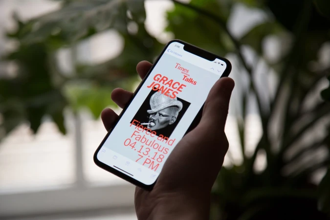
In a masterclass of institutional branding, The New York Times commissioned Base Design to craft a cohesive identity for their TimesTalks event series that bridges the gap between legacy print prestige and contemporary digital engagement. This project illustrates how a storied media publisher maintains visual authority while leaning into a vibrant, modular design language. By anchoring the identity in a disciplined grid-based layout and a sophisticated, high-contrast color palette, the designers created a flexible system that highlights diverse voices—from cultural icons like Grace Jones and Questlove to prominent journalists. The graphic execution, defined by bold serif typography and crisp vector elements, feels at once timeless and urgent. Whether applied to vertical subway posters, minimalist digital invitation mockups, or live-action stage environments, the design maintains a consistent editorial rhythm. The use of cinematic, black-and-white portraiture provides a stark, human-centric anchor against the saturated, block-color backgrounds. Through an intelligent application of UI illustration and clean, commercial aesthetic choices, the system successfully translates the weight of The New York Times into an accessible, modern lifestyle experience. The result is a sharp, professional toolkit that ensures the TimesTalks branding remains recognizable across varied touchpoints, proving that even within a rigid corporate framework, there is significant room for expressive, punchy, and highly functional graphic design.
 Project
 Medium · Brand Identity
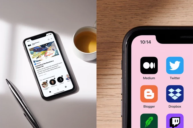
Medium commissioned COLLINS to develop a comprehensive brand identity system for their digital publishing platform. The project centers on a clean, minimalist aesthetic, integrating precise serif typography with a versatile, motion-driven visual language. Collateral across the identity spans physical print guidelines and environmental graphics to digital interface designs. The motion graphics components utilize kinetic typography and three-dimensional wireframe geometries against monochrome and pastel backdrops to convey editorial depth. Photography and collage elements incorporate varied textures and human-centric imagery to complement the platform's focus on digital storytelling and long-form content.
 Project
 McMaster Museum of Art · Brand Identity
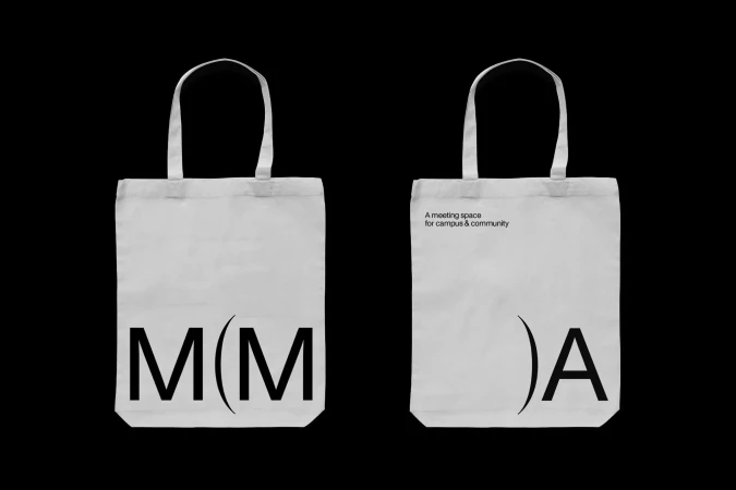
Underline Studio has developed a comprehensive brand identity for the McMaster Museum of Art, establishing a cohesive visual system across print, digital, and environmental touchpoints. The identity centres on bold typography and a minimalist graphic language, featuring a distinctive monogram and curved parenthesis elements that recur throughout the museum’s communications. Applying a clean, modernist aesthetic, the project extends from exhibition posters and street-level installations to wayfinding signage and digital UI assets. The design utilizes high-contrast colour fields—notably vibrant yellow and deep black—to frame the museum's institutional messaging. This work emphasizes precise alignment and structured negative space, providing a unified presence for the campus and community space.
 Project
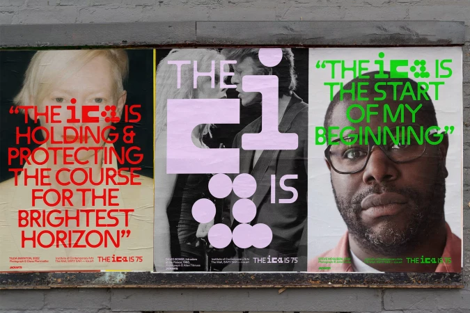
 Institute of Contemporary Arts · Brand Identity
The Institute of Contemporary Arts brand identity project establishes a comprehensive visual language spanning physical, architectural, and digital environments. Led by graphic designer Chris Chapman, the system integrates bold, expressive typography with archival portraiture, anchoring the institution’s aesthetic across varied mediums. Motion designer Jack Collis extends this identity through dynamic logo sequences and geometric transformations. The work, captured by photographer Philip Vile, manifests in diverse formats ranging from wheat-pasted street posters and large-scale outdoor signage to mobile-optimized UI layouts. The result is a clean, graphic approach that utilizes a distinct palette of primary and secondary tones to articulate the organization's cultural focus.
 Project
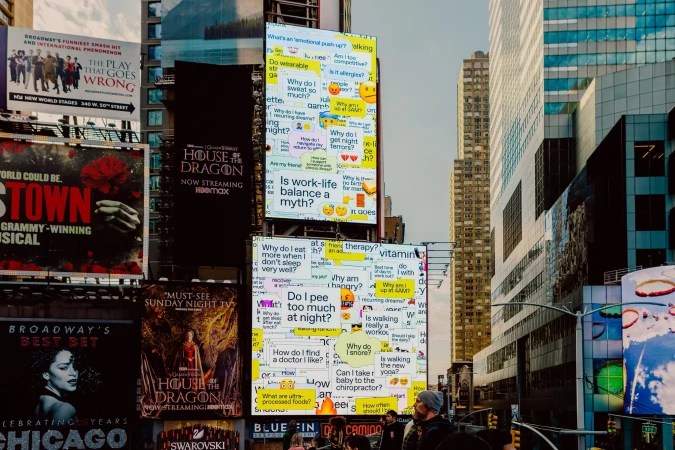
 The Washington Post · Brand Identity
The Washington Post brand identity project, crafted by Koto, introduces a modular visual language centered on editorial curiosity. The work integrates speech bubbles, browser windows, and UI elements to represent the platform's digital engagement and expert-driven content. The project leans into a clean, graphic aesthetic, utilizing bold primary colors and minimalist typography across static billboards and motion sequences. Whether applied to large-scale urban signage or digital campaign assets, the design system maintains a consistent focus on textual inquiries and interactive iconography.
London College of Communication · Brand Identity
The brand identity for the London College of Communication centres on a high-contrast palette of deep blue, white, and magenta, executed through a series of bold typographic systems. The identity prioritises clear, modular layouts that adapt across diverse formats, from architectural environmental graphics and large-scale wheat-pasted posters to tactile editorial brochures. Developed in collaboration with Fedrigoni, the collateral leans into physical material textures, utilising screen print and high-quality paper stocks. The identity integrates motion graphics and digital UI prototyping, using kinetic text and VHS-inspired lo-fi distortion to bridge the gap between static signage and interactive experiences. Creative design by MAKE.
 Project
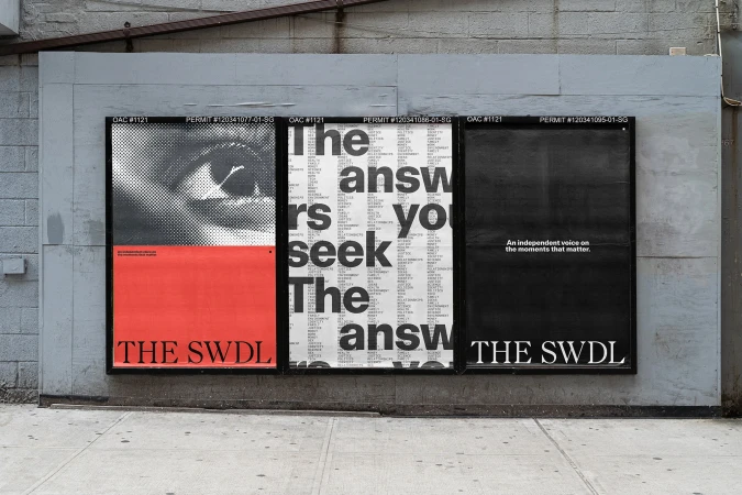
 The Swaddle · Brand Identity
The Swaddle’s brand identity project, led by Nightjar, establishes a contemporary visual system for digital publishing. The project utilizes a minimalist design language characterized by sharp graphic contrast, custom typography, and a structured modular layout that prioritizes editorial hierarchy across print and digital touchpoints. The execution leans into a clean, modern aesthetic, incorporating vector construction lines and rhythmic typographic patterns. By balancing bold serif letterforms with atmospheric photography and intentional negative space, the identity provides a versatile framework for editorial content and digital interface applications.
University of Leeds School of Design · Brand Identity
Fable&Co. developed a comprehensive brand identity for the University of Leeds School of Design, establishing a structured, contemporary visual system across both physical and digital touchpoints. The identity centres on a minimalist graphic language, utilizing bold typography and precise grid systems to reflect the institution's academic and creative rigor. The project incorporates motion graphics to illustrate the brand's versatility, moving between clean monochromatic animations and dynamic typographic layouts. Tactile elements, such as embossed textures on dark paper stocks and high-contrast fabric banners, reinforce a sophisticated aesthetic while maintaining professional clarity throughout the collateral. From editorial layouts and outdoor signage mock-ups to social media assets, the design system emphasizes geometric precision. By pairing clean sans-serif and serif typefaces, Fable&Co. creates a versatile framework that communicates the school's focus on design education and craftsmanship.
Explore other industries
Explore Visie's leading industries, projects, and the talented creatives representing them.