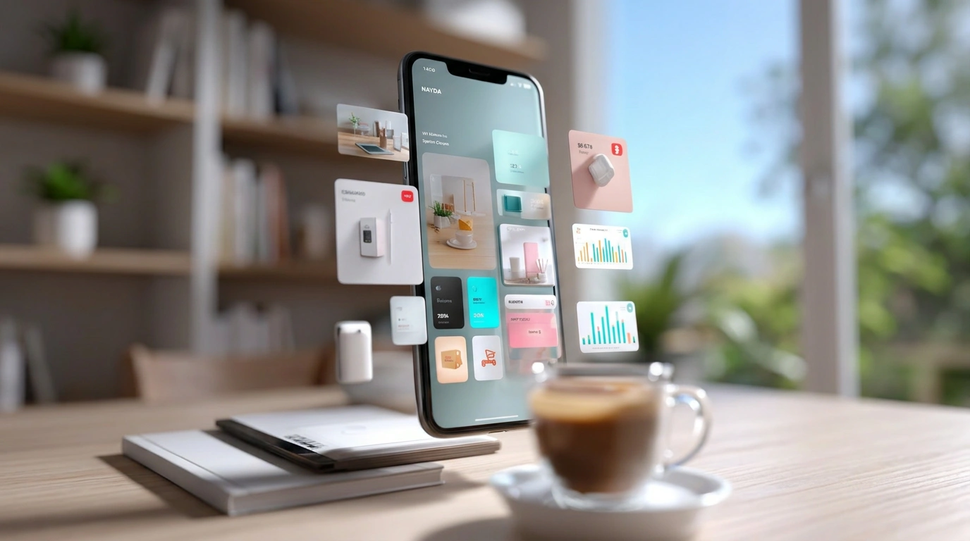
Apps & Digital Platforms
Apps & Digital Platforms photography frequently has to represent both sides of a transaction in the same image — a rider and a driver, a guest and a host — since the product is the connection between two people. On Visie, that craft spans campaign and UI photography for marques like Uber, Airbnb, TikTok, and Instagram, often shot with two distinct casts representing each side of the platform.
This week's top Apps & Digital Platforms projects
This week's top Apps & Digital Platforms projects, carefully handpicked by Visie's expert curators, showcase the best in style and innovation.
Polymarket · Polymarket HQ
Polymarket HQ is a dynamic commercial video directed by Peter Berg that captures the fast-paced energy of a modern corporate environment. The film leans into a cinematic visual style, utilizing fast-paced editing and vibrant lighting to highlight the platform's focus on high-stakes financial forecasting and workplace collaboration. The project features athlete LeBron James navigating an open-plan office space alongside a diverse ensemble cast. The cinematography emphasizes clean, modern corporate interiors and active motion, framed here in a vertical format suited for digital display.
Microsoft · Doppelmode
In the latest campaign for Microsoft, titled Doppelmode, the tech giant masterfully pivots away from sterile office tropes to explore the duality of the modern digital workflow. Set within the hushed, intellectual confines of a wood-paneled library, the project breathes new life into consumer electronics marketing by framing high-performance hardware as the ultimate partner for cognitive expansion. Through a sophisticated blend of live-action technique and seamless motion graphics, the film visualizes the concept of effortless multitasking by having diverse professionals work alongside their own digital clones. The contrast between the setting—complete with warm, iconic green desk lamps—and the sleek, innovative technology creates a compelling visual tension that feels both scholarly and futuristic. The project, brought to life through the creative vision of the agency Droga5, leans into a cinematic aesthetic that prioritizes narrative depth over mere feature listing. By utilizing high-end VFX, the film transforms the act of working into a rhythmic, almost hypnotic dance of productivity. This approach successfully positions Microsoft not just as a provider of tools, but as a facilitator of a more versatile, creative lifestyle. The result is a polished, stylish entry in the technology industry, proving that when cinematic storytelling meets clever post-production, the mundane reality of professional output can feel entirely electric and endlessly capable.
Rover · Cookie's Photo Update (15s)
For this latest campaign, Rover leans into the tactile, everyday joy of pet ownership, capturing a spontaneous moment of domestic play between a cat and his owner. The fifteen-second spot functions as a warm, inviting exploration of the bond shared within a modern home, utilizing live-action technique to ground the platform's digital-first brand identity in a tangible, relatable reality. The cinematic execution focuses on a young man blowing bubbles for his curious tabby cat, a deceptively simple premise that allows the pet's natural, inquisitive behavior to take center stage. By prioritizing soft indoor lighting and natural sunlight streaming through large windows, the production achieves a bright, airy aesthetic that complements the contemporary, minimalist decor of the space. The visual narrative relies on a mix of tight close-ups that emphasize the cat's playful engagement and wider, carefully composed angles that showcase the relaxed environment of the living room. Utilizing slow motion to accentuate the ephemeral nature of the bubbles, the piece avoids overt product placement, instead focusing on the emotional resonance of the pet-owner experience. This approach effectively positions the tech-forward platform as a thoughtful companion to the modern lifestyle, proving that even a brief interaction can communicate the essential value of the service through authentic, candid storytelling.
Apple · Calendar Stacking
In a display of polished efficiency, Apple’s Calendar Stacking campaign highlights the innate fluidity of its native organizational tools through a sleek, minimalist lens. The project captures the essence of digital productivity, utilizing live-action technique to breathe life into the familiar interface of the Apple calendar. As event blocks in a soft, curated palette of pink, green, yellow, and blue populate the grid, the motion design emphasizes a seamless user experience that feels both intuitive and aesthetically refined. By focusing on the rhythmic act of scheduling—from study sessions to collaborative marketing groups—the creative team successfully transforms routine digital task management into a visual narrative of purpose and clarity. The dark blue and teal abstract desktop background serves as a sophisticated canvas, grounding the UI illustration in a modern, professional context that speaks directly to the needs of the organized contemporary user. With agency and creative direction from Michael Parmeter, and expert production support from Max Cooper and the team at Be Grizzlee for post-production and VFX, the execution manages to elevate a functional digital platform into a compelling piece of lifestyle marketing. This project leanly channels the intersection of high-end corporate branding and consumer technology, proving that even the most mundane digital administrative tasks can be rendered with a sense of deliberate, high-quality craft and visual harmony.
 Project
 Threads · Brand Identity
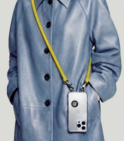
The brand identity for Threads is a masterclass in minimalist design, bridging the gap between digital utility and tangible, tactile storytelling. Orchestrated by Studio NARI, the project establishes a cohesive visual language that feels as comfortable on a massive urban billboard as it does in the technical precision of a vector animation. By balancing high-contrast typography with a striking palette of monochromatic tones and vibrant, saturated yellow accents, the system feels both authoritative and accessible. The execution leans heavily into geometric rigor, showcased through a series of animations that highlight the structural integrity of the letterforms, anchor points, and mathematical curves. Whether through the clean, macro photography of branded stationery or the expansive, cinematic scope of a drone shot capturing a branded basketball court, the identity maintains a strict focus on scalability and clarity. This work demonstrates a deep commitment to functional aesthetics, utilizing natural light and deliberate studio strobe setups to reinforce the brand's presence across diverse environments. As a digital platform, Threads requires a visual system that is both fluid and indelible, and this identity succeeds by grounding its modern, sans-serif logic in a raw, almost artisanal appreciation for form and material quality. It is a sophisticated exercise in corporate branding that balances abstract design principles with the practical, everyday realities of the technology industry.
design platform Vizcom puts process over polish · Brand Identity
The new brand identity for digital design platform Vizcom marks a departure from conventional, high-gloss tech aesthetics, favoring a visual language that celebrates the raw, iterative process of creation over polished finality. Orchestrated with design contributions from Outland, illustration by Harri Owain, and 3D work from Krystof Jezek, the identity leans into a modular, experimental ethos. The brand relies on a combination of vector typography and clean, modern design principles to establish a professional yet approachable presence. This approach is anchored by a vibrant, tactile color palette—ranging from Clay Orange to Cutting Mat Green—which draws inspiration from the physical tools of the design trade. By integrating UI illustration alongside live-action technique, the project bridges the gap between digital workspace efficiency and analog creativity. The use of a technical light-blue grid against deep blue backgrounds provides a rigid, structural foundation, which is then softened by playful, speckled blue icon sets and stickers that embody the brand mantra to sketch up and make ideas real. Whether displayed through structured icon grids or captured in lifestyle compositions, the identity succeeds by positioning the brand not just as a tool, but as a collaborative companion for creative professionals. This comprehensive branding strategy effectively translates the complex functionality of the app into a cohesive, process-oriented visual narrative that feels both grounded and deeply innovative.
time the rebrand · Brand Identity
The brand identity overhaul for Time The Rebrand, executed by the team at Buff Motion, serves as a masterclass in modern digital storytelling and corporate communication. Through a sophisticated fusion of commercial motion design and minimalist UI illustration, the project establishes a cohesive visual language that feels both approachable and highly professional. The creative execution leans into a versatile design system, utilizing a vibrant palette of pastels and bold, high-contrast accents that bridge the gap between abstract corporate data visualization and relatable lifestyle imagery. By integrating 3D render / CGI elements with fluid animation sequences, Buff Motion successfully brings complex financial functionalities, such as budget planners and virtual card interfaces, to life in a way that prioritizes user engagement and clarity. The work consistently employs clean sans-serif typography and intentional spatial layouts, ensuring that the brand remains legible across various mobile-first touchpoints. Whether showcasing social media content strategies or intricate banking tools, the motion graphics maintain a smooth, cinematic cadence that enhances the overall brand experience. This holistic approach to identity design confirms the power of strategic visual systems, transforming routine financial interactions into a seamless, digital-forward narrative that resonates with a modern audience while maintaining the structural rigor expected in high-end corporate identity projects.
Meta · Facebook
Meta bridges the gap between digital utility and human connection in this latest campaign for Facebook, which leans into the authentic rhythms of daily life. By spotlighting the platform as a vital ecosystem for small businesses and personal interests alike, the project adopts a refreshingly naturalistic and documentary-like approach. The storytelling feels organic rather than manufactured, moving seamlessly from the quiet focus of an artisan sewing handmade toys to the high-energy camaraderie of a neighborhood run club. With production by Strike Anywhere and sound design by Consortium, the vignettes capture the texture of reality through a lived-in lens. The series utilizes a live-action technique that prioritizes movement and spontaneity, grounding the digital interface of Facebook Marketplace within the physical world of suburban driveways and sunlight-drenched workshops. Whether a user is sourcing vintage car parts or discovering local artisanal goods, the work emphasizes the accessibility of these connections. Further polished by the post-production teams at PARALLAX and Traffik, the edit maintains a consistent commercial aesthetic that balances muted earth tones with vivid, playful highlights. These lifestyle moments successfully humanize the technology, positioning the app as an essential, approachable companion that facilitates real-world experiences, from practical repairs to meaningful social gatherings, all while keeping the user experience central to the narrative flow.
Google · Black Owned Friday
Google turns the lens on intentional consumerism with the latest iteration of its Black Owned Friday campaign, a vibrant project that masterfully blends e-commerce platforms with a sophisticated retail narrative. Eschewing the frantic, discount-heavy tropes typically associated with seasonal shopping, the creative direction leans into a polished, high-end commercial aesthetic that celebrates both personal style and community-driven commerce. The central visual sequence features a confident protagonist navigating an urban apartment hallway, an image that reads as both aspirational and deeply human. By prioritizing rich, warm lighting that highlights the intricate textures of the subject's afro and the tactile shearling of her jacket, the production achieves a distinct cinematic quality that elevates the brand message above standard advertising fare. This live-action technique creates a grounded, tangible sense of luxury that invites the viewer to look closer. With seamless production oversight by Max Cooper, the film succeeds in positioning the platform as a curator of quality rather than just a marketplace. It is an exercise in editorial minimalism, proving that even within a busy retail landscape, thoughtful pacing and intentional visual storytelling can effectively bridge the gap between digital utility and authentic cultural representation, ultimately reinforcing the importance of supporting Black-owned businesses through a lens of undeniable class and contemporary relevance.
Instacart · The Male Shopper Project
In a refreshing pivot for e-commerce platforms, Instacart launches The Male Shopper Project, a witty editorial brand campaign that deftly leans into cultural stereotypes surrounding grocery shopping habits. The spot features television personality Antoni Porowski, who anchors the narrative with his signature charm while sitting opposite a skeptical host in a lively, conversational podcast setting. The visual language is defined by a bold, brightly lit aesthetic featuring geometric triangle backdrops that pop against the screen. By utilizing live-action technique and clever slow motion inserts to punctuate the comedic beats, the film transforms relatable social media grievances into a polished commercial piece that feels both timely and authentic. The creative direction from the Instacart team effectively bridges the gap between digital consumer frustration and the convenience of the service itself, grounding the humor in a polished lifestyle framework. By prioritizing sharp dialogue and character-driven comedy over high-gloss artifice, the production succeeds in positioning the brand as a partner in modern domestic life. The final result is a clever, high-energy commentary on modern consumption that feels right at home in today’s social-first landscape, proving that retail advertising can indeed benefit from a healthy dose of self-awareness and a personality-forward approach that resonates deeply with an online audience hungry for genuine, lighthearted engagement.
Meta · Instagram Teen Accounts Director's Cut
Meta frames its latest narrative approach for Instagram Teen Accounts through a lens of quiet, human-centric storytelling that prioritizes connection over platform mechanics. This campaign for the streaming platforms, media, and entertainment industry moves away from high-gloss tech promotion, instead opting for a lifestyle-driven narrative that mirrors the genuine experiences of its user base. By focusing on a nuanced montage of a young woman and a young boy, the production captures the complexities of mentorship and shared daily rhythms with remarkable ease. The project utilizes a sophisticated live-action technique to ground the messaging in reality, moving through sun-drenched settings that feel both accessible and aspirational. Central to the film’s success is a soft, cinematic color grade with warm undertones, which invites the viewer into a space of nostalgic comfort rather than digital distraction. By alternating between expansive environmental shots and intimate close-ups, the creative team emphasizes the tactile nature of relationships, highlighting small gestures—from navigating an urban crosswalk to the gentle application of sunscreen—that define authentic human interaction. This directorial choice effectively translates the platform's safety-focused features into a relatable experience, ensuring the message resonates with emotional intelligence rather than corporate mandate. The work stands as a testament to the power of authentic live-action storytelling within the contemporary digital landscape, bridging the gap between brand responsibility and genuine youth culture.
Meta · Find More
Meta’s Find More campaign masterfully reframes the role of digital platforms within the tapestry of our daily existence, leaning into a documentary style that feels both intimate and expansive. By capturing the authentic intersections of technology and human connection, the project moves beyond mere features to explore the communal power of virtual spaces. The visual narrative utilizes 35mm film and slow motion techniques to infuse a nostalgic, tactile texture into the digital experience, whether it is a candid commute through an urban landscape or the whimsical energy of a themed book club. Creative direction from the team at Droga5 New York ensures the messaging remains grounded in genuine lifestyle moments, rather than polished artifice. The production, helmed by the experts at SMUGGLER, balances these cinematic sensibilities with a lighthearted commercial appeal, particularly in the playful sequences involving miniature electric vehicles. Supported by meticulous post-production work from ETHOS and Pariah Creative, the campaign successfully elevates the technology industry by treating digital engagement as a fundamental layer of modern social reality. Through this live-action technique, the work transforms how audiences perceive the utility of social apps, suggesting that these interfaces are not just tools, but portals to deeper community engagement and personal discovery in an increasingly connected world. Every frame underscores a commitment to organic, unscripted beauty, cementing the brand’s relevance in a digital-first culture.
Explore other industries
Explore Visie's leading industries, projects, and the talented creatives representing them.