
Steep St.: Brand Identity

Sep 2020
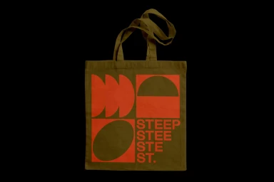
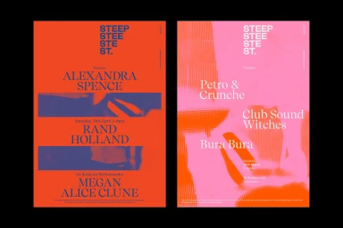
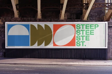
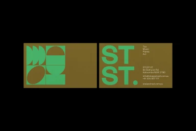
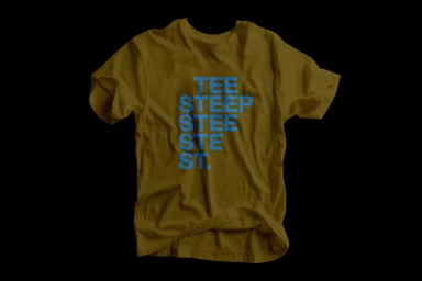
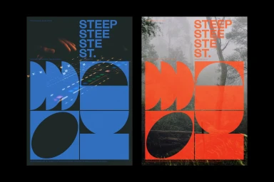
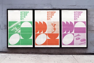
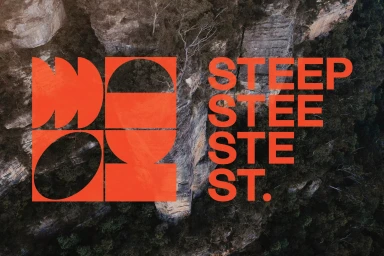
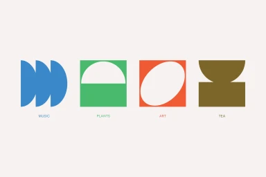
The brand identity for Steep St. serves as a masterclass in modular graphic design, balancing bold industrial precision with organic, earth-toned textures. Orchestrated by the creative team at Christopher Doyle & Co., the project establishes a cohesive visual language that seamlessly bridges the gap between disparate offerings like tea, music, plants, and art. The system relies on a rigorous grid-based layout and high-contrast typography, utilizing a vibrant palette of neon orange, deep navy, and olive green to ground its modern aesthetic. By layering clean, sans-serif letterforms over moody, high-resolution photographs of natural landscapes and urban structures, the design creates a compelling visual tension between the man-made and the organic. This commitment to artistic minimalism extends across a vast range of collateral, from studio-lit apparel and tote bags to large-scale urban billboard installations and versatile UI illustration elements. The use of flat geometric iconography acts as a functional shorthand for the brand, ensuring that the identity remains scalable and legible across both digital and physical touchpoints. Through deliberate color blocking and an experimental approach to composition, the work captures a contemporary spirit, proving that corporate branding can feel both highly professional and culturally relevant. This identity system effectively translates the diverse, textured nature of the Steep St. brand into a singular, recognizable graphic voice.
Horizontal, Commercial, Graphic
Typography
Advertising Campaign
