
Christopher Doyle & Co.
Brand Identity
Oct 2016
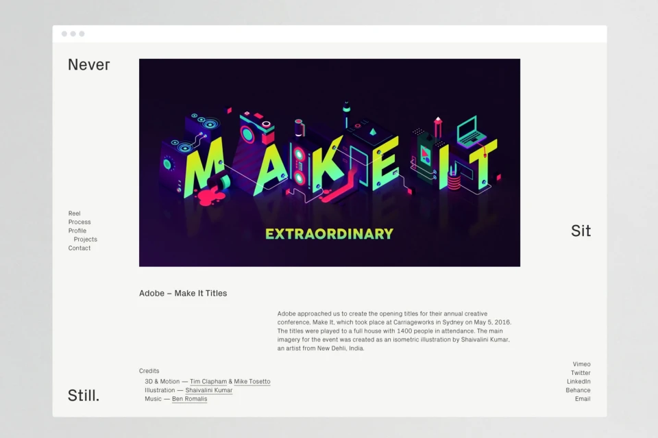
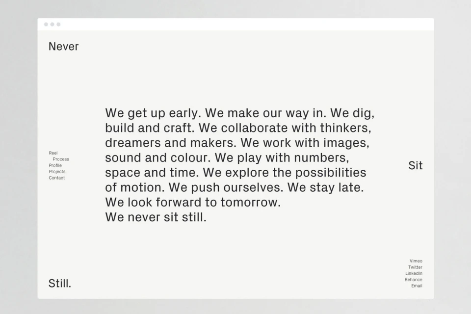
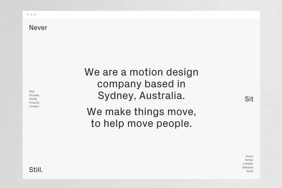
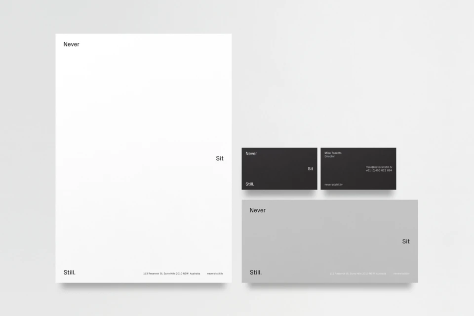
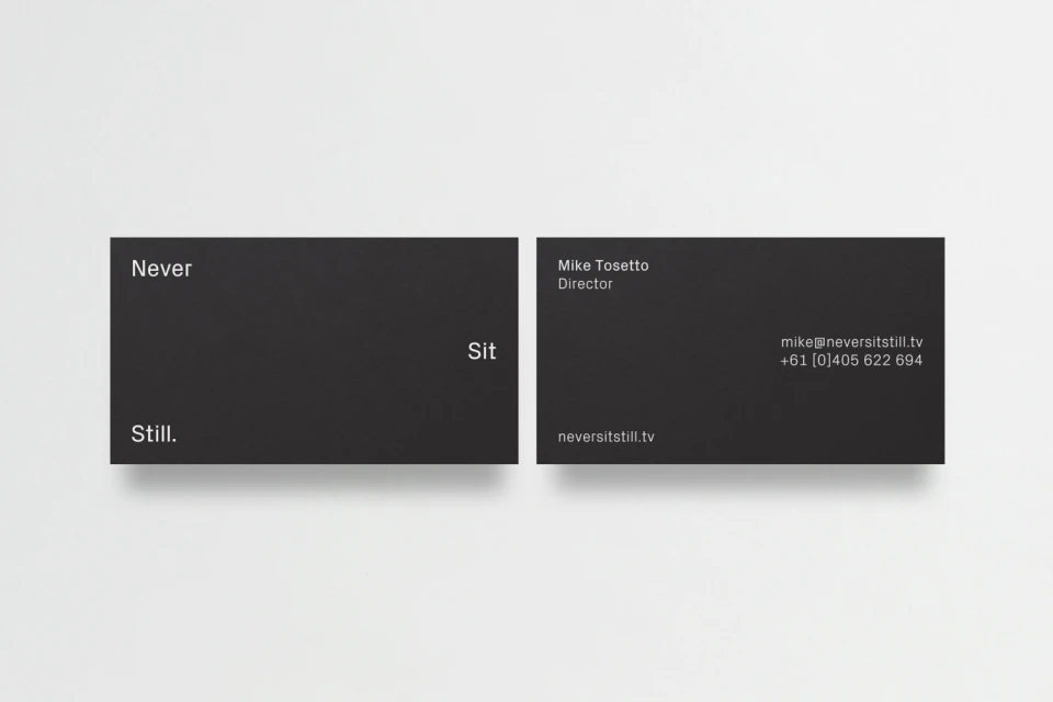
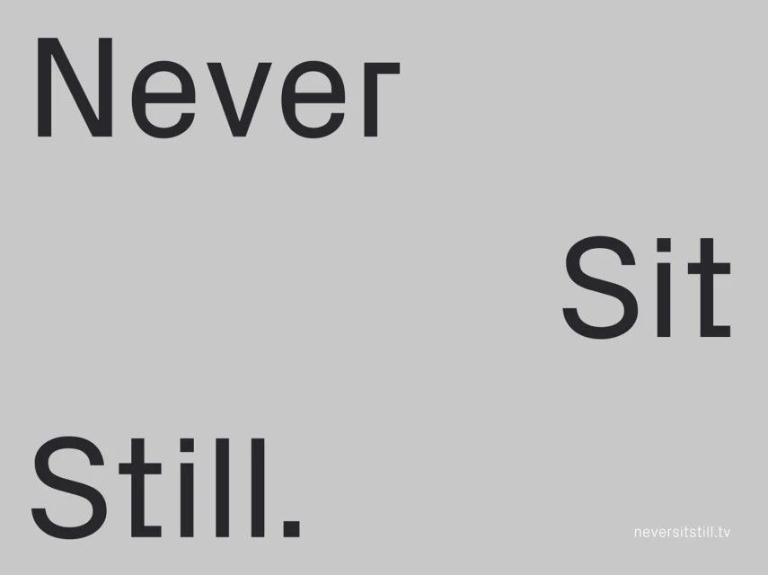
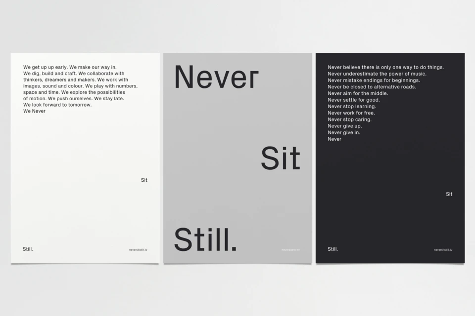
Christopher Doyle & Co. elevates the standards of contemporary branding with a meticulously curated brand identity project that serves as a masterclass in minimalist graphic design. By prioritizing negative space and a strict grid-based layout, the studio creates a visual language that feels both timeless and deeply functional. The work channels a sophisticated, corporate aesthetic, utilizing high-contrast typography and a neutral color palette of stark black, white, and light gray to establish a strong, professional presence. Beyond the clean, structured UI illustration that defines their digital interface, the project integrates bold 3D render and CGI elements to provide depth, particularly within their work for the Adobe Make It conference. This fusion of technical precision and creative minimalism is carried through every touchpoint, from the expansive digital manifestations of their manifesto to the tactile, matte-finished stationery sets. The recurring motif of Never Sit Still acts as a conceptual anchor, reinforcing a philosophy of constant motion and creative rigor. Every element, whether it is an isolated word or a complex isometric graphic, is balanced with intentionality to prioritize typographic hierarchy and clarity. The resulting identity is a testament to the power of restrained design, proving that a refined approach to scale and spatial composition can define a brand more effectively than excess, positioning the studio as a leader in the modern technology sector.
Horizontal, Commercial, Minimalist, Clean
Typography
White Seamless
Website / Web
