
Nimble
Brand Identity
Sep 2015
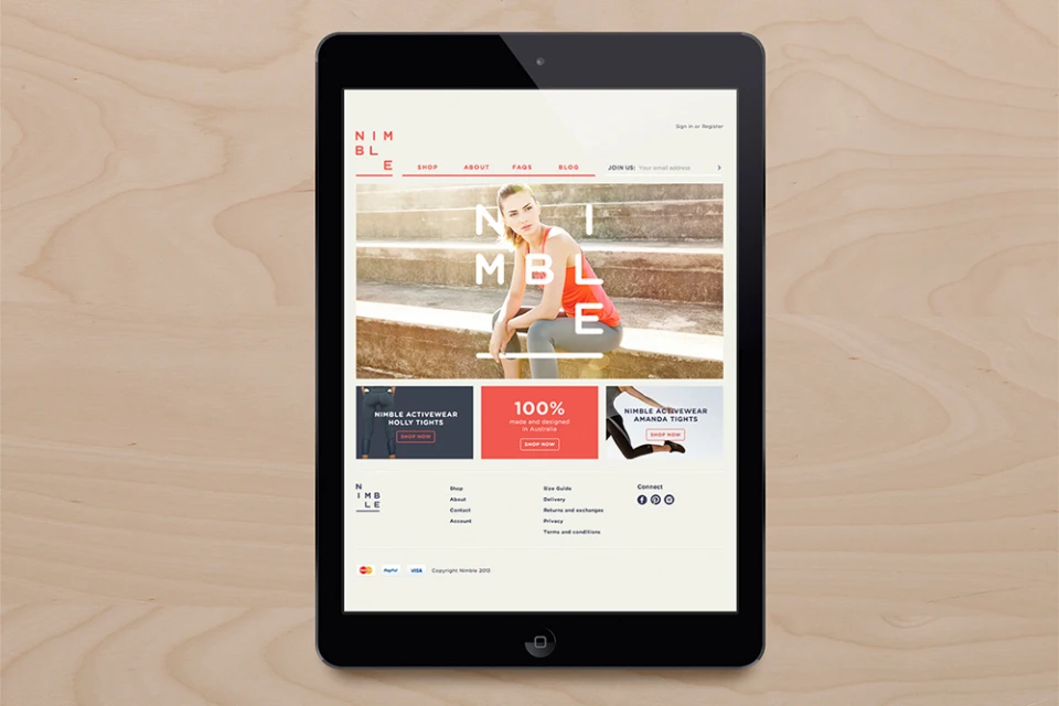
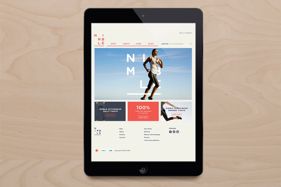
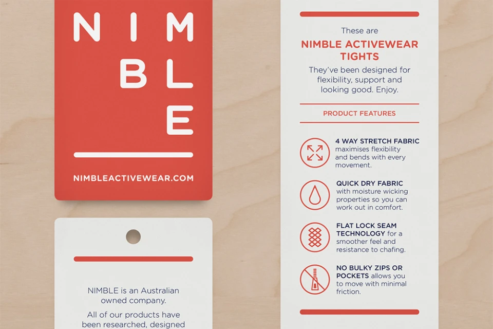
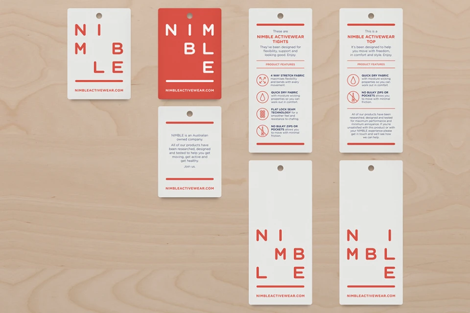
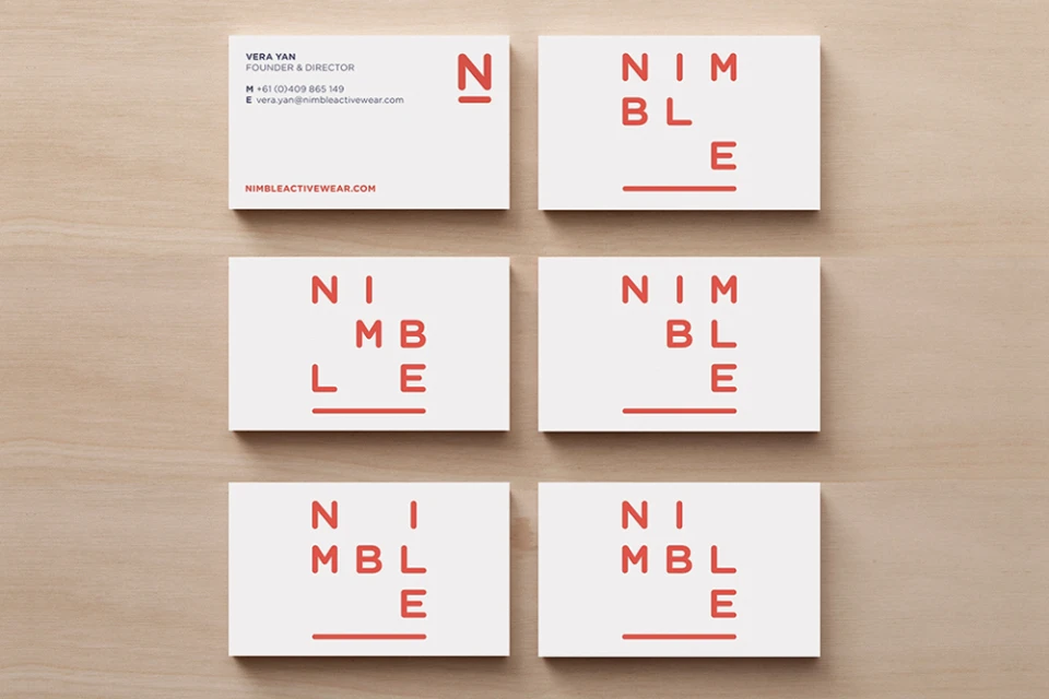
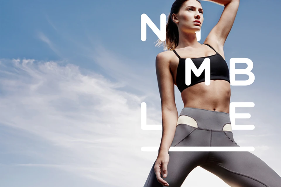
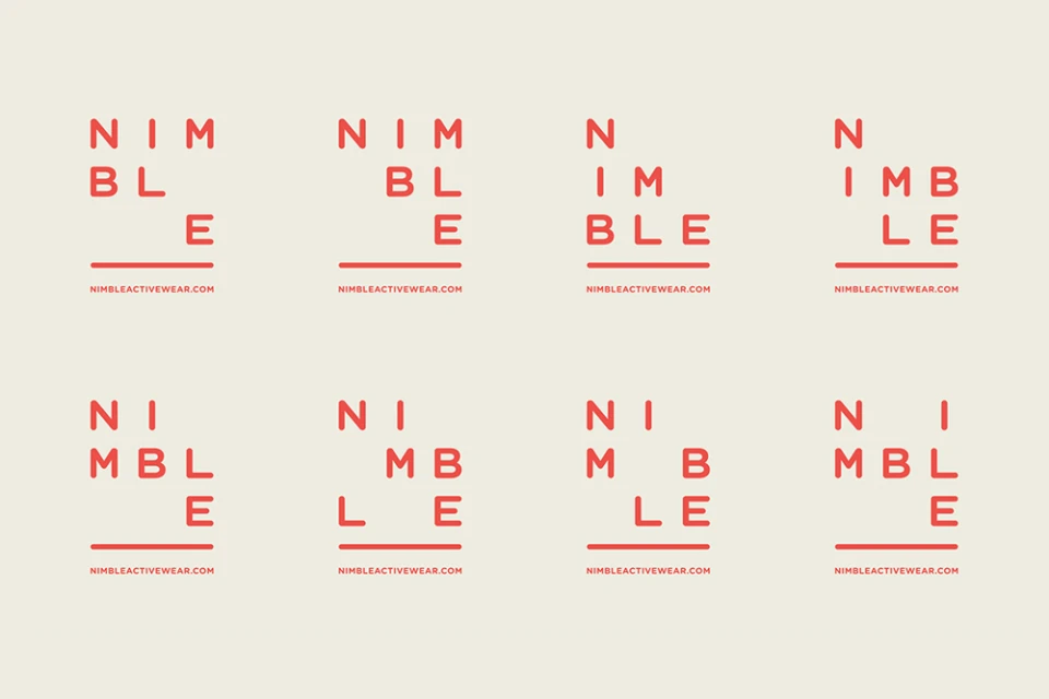
The brand identity for Nimble, developed by Christopher Doyle & Co., serves as a masterclass in editorial minimalism and functional commercial design. By stripping back the visual language to its core essentials, the project establishes a cohesive aesthetic that spans both digital interfaces and physical collateral. The design system leans heavily into a high-contrast palette of crisp white, neutral creams, and a signature vibrant coral-orange, anchored by a bold, sans-serif red typography that demands attention without cluttering the user experience. Whether displayed through sleek 3D render CGI tablet mockups of an e-commerce platform or across tangible retail hang tags and stationery, the identity maintains a consistent, modern edge. The project balances technical specifications—such as clear icons for moisture-wicking and four-way stretch fabrics—with lifestyle imagery that emphasizes movement and athleticism. Natural light photography captures a dynamic, aspirational energy that reinforces the brand's activewear roots, while the structured grid layouts for logos and business cards highlight a disciplined approach to graphic design. This cohesive visual strategy successfully translates the brand’s commitment to quality and simplicity into a scalable identity that feels equally at home on a digital screen as it does on a physical product, proving that thoughtful, clean execution is the ultimate signifier of a modern performance brand.
Commercial, Clean
Typography
Wood Texture
Advertising Campaign
