
Deluca Coffee
Brand Identity
Jan 2017
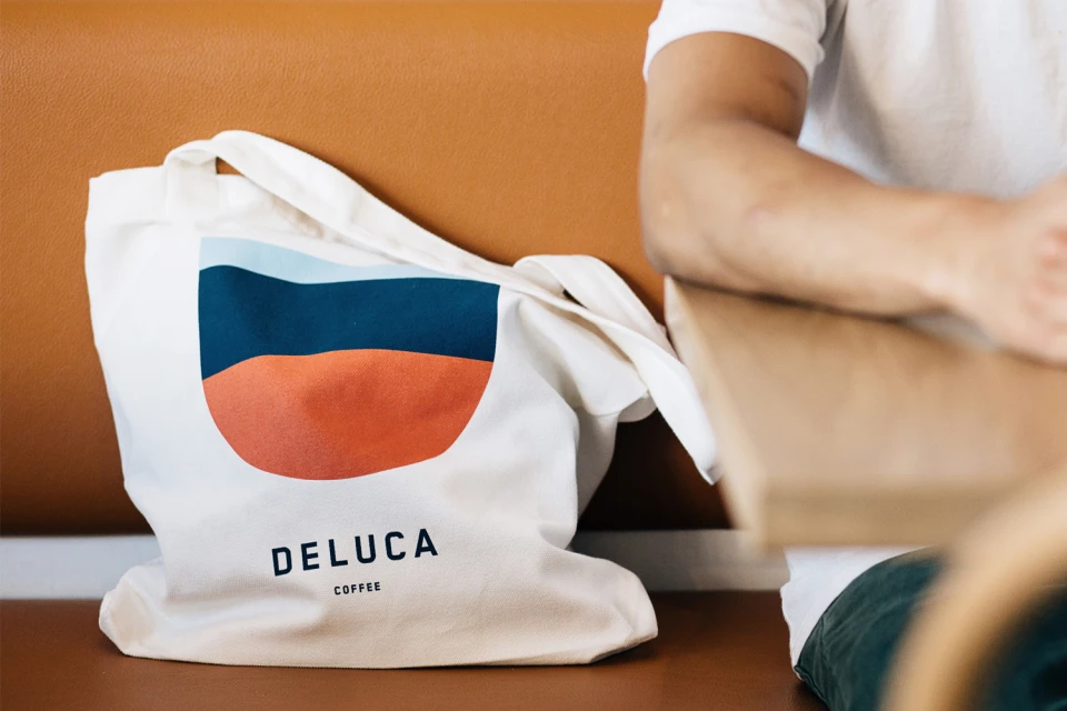
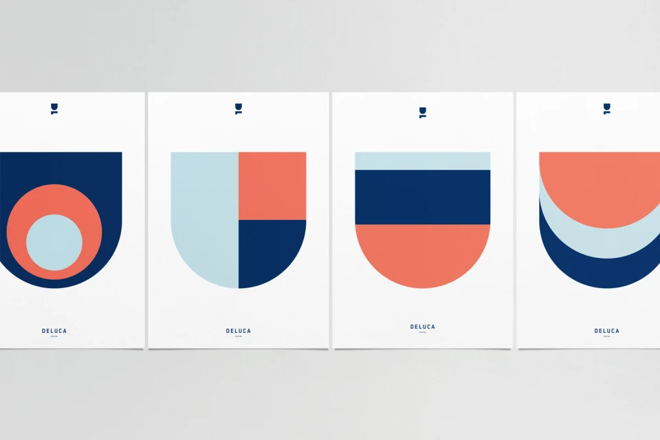
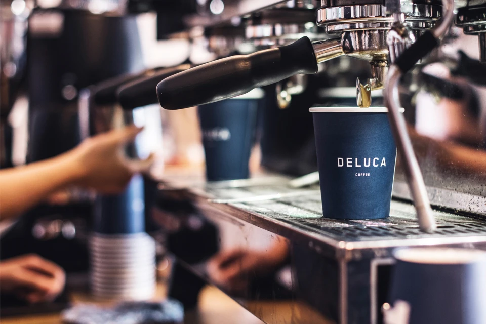
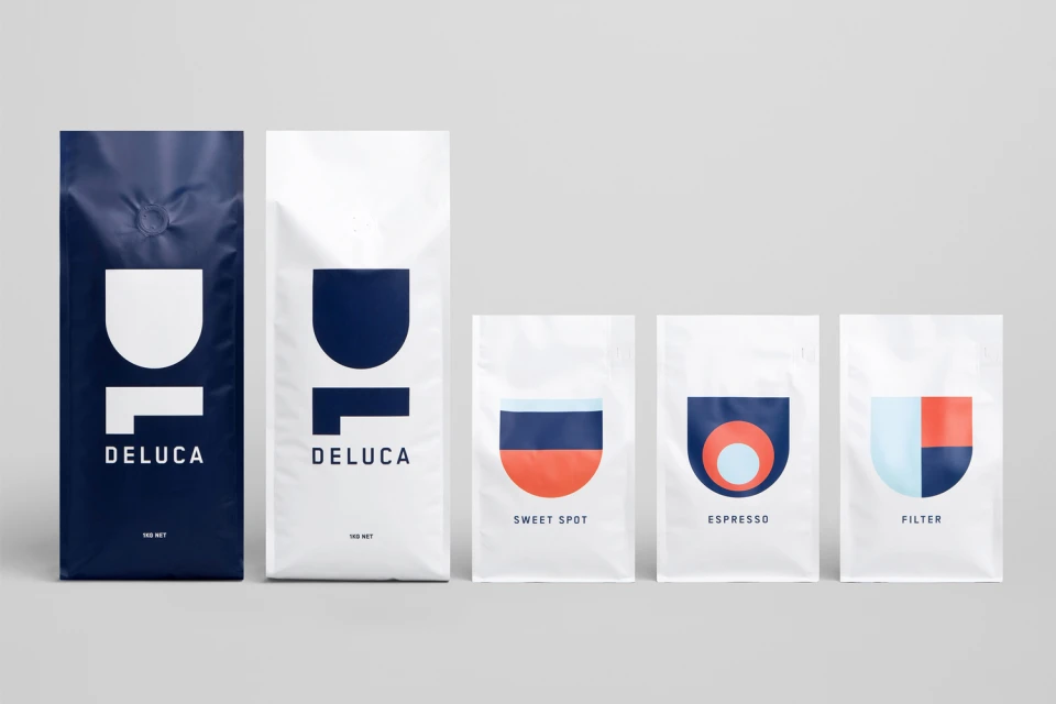
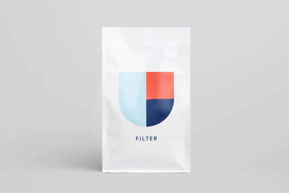
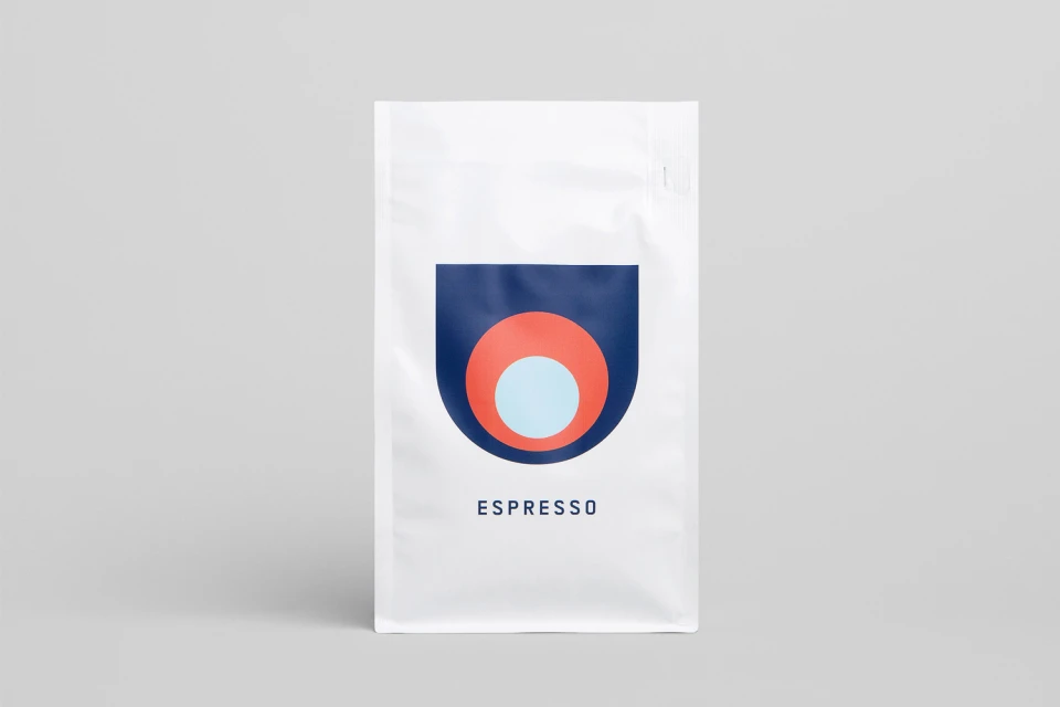
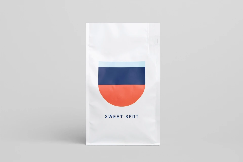
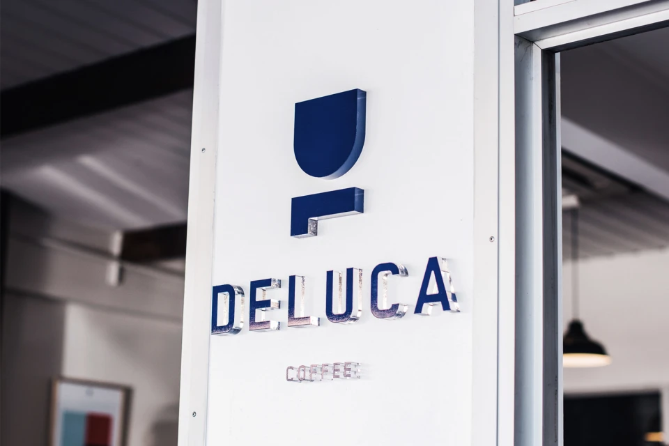
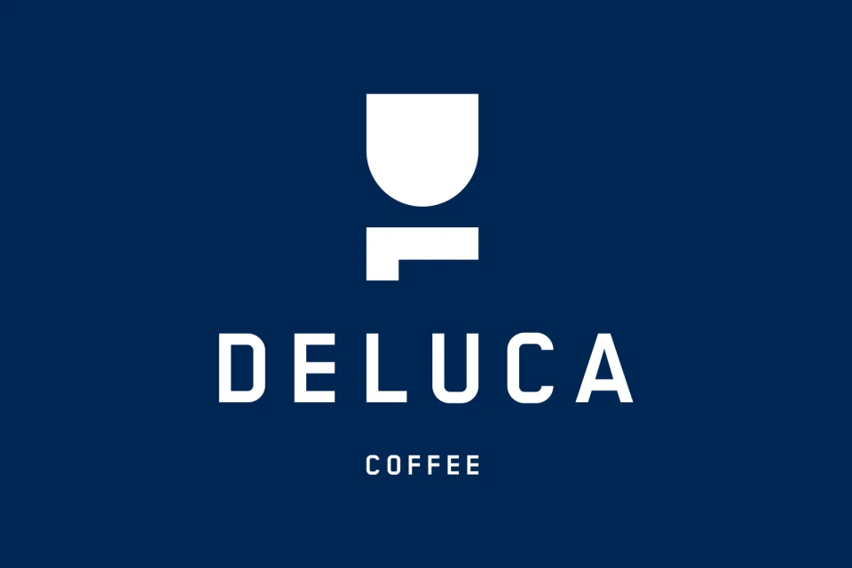
Deluca Coffee has unveiled a sophisticated new brand identity that leans into a refined, minimalist aesthetic to elevate its standing within the competitive CPG and food and beverage landscape. Under the expert graphic design hand of Christopher Doyle & Co., the brand moves away from traditional cafe tropes toward a more precise, geometric abstraction. The visual system is defined by a modular approach, utilizing a cohesive color palette of navy, muted coral, and light blue that is applied across a diverse range of touchpoints, from clean, vector-based posters to tactile, matte-textured coffee packaging. The identity relies on sharp typography and balanced compositions to create a professional, modern corporate aesthetic that feels both approachable and premium. Whether captured through natural light in lifestyle photography or rendered in controlled studio strobe product shots, the design remains consistently symmetrical and orderly. By prioritizing clean, sans-serif typefaces and bold, recurring geometric icons like the stylized U-shape and nested circles, the project achieves a high-contrast visual language that translates perfectly from digital displays to physical retail environments. This comprehensive overhaul successfully captures the essence of the modern coffee experience, blending functional, clinical product clarity with the inviting atmosphere of contemporary cafe culture to establish a distinct, memorable presence for the Deluca Coffee name.
Horizontal, Commercial, Clean, Minimalist
Beverages
Advertising Campaign
