
Australian Design Radio
Brand Identity
Jul 2016
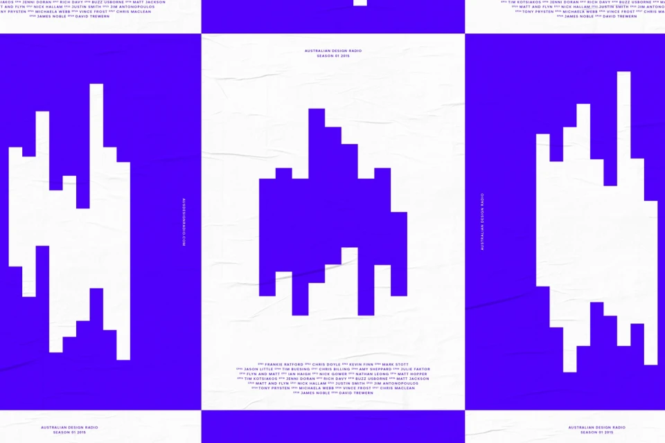
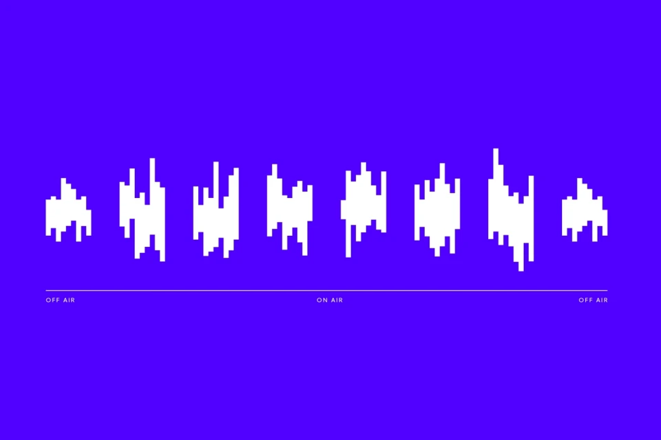
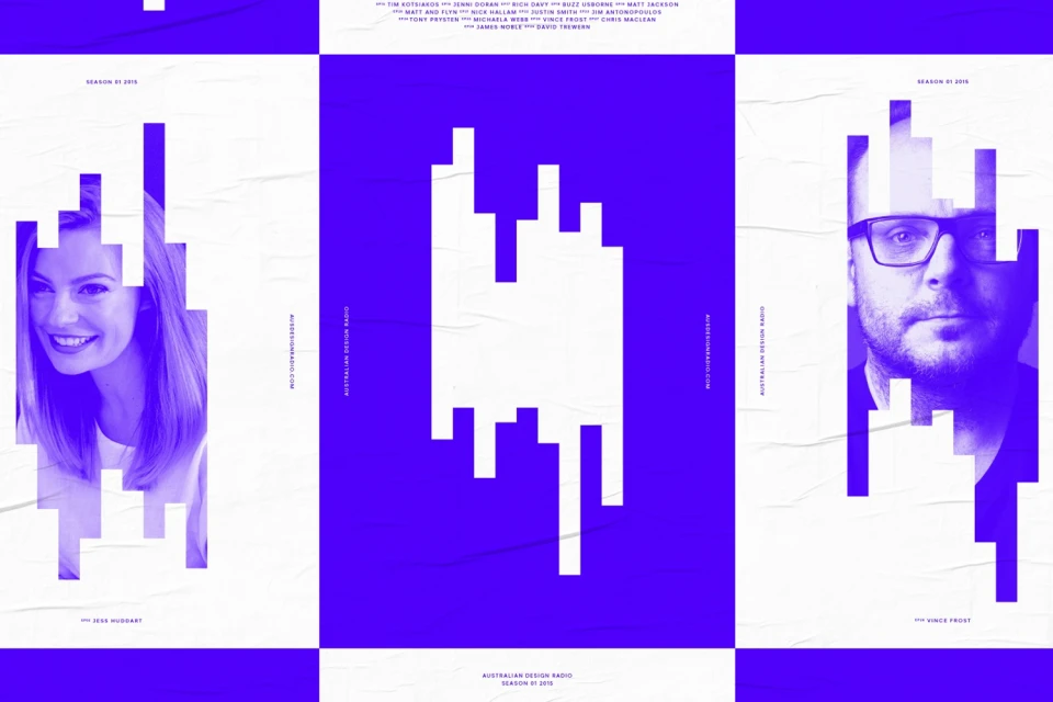
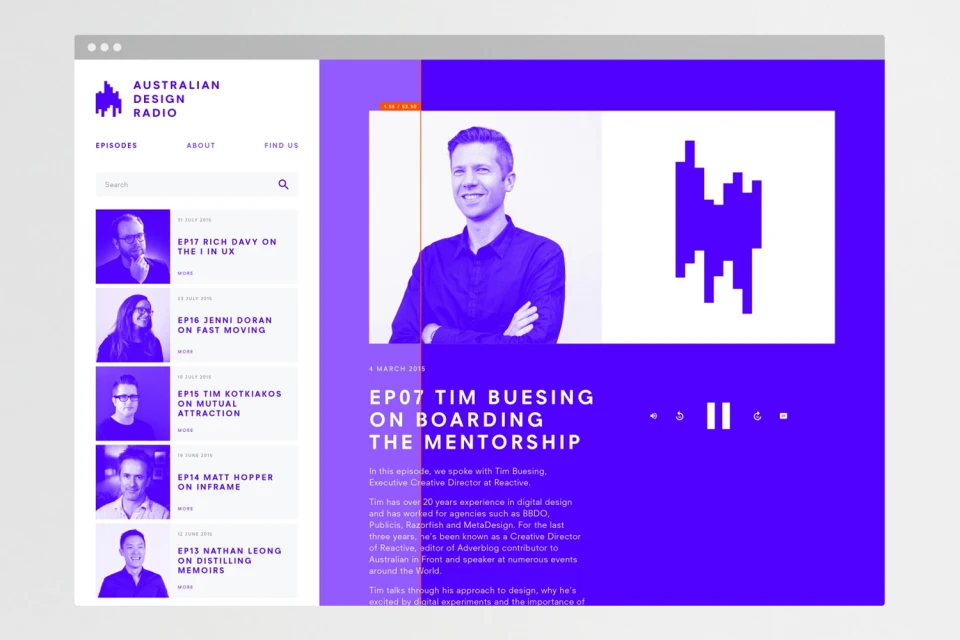
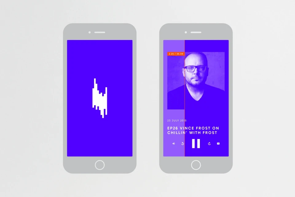
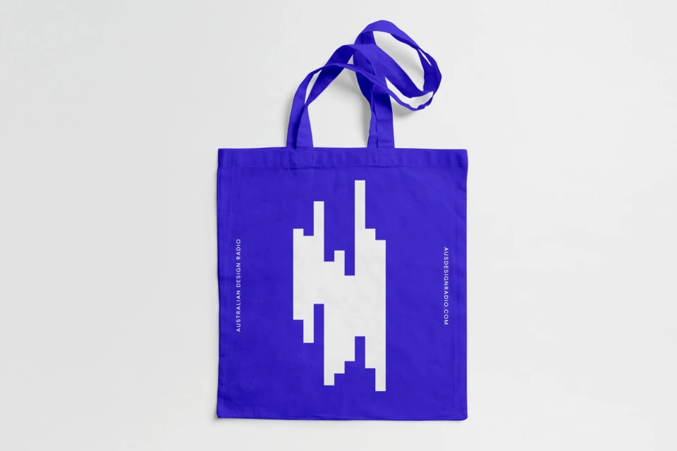
The brand identity for Australian Design Radio serves as a masterclass in modular communication, effectively bridging the gap between tactile print media and digital-forward podcasting. Developed with a rigorous, minimalist approach by Christopher Doyle & Co., the visual system leans heavily into a high-contrast palette of vibrant blue and stark violet, anchored against clean white negative space. At the heart of the project is a sophisticated typographic language that pairs sans-serif precision with abstract, pixelated geometric forms that mirror the fluctuating nature of audio frequencies and digital sound waves. This rhythmic, bar-like iconography is expertly scaled across a wide range of assets, from structured triptych posters that play with paper-like textures to highly functional UI illustrations optimized for mobile and web interfaces. By weaving these sharp, vector-based motifs into diverse formats—including lifestyle merchandise like cotton tote bags—the design identity maintains a remarkable level of coherence. The result is a bold, commercial aesthetic that feels both systematic and expressive, successfully transforming the ephemeral nature of a podcast platform into a permanent, highly recognizable brand mark that commands attention through its graphic clarity and disciplined geometry.
Horizontal, Clean, Graphic, Commercial
Advertising Campaign
