
Brand
ProjectBrand Identity
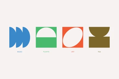
Steep St. Brand Identity 2020
Associated creatives

Tags
Description
Graphic design brand identity project for Steep St. created by Christopher Doyle and Co. The image presents four distinct geometric icon blocks arranged horizontally against a clean off-white background. The first blue icon represents music, the second green and white icon represents plants, the third orange and white icon represents art, and the fourth brown icon represents tea. Each minimalist symbol utilizes bold flat colors and geometric shapes to establish a cohesive visual system. The clean typographic labels appear centered underneath each respective icon.