
Souk
Brand Identity
Feb 2018
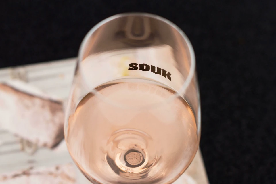
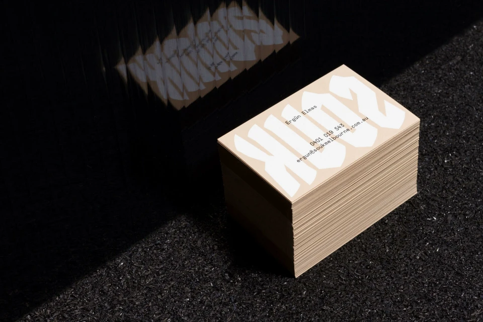
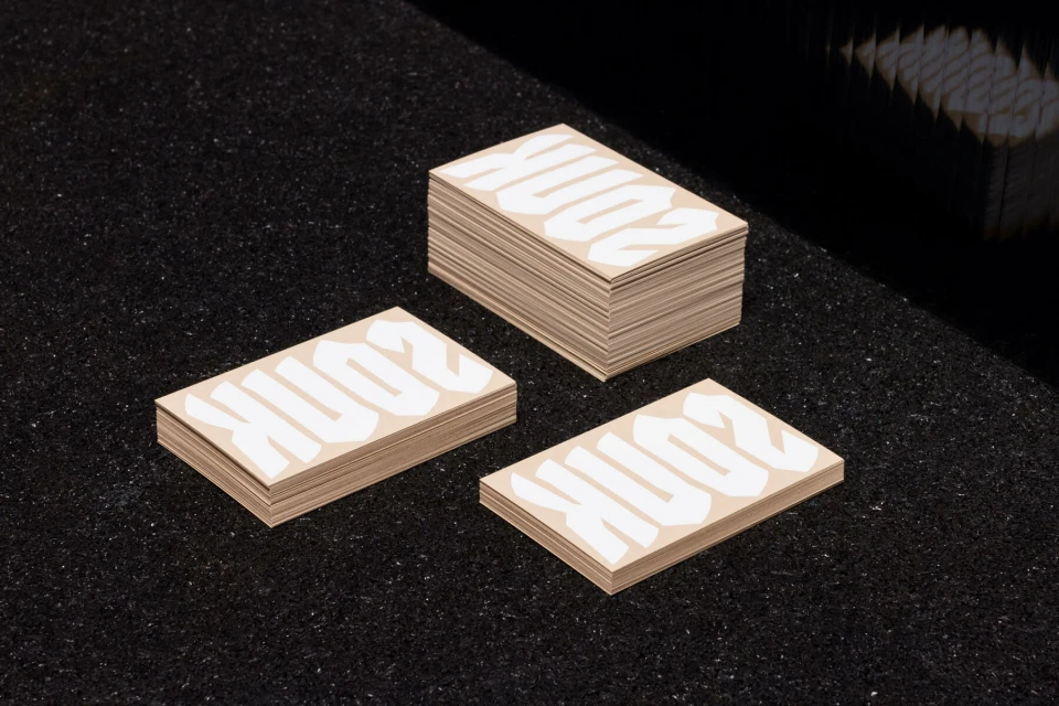
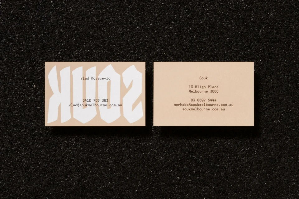
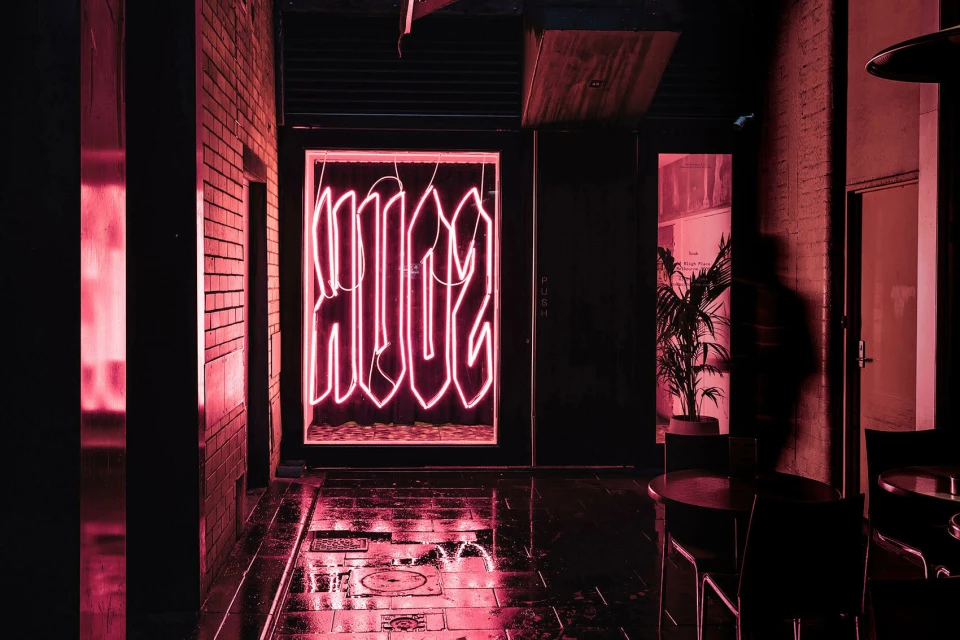
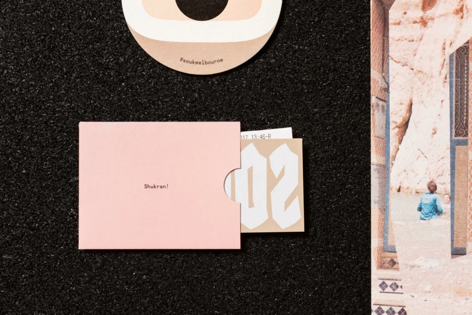
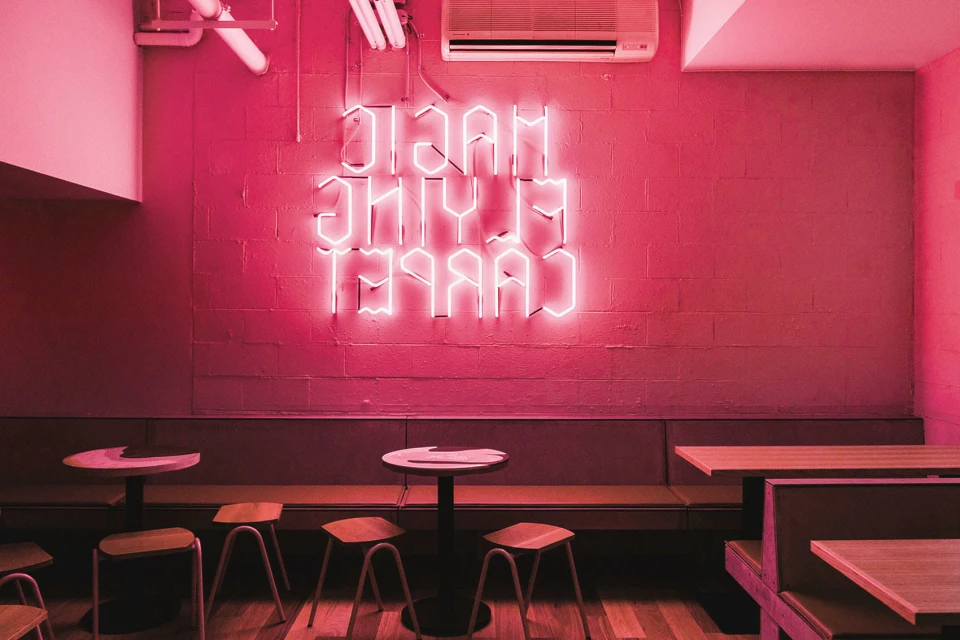
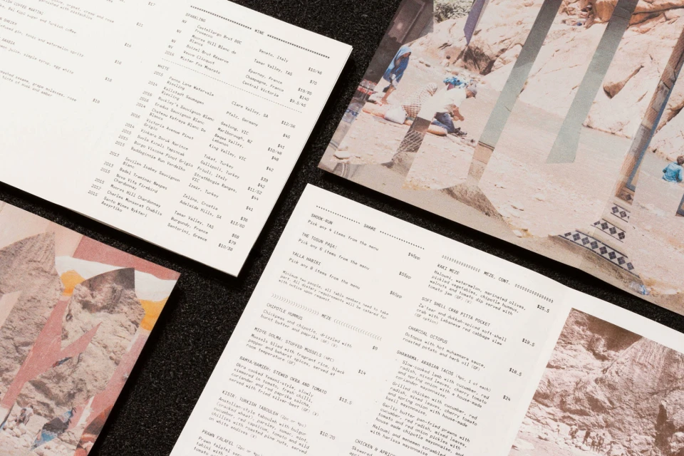
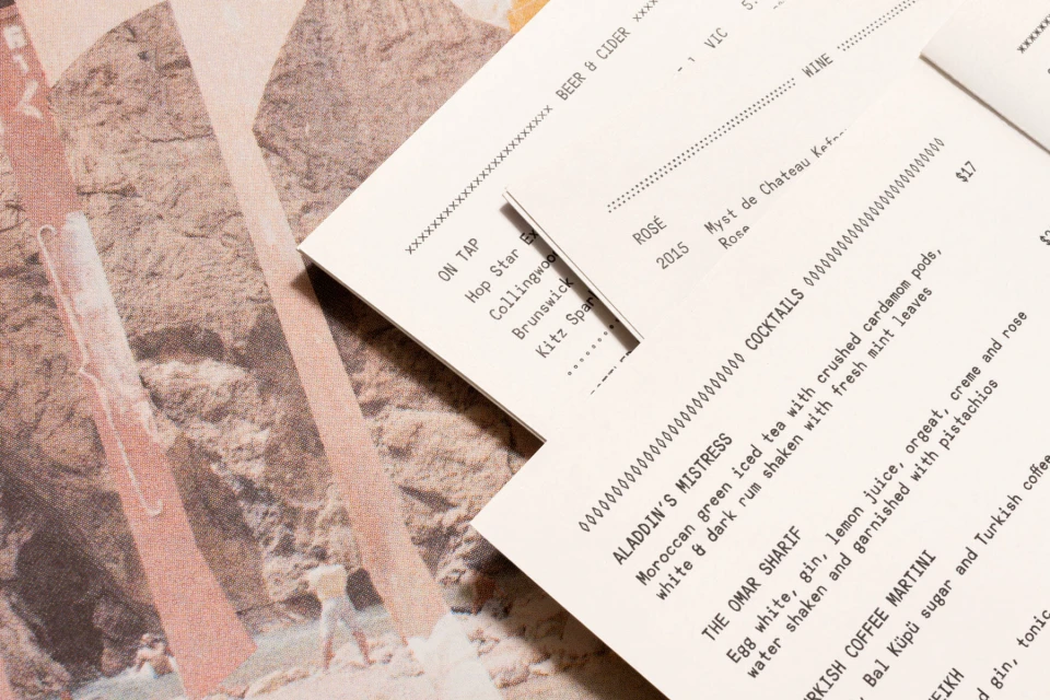
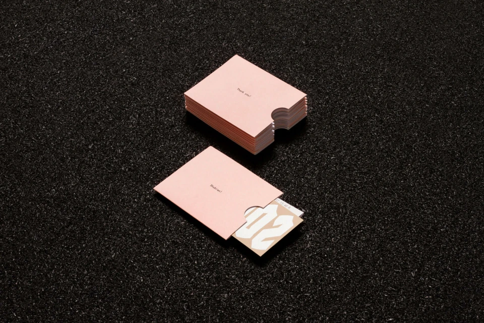
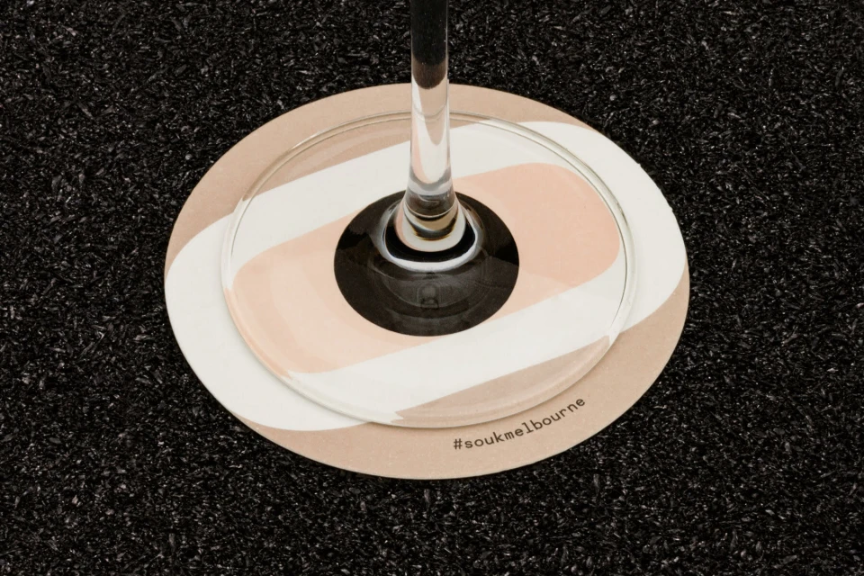
The brand identity for Souk masterfully balances raw, tactile materiality with sophisticated graphic design, creating a visual language that feels both grounded and cinematic. By pairing bold typography—ranging from assertive sans-serifs to stylized gothic lettering—with a stark, monochromatic palette, the project effectively navigates the intersection of commercial hospitality and editorial minimalism. A key component of this identity is the intentional contrast between smooth, matte paper stocks and the coarse, dark asphalt textures that recur across the collateral, anchoring the brand in a physical space that feels tangible and intentional. The use of studio strobe lighting enhances the crispness of these paper goods, while the incorporation of collage elements featuring desert landscapes and vintage-inspired cut-outs injects a sense of narrative depth into the menu design. Beyond the printed materials, the brand extends into the physical environment through vibrant neon installations that bathe architectural interiors in saturated, high-contrast hues, leaning into a cinematic atmosphere that bridges the gap between urban dining and dreamlike exploration. This cohesive system, executed with a sharp focus on geometric composition and negative space, successfully translates a distinct brand spirit into a multi-sensory experience. From the minimalist stationery to the evocative drink menus, every detail is considered, reflecting a brand that is as comfortable in a high-end bistro as it is within a bustling, late-night urban alleyway.
Commercial, Clean, Horizontal
Typography
Advertising Campaign
