
Kate Lee
Brand Identity
Dec 2017
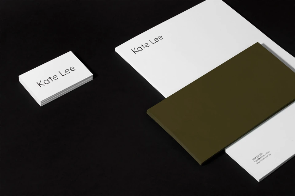
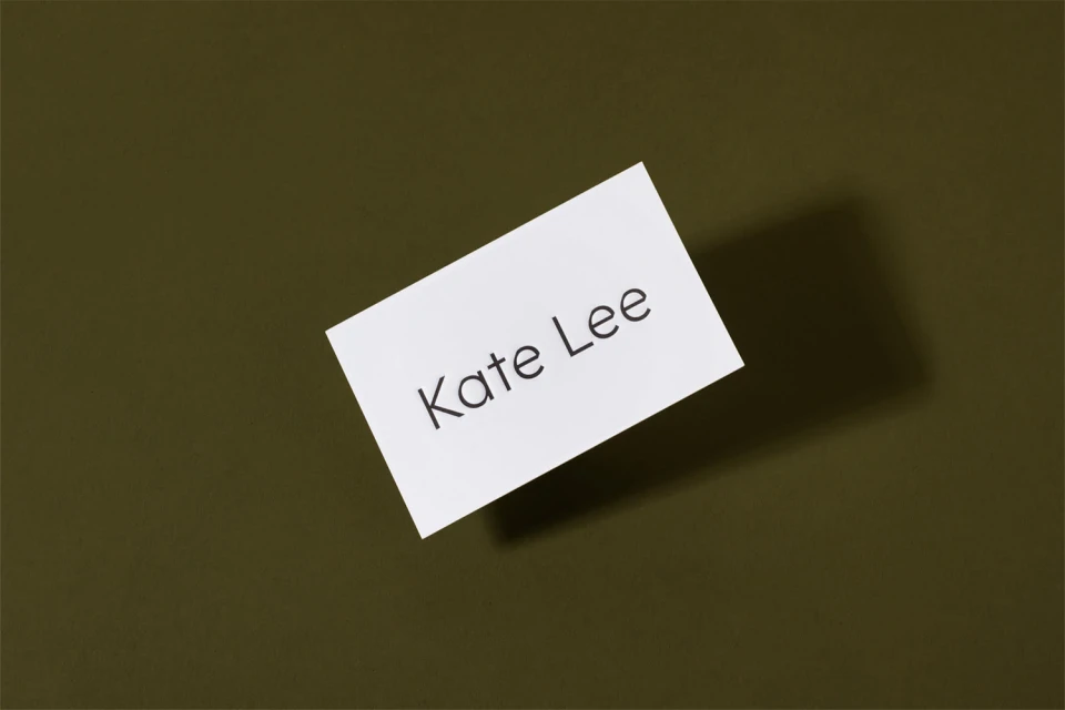
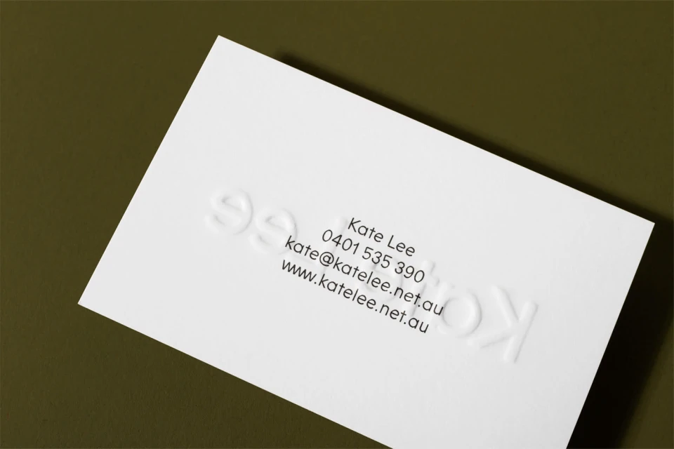
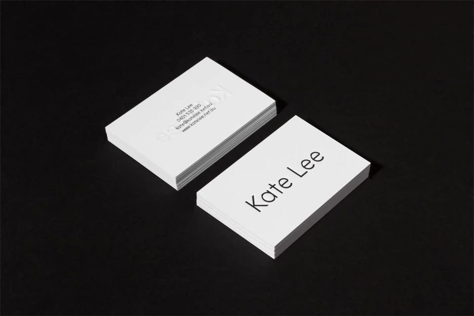
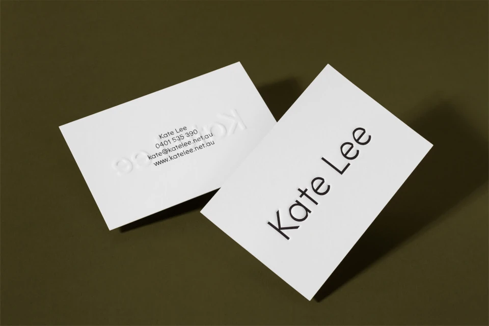
The brand identity for Kate Lee signals a pivot toward sophisticated e-commerce platforms and retail design, prioritizing clarity and tactile elegance above all else. This commercial project focuses on a refined typographic language that anchors the identity in modern professionalism. Through the deliberate use of high-contrast compositions and a color palette grounded in stark blacks and deep, earth-toned olive, the work emphasizes a minimalist aesthetic that feels both authoritative and approachable. The execution relies on precise graphic design to convey a sense of premium quality, with subtle blind embossing on the stationery suite providing a necessary tactile dimension that bridges the gap between digital identity and physical brand assets. By leveraging studio strobe lighting, the presentation captures crisp edges and sharp shadows, ensuring every detail of the sans-serif type remains central to the narrative. The design language avoids unnecessary ornamentation, instead leaning into the clean, geometric balance of the cards to communicate a streamlined, trustworthy brand voice. With its emphasis on structured layout and deliberate negative space, this branding effort serves as a masterclass in editorial minimalism for the retail sector, demonstrating how effective typography and thoughtful production techniques can define a brand presence without the need for additional visual clutter or complex, distracting ornamentation.
Horizontal, Commercial, Clean, Minimalist
Typography
