
Sister
Brand Identity
Dec 2017
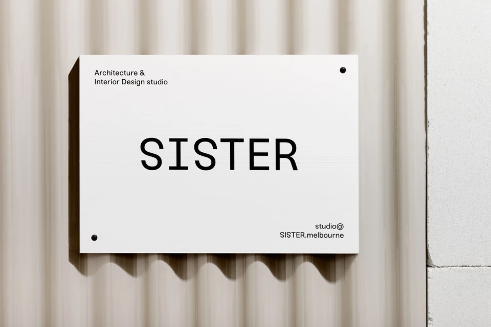
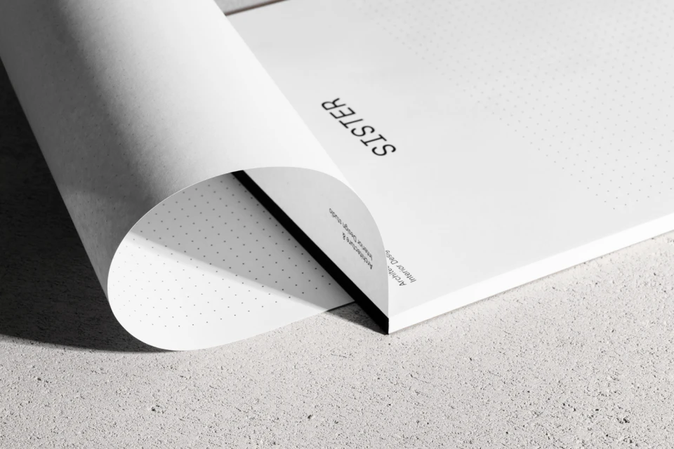
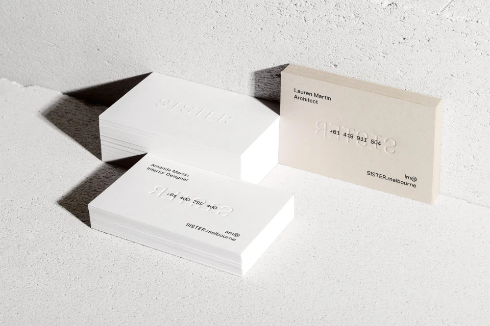
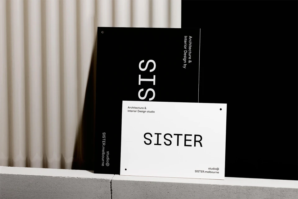
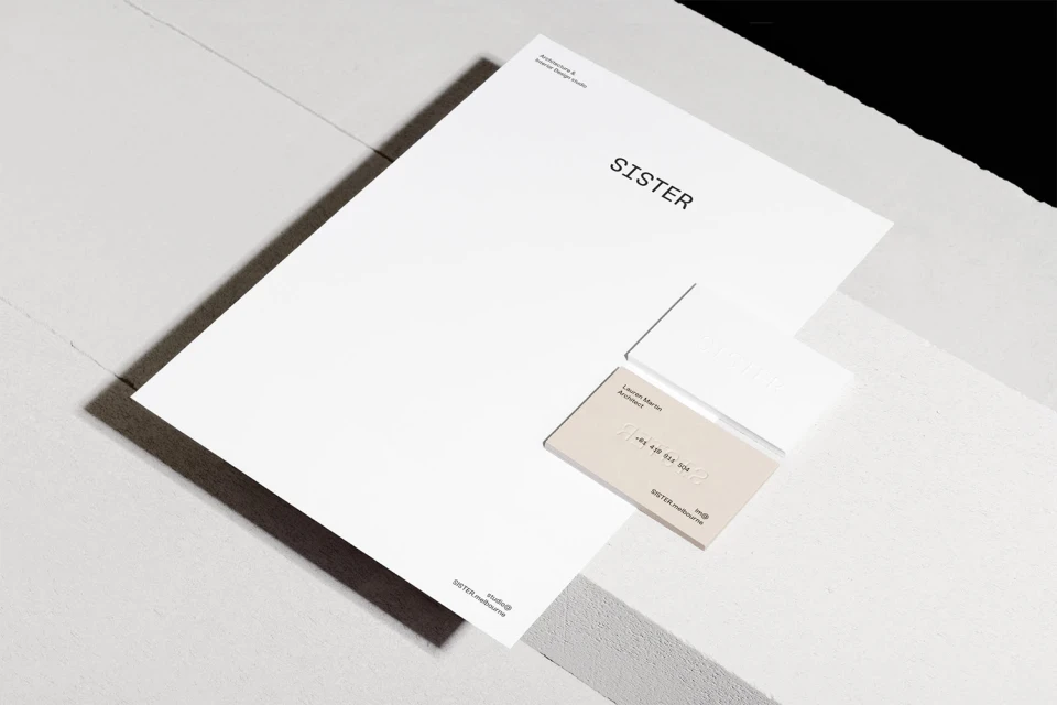
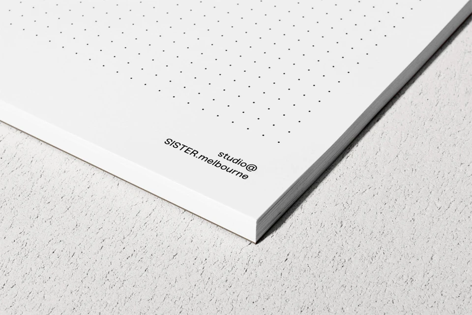
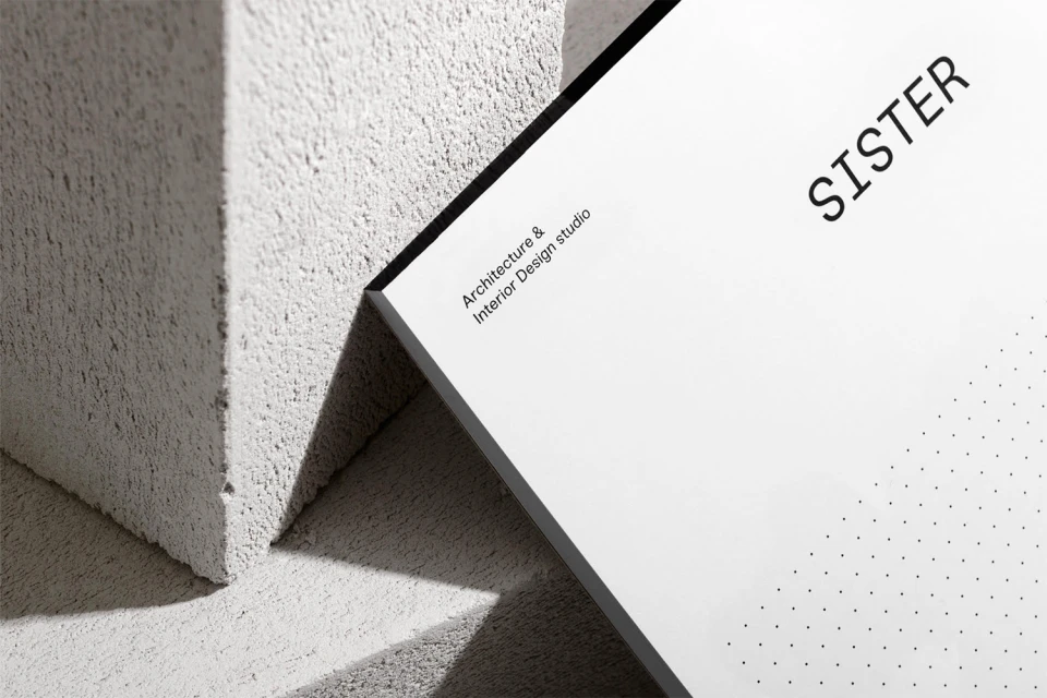
The brand identity for Sister Architecture & Interior Design manifests as a masterclass in editorial minimalism, grounding a high-end, contemporary aesthetic in the raw, tactile reality of the built environment. Through a curated suite of corporate identity materials, the project leans into a restrained visual language where typography becomes the central architect. By utilizing a deliberate contrast between clean, sans-serif letterforms and the coarse, unforgiving textures of concrete and stone surfaces, the design establishes a sophisticated dialogue between the ephemeral nature of print collateral and the structural weight of the firm’s architectural practice. The application of low-key and chiaroscuro lighting techniques highlights the intentionality behind the embossed logos and dot-grid stationery, transforming basic brand touchpoints into tactile, high-contrast artifacts. By juxtaposing stark black-and-white compositions with directional natural light, the studio captures a sense of modern precision that feels both timeless and distinctly professional. This project moves beyond mere graphic design to create a cohesive sensory experience, where every shadow and paper edge reinforces a brand identity built on clarity, material honesty, and spatial awareness. The result is a polished, highly readable corporate visual system that mirrors the studio's own architectural philosophy, favoring functional elegance over ornamentation and ensuring that the Sister brand remains as enduring and well-constructed as the spaces they envision for their clients.
Horizontal, Commercial, Clean, Minimalist
Typography
Concrete Texture
