
Sisällä
Brand Identity
Jan 2017
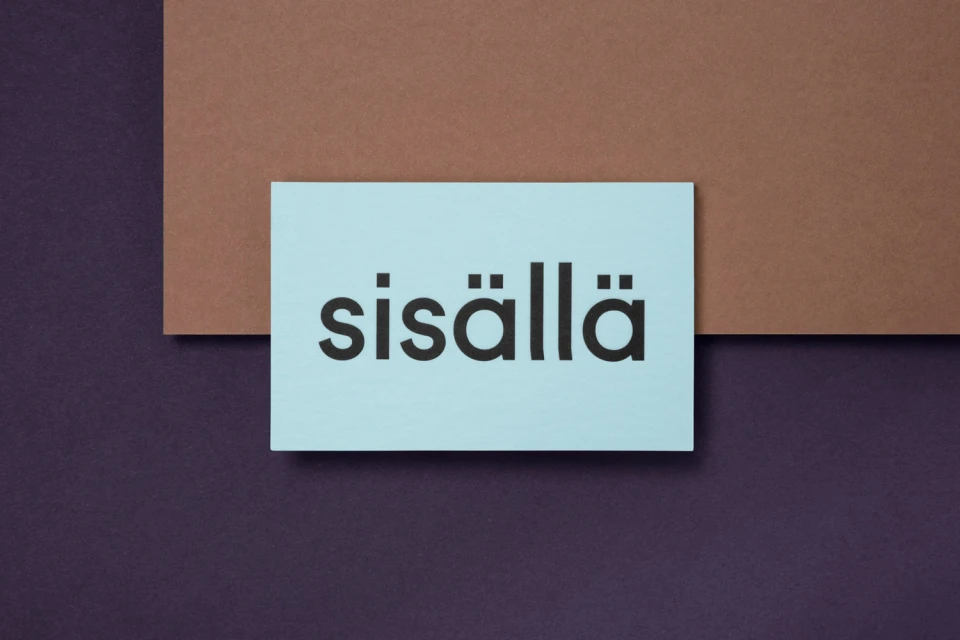
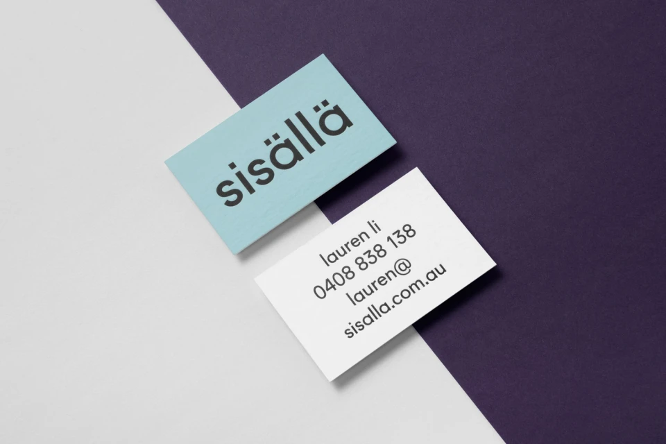
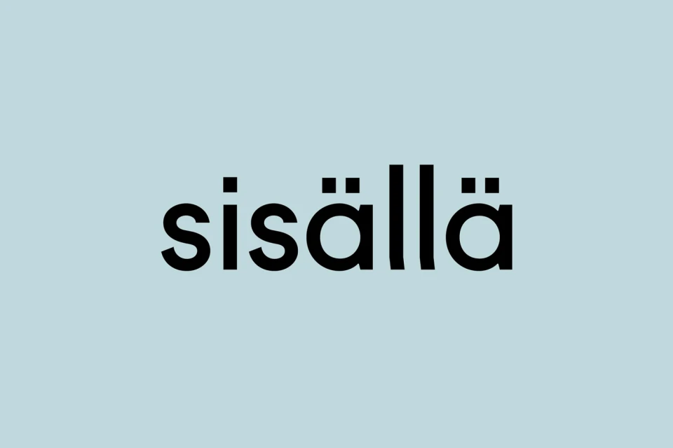
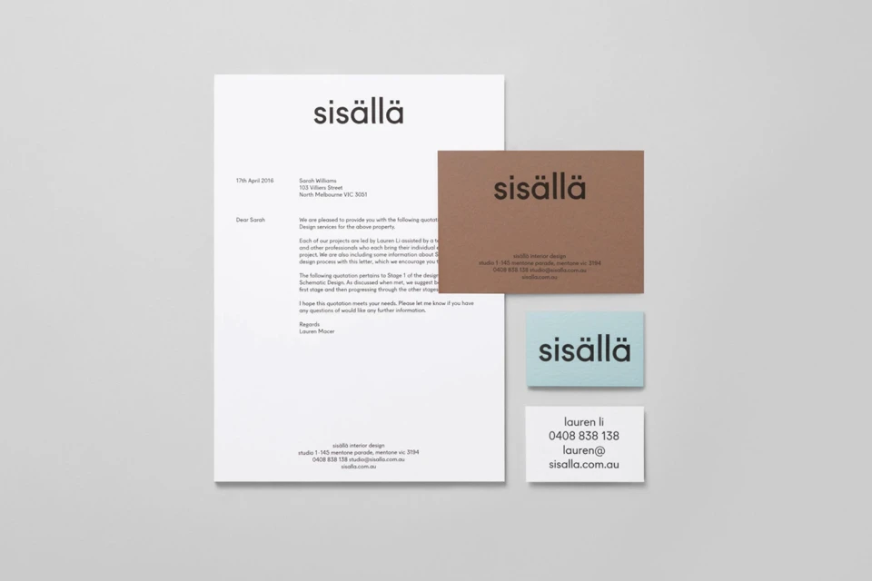
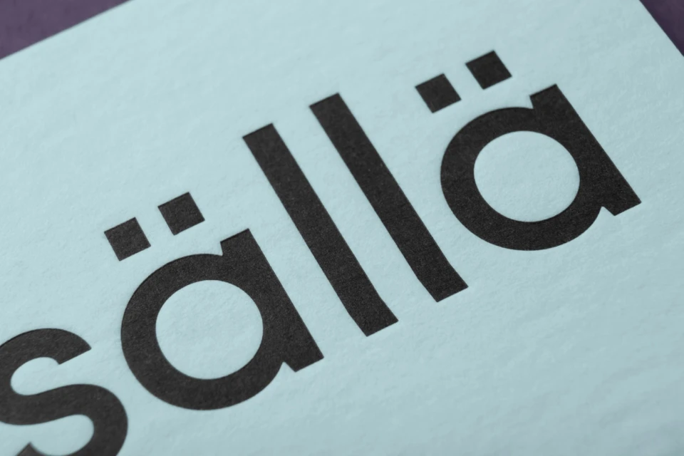
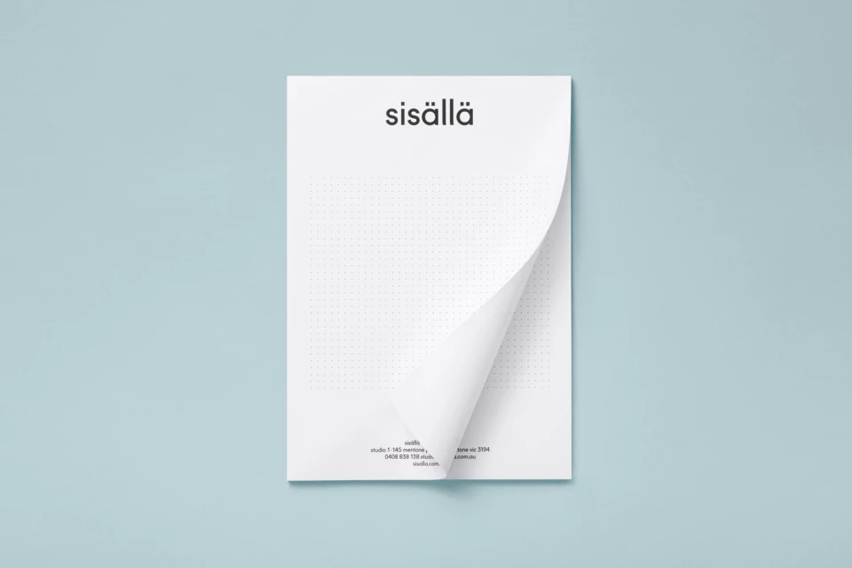
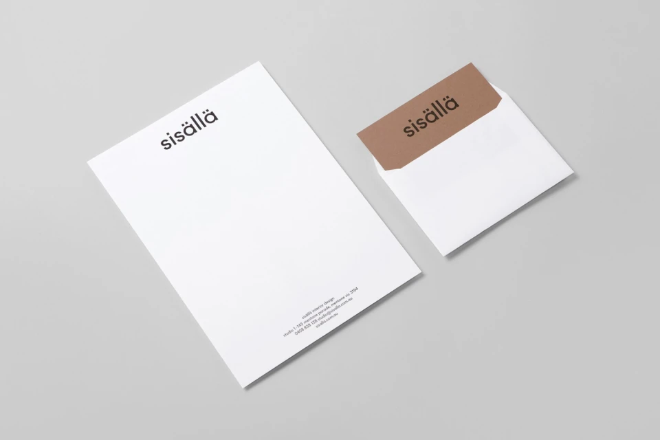
The brand identity for Sisällä serves as a masterclass in restrained, intentional graphic design. By leaning into a minimalist aesthetic, the project creates a sophisticated visual language that speaks volumes through precise geometric balance and tactile material choices. The system hinges on a high-contrast palette of muted light blue, deep purple, and clean white, grounding the brand’s professional interior design focus with a contemporary, elevated sensibility. Every element, from the bold, sans-serif typography that anchors the logo to the thoughtfully curated corporate stationery set, feels meticulously calibrated for clarity and impact. Through an expert application of macro-level attention to detail, the project elevates standard collateral into a cohesive design experience. The use of studio strobe lighting emphasizes the crisp lines and distinct paper grains, while the flat-lay compositions reinforce a highly structured, symmetrical approach to the brand mark. By avoiding unnecessary flourishes, the identity effectively signals a modern, high-end firm that values both architectural structure and visual simplicity. This branding work perfectly balances a corporate, commercial utility with an artistic commitment to minimalist form, proving that a strong visual identity is often found in the deliberate interplay of negative space and refined, legible typography. The resulting identity feels both timeless and sharp, positioning Sisällä as a brand that is as polished as it is modern.
Horizontal, Commercial, Clean, Minimalist
Typography, 3D render / CGI
