
unknown: Brand Identity
Jun 2018
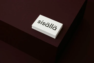
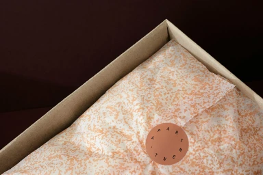
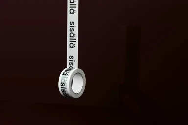
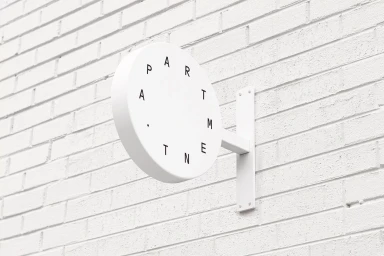
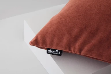
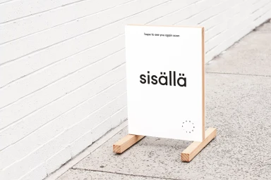
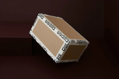
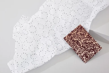
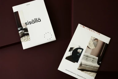
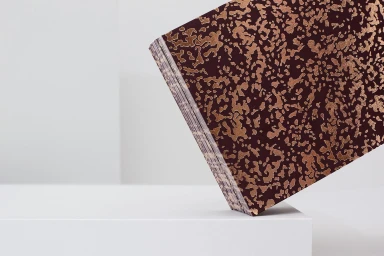
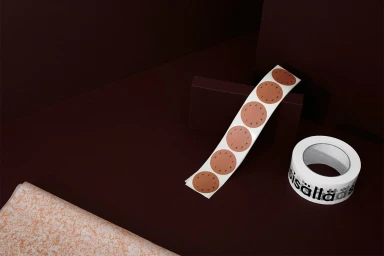
This brand identity project for Sisällä serves as a masterclass in editorial minimalism and cohesive visual storytelling. By leaning into a sophisticated palette of deep burgundy, chocolate brown, and stark white, the design team at Both has crafted a language that feels both architectural and tactile. The project avoids the clutter of modern marketing, instead utilizing generous negative space and a consistent sans-serif typography to anchor the brand across various touchpoints. From the delicate, speckled tissue paper wrapping to the bold, functional application of branded adhesive tape, every element is considered for its material impact. The photography reinforces this narrative through deliberate use of soft light and high-key lighting, elevating mundane office collateral into a cohesive collection of design objects. Whether it is the precision of a die-cut circular sticker or the quiet confidence of a sandwich board on a grey sidewalk, the identity maintains a rigorous graphic discipline that commands attention without raising its voice. By focusing on the interplay between matte and semi-gloss surfaces and the structural geometry of the product packaging, this identity functions as an extension of the space it represents. It is a striking example of how corporate branding can transcend simple utility, transforming everyday assets into a polished, unified presence that speaks to a refined, design-forward audience.
Horizontal, Commercial, Clean, Minimalist
