
Bicker
Brand Identity
Dec 2016
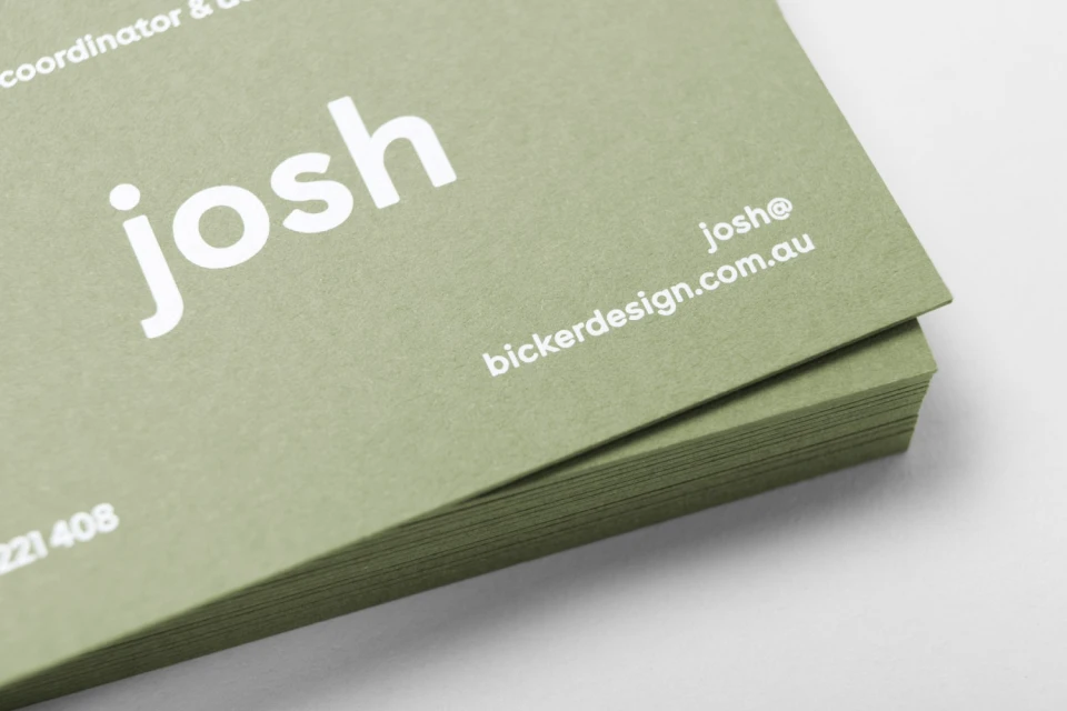
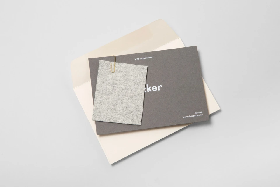
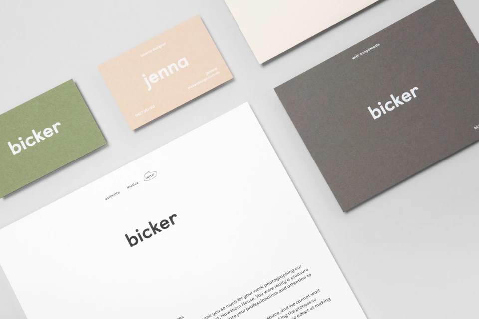
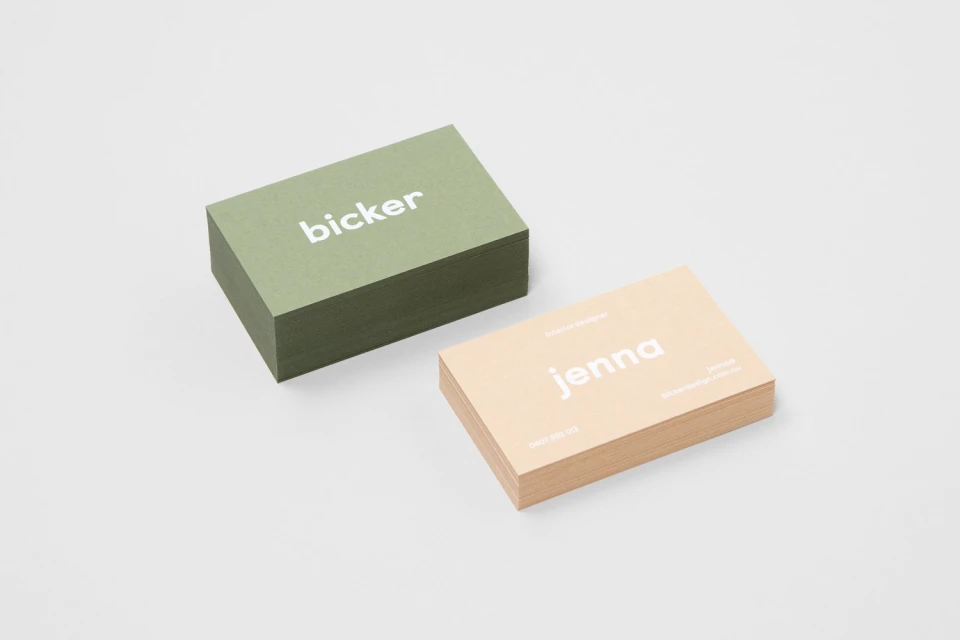
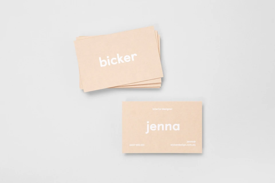
The brand identity for Bicker serves as a masterclass in editorial minimalism, channeling a sophisticated and restrained corporate aesthetic that prioritizes tactile engagement. Through a thoughtful integration of commercial design principles, the project establishes a cohesive visual language defined by an earthy, muted palette of olive green, peach, and soft beige. The execution leans into a clean, modern sans-serif typography that grounds the brand in professionalism while maintaining an approachable, lifestyle-oriented sensibility. By utilizing high-quality, textured cardstocks and thoughtful details like felt accents and gold clips, the design transcends typical stationery, transforming functional items into a tactile brand experience. The project documentation highlights this identity through a series of balanced studio strobe and natural light photography, showcasing a meticulous attention to material weight and color contrast. Whether presented as a flat-lay arrangement or a stark macro capture, the identity feels intentional and grounded, perfectly reflecting a contemporary design-led firm. By stripping away visual clutter, the creative team at Both has crafted a versatile identity that feels as comfortable in an interior design studio as it does in a boardroom. This project successfully demonstrates how subtle shifts in texture and tone can define a brand's narrative without the need for ornamental complexity, resulting in an elegant and enduring corporate presence.
Horizontal, Commercial, Clean, Minimalist
Typography
