
Santo Cielo: Brand Identity
Nov 2021
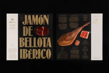
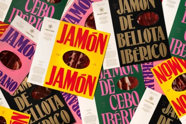
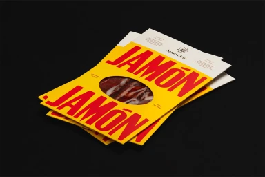
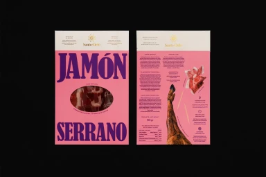
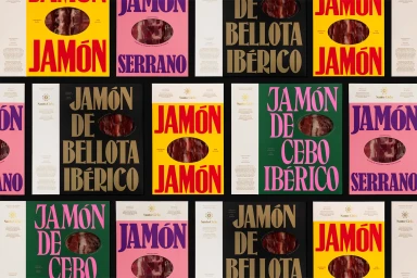
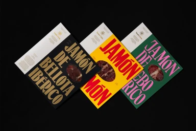
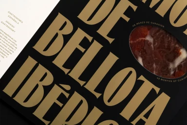
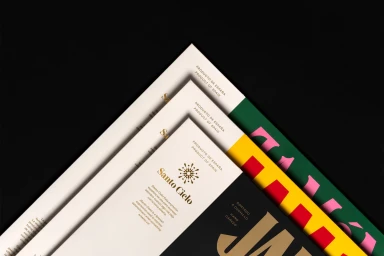
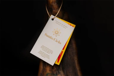
Santo Cielo’s brand identity project establishes a premium visual language for their range of cured Spanish hams. Developed with graphic design by Pràctica, motion by GIMMEWINGS, and photography by Enric Badrinas, the work leans into a sophisticated aesthetic that balances traditional gourmet food presentation with modern, high-contrast graphic design. The packaging system utilizes a recurring circular window to reveal the product, set against a bold color palette of yellow, deep green, and black. Typography plays a central role, utilizing elegant gold foil and serif typefaces to create a tactile, minimalist feel. Motion graphics elements further define the brand's premium positioning, incorporating clean, metallic animations that mirror the precise layout found in the print collateral.
Horizontal, Commercial, Clean, Graphic
Black Seamless
Advertising Campaign


