
El Primo Sanchez: Brand Identity
Oct 2023
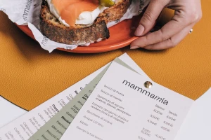
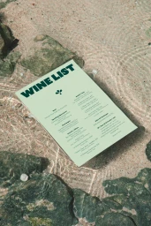
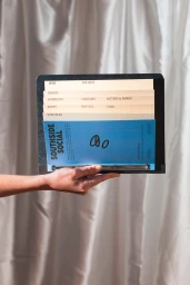
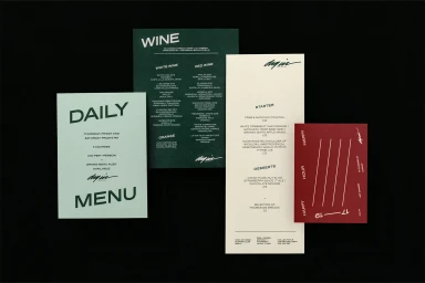
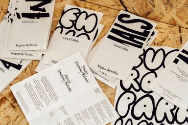
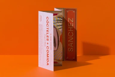
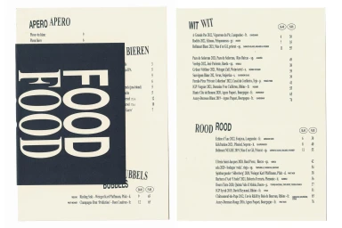
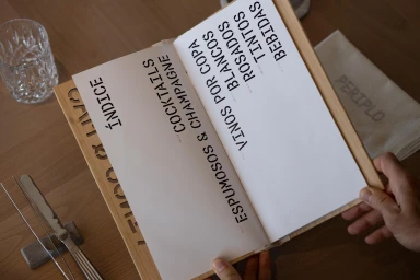
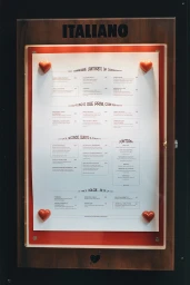
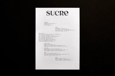
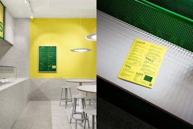
The brand identity for El Primo Sanchez is a comprehensive study in modern hospitality graphic design, featuring a cohesive visual system across print collateral and environmental signage. The project utilizes a restrained, editorial approach to typography, pairing bold serif lettering with minimalist layouts to establish a distinct and legible brand presence. Executed through a curated color palette of deep greens, rich reds, and soft creams, the work spans diverse touchpoints including folded brochures, daily menus, and wine lists. The design leverages tactile paper stocks and screen print techniques to ground the visual system in an artisanal, warm aesthetic. Collaborators on the project include The Bar Brand People, Davy Denduyver, Caterina Appignani, DutchScot, Angel & Anchor, Studio Oker, Enrique Presa, 25AH, Korak Studio, Pràctica, Goods, and Heydays.
Horizontal, Commercial, Clean
Advertising Campaign
Associated creatives


