
Brand
ProjectBrand Identity
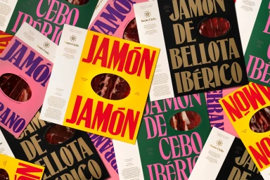
Santo Cielo Brand Identity 2021
Associated creatives


Tags
Description
This brand identity project for Santo Cielo features a vibrant, top-down flat lay of various food packaging sleeves and labels. Designed by Pràctica, GIMMEWINGS, and Enric Badrinas, the composition showcases striking color combinations including bright yellow, deep black, vivid pink, and dark green backgrounds paired with bold, contrasting typography. Oval window cutouts reveal slices of cured ham beneath the printed surfaces. Clean layout arrangements highlight product details, brand logos, and Spanish gastronomy descriptions.