
Brand
ProjectBrand Identity
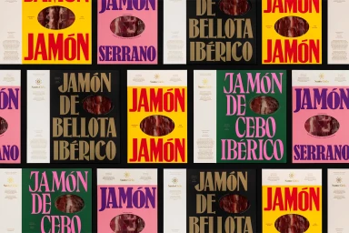
Santo Cielo Brand Identity 2021
Associated creatives


Tags
Description
This image showcases the brand identity and packaging design for Santo Cielo, created with graphic design by Pràctica, motion by GIMMEWINGS, and photography by Enric Badrinas. The composition features a repeating grid of product packaging items in striking color combinations including yellow, pink, dark green, and black. Each package highlights bold serif typography with large lettering spelling out jamon varieties such as serrano, de bellota iberico, and de cebo iberico. Centered within each packaging layout is a small oval transparent window displaying the cured meat product inside. The overall aesthetic is graphic, modern, and high contrast, arranged neatly against a dark background.