
Roger&Sons: Brand Identity



Brand
Date
Nov 2020
Description
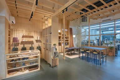
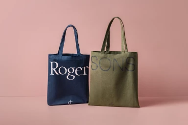
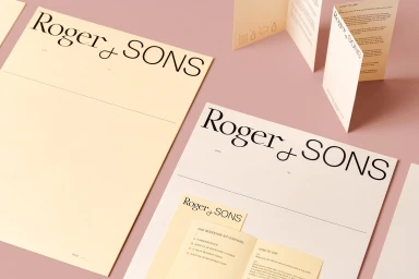
The brand identity for Roger&Sons establishes a cohesive visual language rooted in tactile materials and precise graphic design. Developed in collaboration with Foreign Policy, the project centers on custom typography and a distinct material palette that bridges the brand's retail presence with its workshop-based heritage. Collateral across the identity system incorporates textured paper stocks from Materica and Fedrigoni, utilizing emboss and deboss techniques to emphasize a craft-focused approach. The visual system balances minimalist layouts with a muted color story of earth tones and deep neutrals, captured through clean commercial photography and motion graphics.
Style
Horizontal, Commercial, Clean
Associated creatives


5000+ creatives to discover
Sign up to gain access to the entire directory. It’s free.
Visie is a curated library of creative professionals.