
Brand
ProjectBrand Identity
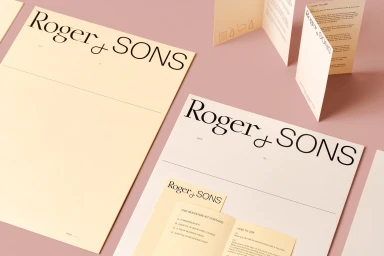
Roger&Sons Brand Identity 2020
Associated creatives


Tags
Description
Brand identity and stationery design featuring custom typography for Roger and Sons. The composition displays multiple printed pieces, including letterhead sheets, small cards, and folded instruction booklets in cream paper with crisp black typography. The items are arranged on a pink surface with soft natural lighting casting gentle shadows. Foreign Policy handled the graphic design using specialized paper stocks.