
Bottura
Brand Identity
Nov 2015
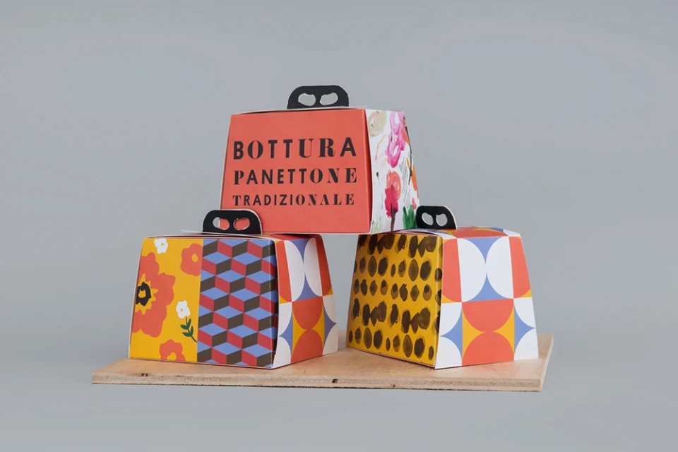
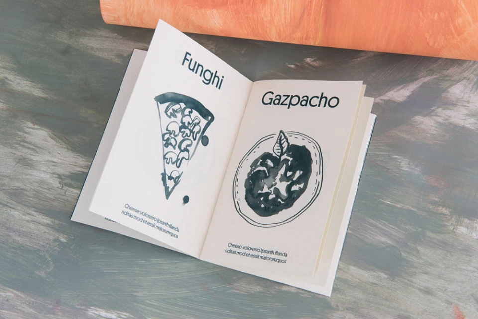
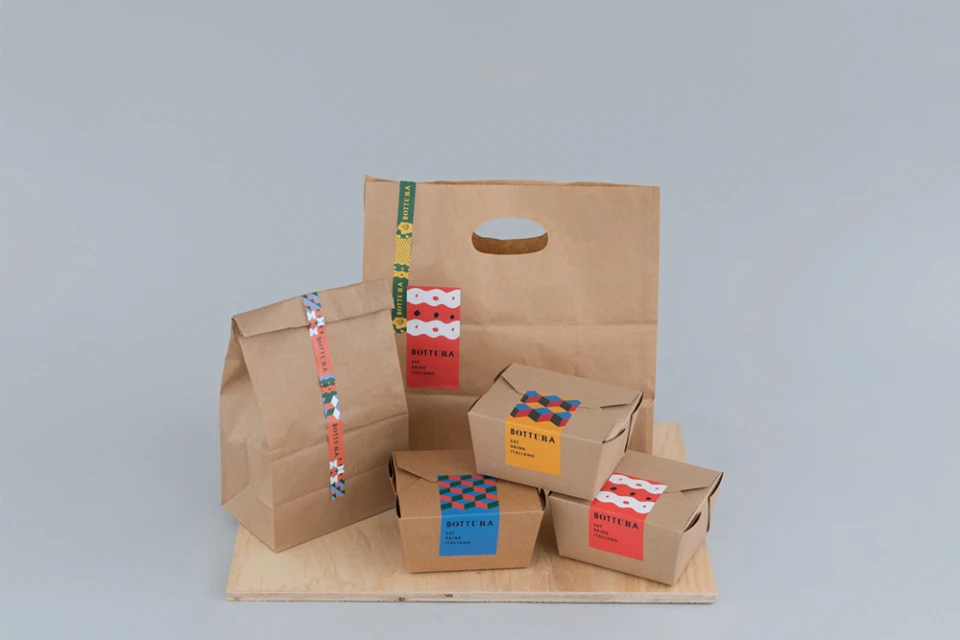
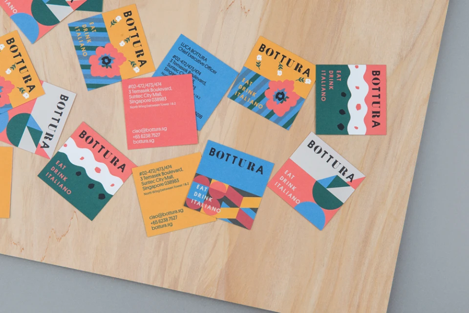
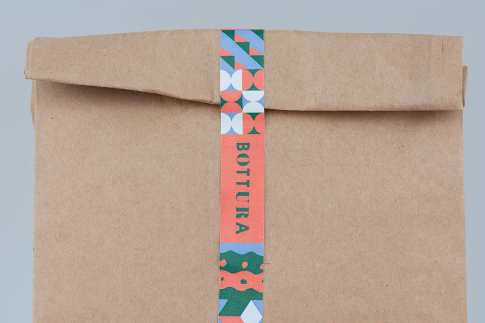
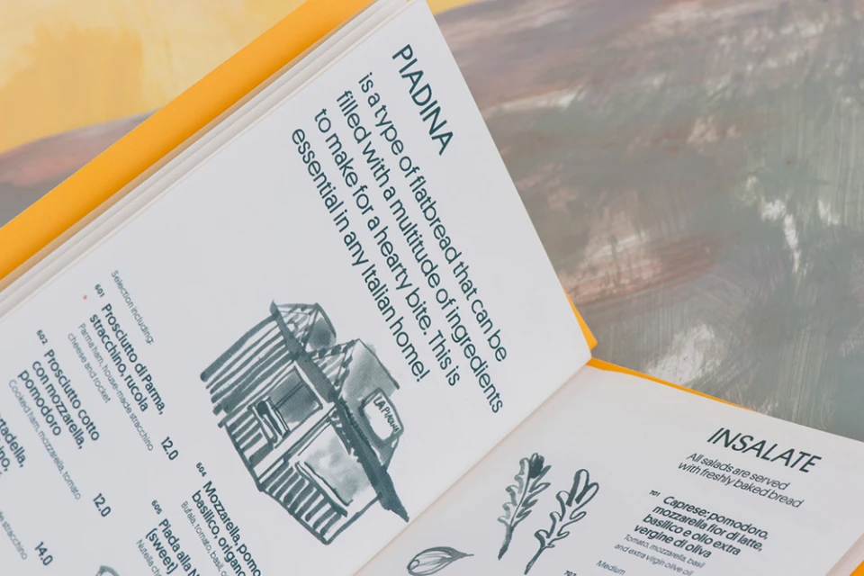
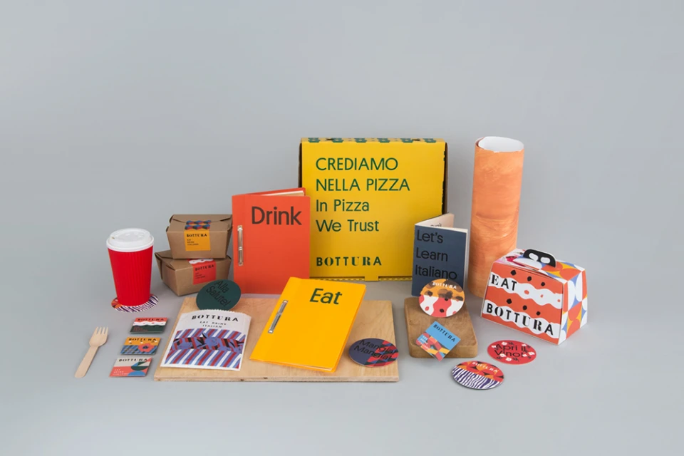
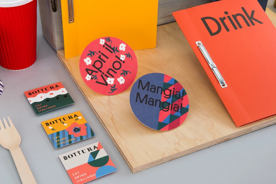
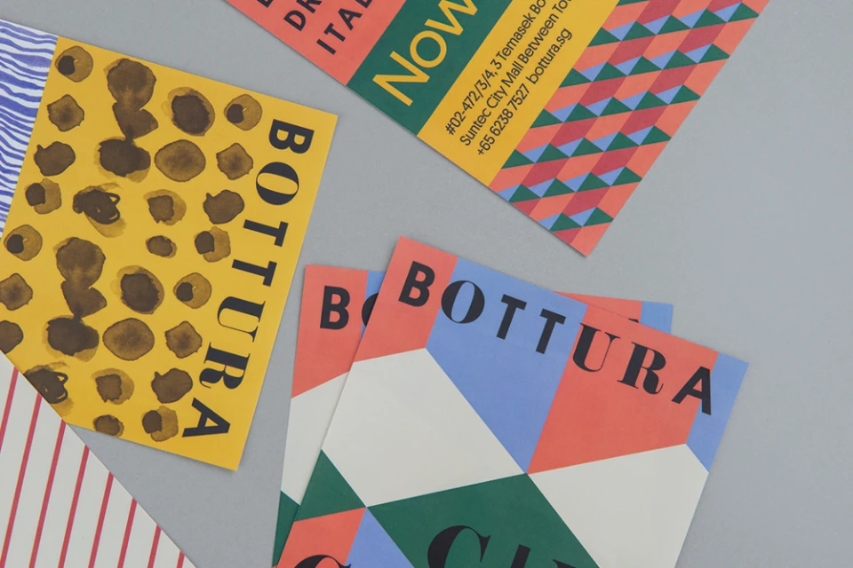
The brand identity for Bottura serves as a masterclass in modern, artisanal Italian dining aesthetics, successfully balancing the warmth of traditional hospitality with a vibrant, contemporary graphic language. Developed by the design team at Foreign Policy, the project establishes a cohesive visual ecosystem that spans across diverse collateral, from intricate menu booklets and takeaway packaging to sophisticated stationery. The design leans into a bold, high-contrast palette of coral, forest green, yellow, and red, which, when paired with a clean black serif typeface, evokes a sense of both heritage and playfulness. Each element is brought to life through a blend of editorial-style ink illustrations and punchy geometric patterns, creating a tactile experience for the customer that feels both elevated and accessible. Utilizing studio strobe lighting to emphasize the textures of kraft paper and matte cardstock, the photography captures the collection with clinical precision, yet the overall mood remains inviting. By integrating UI illustration elements with classic typographic layouts, the brand identity effectively communicates the restaurant's core values, summarized in the punchy, recurring slogan Eat Drink Italiano. This project demonstrates how a meticulously curated brand system can elevate the perceived quality of a dining experience, turning everyday consumer items like pizza boxes and business cards into essential touchpoints of a unified, professional narrative that is unmistakably rooted in modern, high-end food and beverage design.
Horizontal, Commercial, Clean, Minimalist
Typography
Advertising Campaign
