
BrandRoger&Sons
ProjectBrand Identity
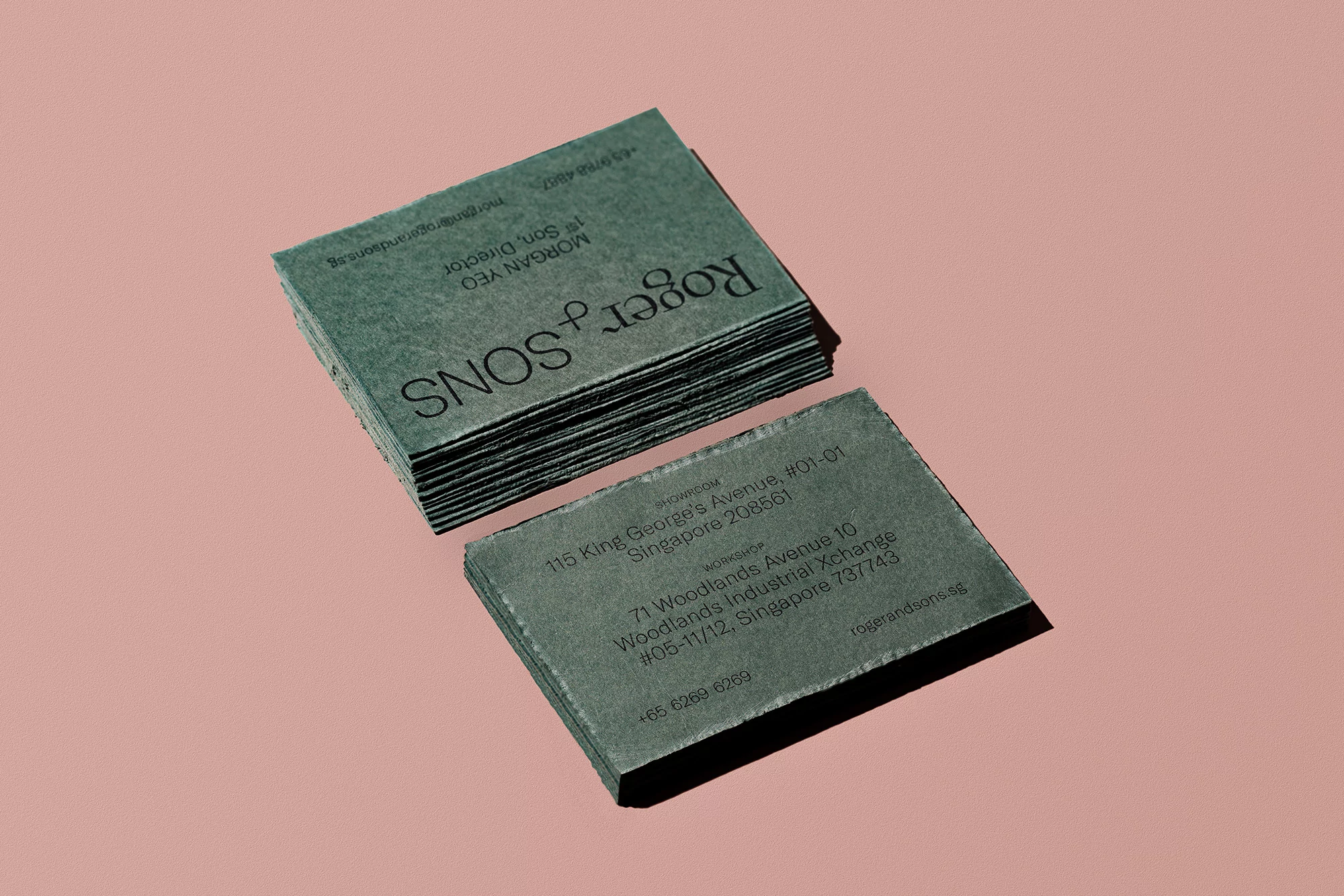
Roger&Sons Brand Identity 2020
Associated creatives


Tags
Description
This brand identity project for Roger and Sons showcases stacked textured green business cards featuring clean black typography. One stack lies neatly while a single card is displayed flat alongside it, highlighting the tactile quality of the paper stock. The cards are arranged on a minimalist solid pink surface, creating a subtle contrast of muted tones. Soft directional lighting casts gentle shadows beneath the objects, emphasizing their depth and physical texture.
Style
Vertical, Commercial, Earthy, Polished
Techniques
Typography, Emboss & Deboss
Color
Forest Green (60%)
Terracotta (40%)
Background
Solid Colour
Context
Advertising Campaign, E-commerce / Product