
Brand
ProjectBrand Identity
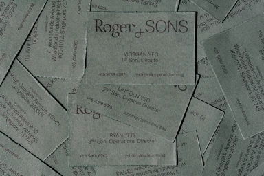
Roger&Sons Brand Identity 2020
Associated creatives


Tags
Description
This brand identity project for Roger and Sons showcases a collection of business cards arranged in a flat lay composition. Crafted from textured grey paper stock, each card displays dark printed typography featuring company names, individual titles such as Director and Creative Director, and corresponding contact details. The composition highlights the tactile quality of the paper and the minimalist graphic design approach.