
The Mozart: Brand Identity






May 2020
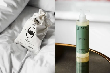
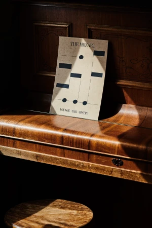
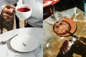
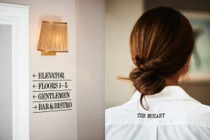
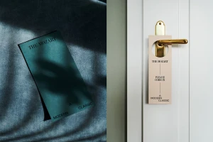
In the competitive landscape of modern hospitality, the brand identity for The Mozart emerges as a masterclass in cohesive, tactile storytelling. Orchestrated by the creative minds at Studio Bruch, the project transcends simple corporate signage to establish a sophisticated visual language that feels both timeless and distinctly contemporary. Captured with clinical precision and evocative depth by photographer Pia Clodi, the campaign leans into editorial minimalism, utilizing natural light to accentuate the rich intersection of materials—from brushed-gold fixtures and polished marble to high-quality paper stocks provided by partners like Fedrigoni and Sirio Color. The work functions as a complete design ecosystem, where every touchpoint, whether it is a screen-printed stationery booklet, a sleek wayfinding element, or a subtly embossed leather coaster, reinforces the hotel’s commitment to an elevated guest experience. By integrating typography that bridges classical serif elegance with bold, modern geometry, the identity feels deeply rooted in a musical, rhythmic structure that honors its namesake. This cinematic approach to commercial photography highlights the interplay of shadow and texture, elevating mundane hotel assets into objects of desire. It is a striking example of how deliberate art direction and material selection can transform hospitality branding into a cohesive, sensory-led journey that defines a space long before the guest even arrives.
Horizontal, Clean, Editorial, Warm
Natural light
Advertising Campaign


