
Primo
Brand Identity

Feb 2017
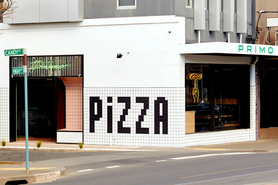
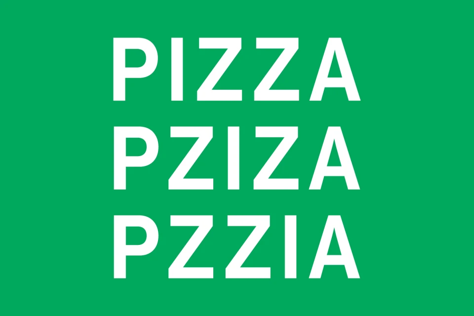
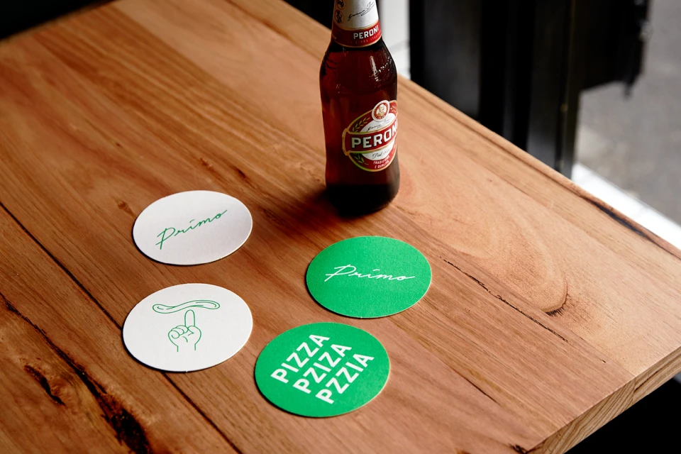
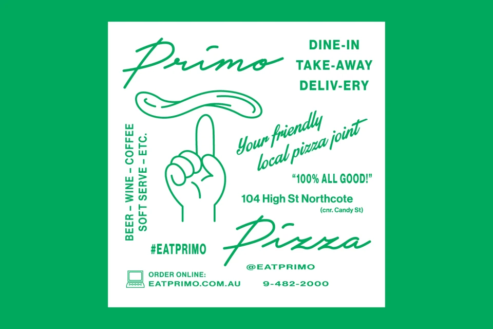
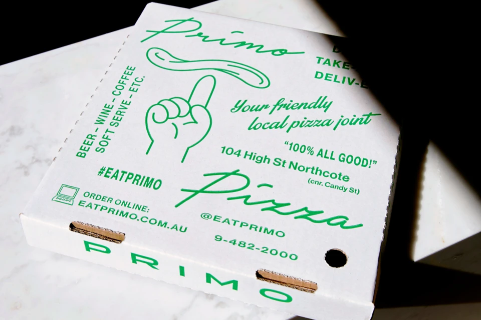
For the launch of Primo, the design studio Never Now has crafted a comprehensive brand identity that masterfully bridges the gap between traditional food culture and modern, minimalist aesthetics. The project centers on a bold, high-contrast visual system that leans into a vibrant green and white color palette to establish immediate shelf and street presence. By utilizing typography as the primary narrative device, the identity system alternates between elegant, flowing cursive scripts and stark, sans-serif letterforms to balance approachability with professional precision. The design execution is anchored by clean, vector-based graphic assets and clever, rhythmic patterns that play with the geometry of the brand name itself. From the architectural integration of pixelated tile work on the restaurant facade to the tactile application on corrugated pizza boxes and circular coasters, the work demonstrates a refined understanding of environmental branding. Through the strategic use of natural light and studio strobe photography, the identity feels both grounded in a physical space and sharp enough for digital interaction. The inclusion of playful, continuous-line illustrations—depicting a hand spinning dough—adds a layer of human-centric charm to the otherwise crisp corporate identity. Ultimately, this cohesive visual language succeeds by maintaining strict minimalist discipline while allowing the brand's personality to shine through clever, recurring motifs and consistent typographic hierarchy.
Horizontal, Commercial, Clean
Typography
Advertising Campaign
