
Potluck: Brand Identity

Jun 2024
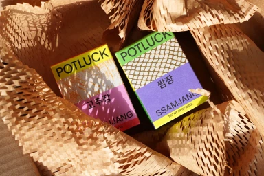
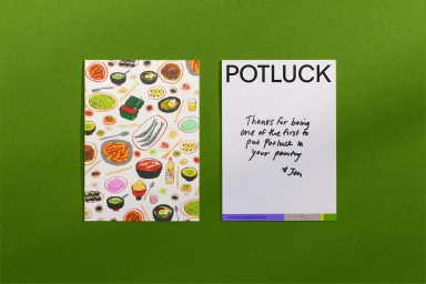
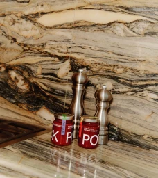
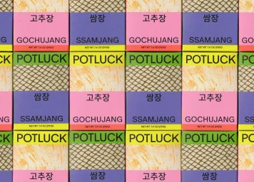
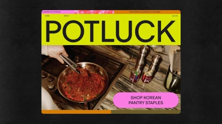
Potluck establishes a vivid brand identity within the CPG and food & beverage space, defined by a bold aesthetic that balances traditional culinary elements with modern graphic design. The project integrates high-contrast typography and expressive illustration to represent a range of Korean pantry staples, moving away from conventional packaging tropes in favor of a dynamic, layered visual language. Execution relies on a blend of commercial photography and motion graphics, utilizing natural light and clean, textural backgrounds to ground the vibrant packaging. The creative process involved graphic design by Regrets Only, with photography by Tony Luong and illustrations from Maggie Cowles and Naomi Otsu. Web development was handled by Camp Quiet, while Madison Trapkin provided photo styling for the product assets.
Horizontal, Commercial


