
RSPCA: Brand Identity

Sep 2024
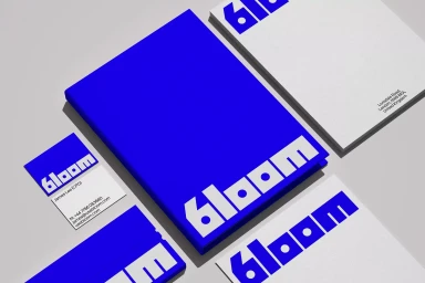
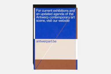
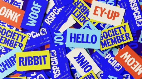
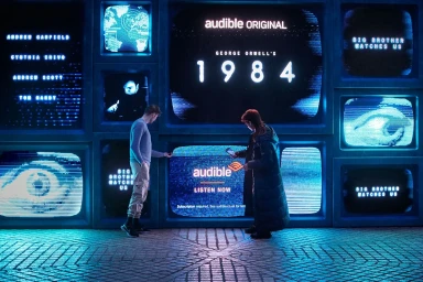
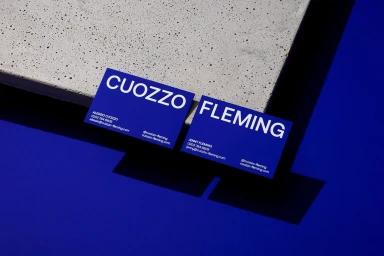
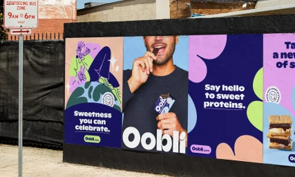
This brand identity project for the RSPCA establishes a visual system defined by bold, high-contrast typography and a signature cobalt blue palette. The work spans various platforms, incorporating motion graphics and static collateral, all while maintaining a consistent graphic execution. The project features clean, minimalist layouts that utilise modern sans-serif typefaces and structured color blocking. By integrating saturated blue textures with 3D render and CGI techniques, the identity achieves a dynamic, institutional look suitable for both digital and print applications. Developed by Visie Admin, the identity incorporates contributions from Studio DRAMA, PARSONS, POST, Studio Freight, Alphabetical, Warriors Studio, Zeus Jones, Vrints-Kolsteren, Caramba Agency, and Regrets Only.
Horizontal, Commercial, Clean
Brand Film / Corporate Video


