Logo
  • Home
  • ·Media
  • ·Potluck brand identity website design
Website interface for Potluck showing cooking noodles in a pan on a marble countertop with bold typography

Potluck Brand Identity 2024

About

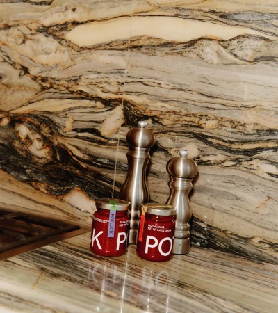
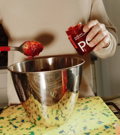
This brand identity showcase presents a digital interface design for Potluck, created under the Brand Identity project. The layout features striking, high-contrast typography with a bold yellow header and black lettering. Below the header, a photograph displays a person using tongs to stir dark red noodles in a stainless steel pan set on a gas stovetop next to marble countertops, salt and pepper shakers, and glass jars. A vibrant pink rounded rectangle contains text prompting users to shop Korean pantry staples. The design incorporates distinct graphic elements, web navigation links, and textured surfaces.

Brand

Project

Keywords

Credits

Styles

Industries

Context

Website / Web
Similar media
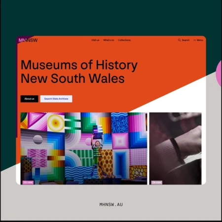
UX design layout for Museums of History New South Wales website featuring bold orange header and colourful geometric imagery.
A completely black image frame with no visible subjects, objects, or details.
Solid black frame with no visible content or detail
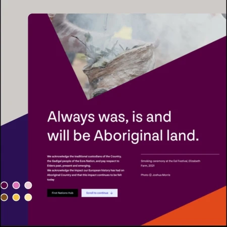
UX design interface featuring bold purple background typography stating Always was, is and will be Aboriginal land.
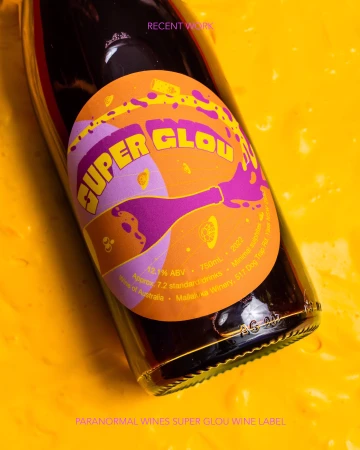
Close-up of a wine bottle featuring a vibrant orange and purple label resting against a textured yellow background.
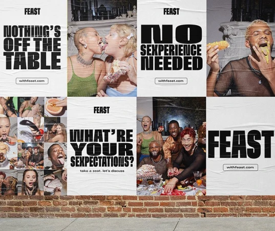
Wheatpaste poster campaign collage featuring diverse people eating and bold typography on a brick wall.
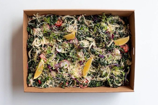
Catering box filled with fresh kale salad, grated cheese, radish slices, and lemon wedges on a white background
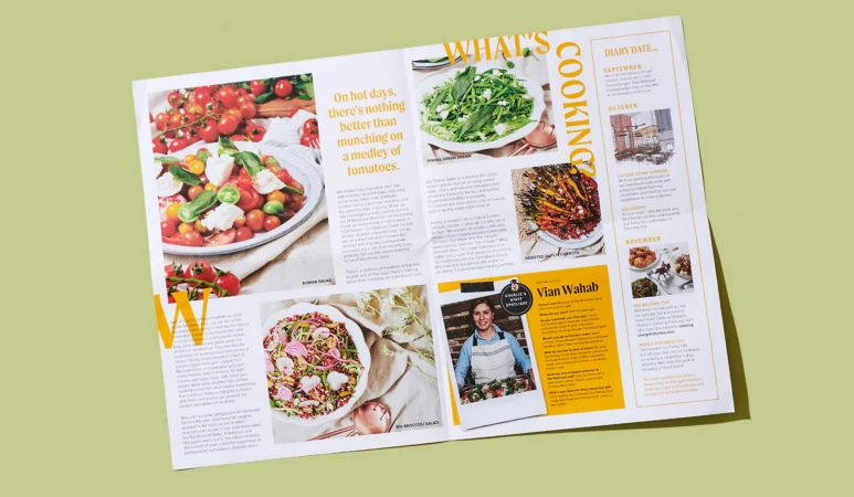
Spreading pages of a food magazine featuring tomato salad recipes, a staff spotlight, and diary dates by JSG Agency in Sydney.