
Nike: Brand Identity


Jul 2019
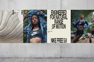
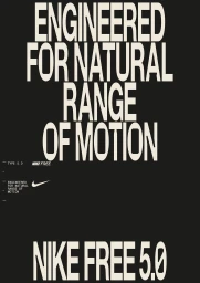
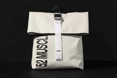
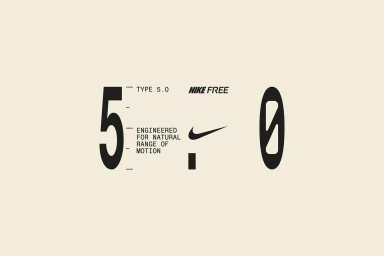
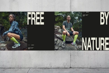
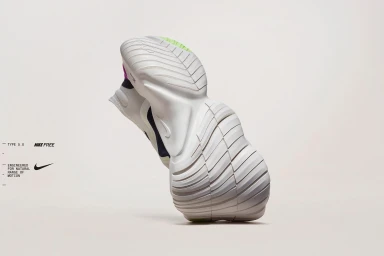
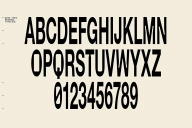
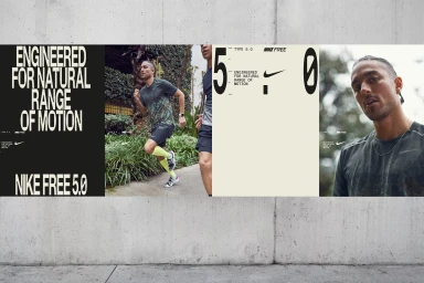
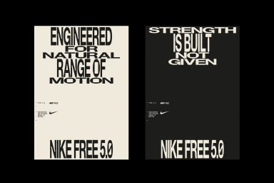
Nike has long mastered the balance between high-performance engineering and iconic aesthetic, and this comprehensive brand identity project for the Nike Free 5.0 series serves as a masterclass in minimalist visual communication. By blending technical prowess with a sophisticated graphic language, the project leans into a stark, utilitarian sensibility that positions the product as both a performance tool and a design object. Under the sharp creative guidance of M35, the identity utilizes a deliberate high-contrast palette of black, off-white, and cream to anchor a series of layouts that feel both modular and editorial. The typography acts as a central protagonist, with bold, sans-serif letterforms meticulously paired with the iconic Swoosh to reinforce the core promise of natural range of motion. Through the application of typography-heavy graphic design and the inclusion of cinematic live-action technique, the work transcends traditional sportswear imagery. From the specimen-like precision of the Bespoke typeface to the lush, atmospheric context of outdoor photography, every asset is unified by a commitment to functional, clean structure. Whether through low-key chiaroscuro product shots that highlight material texture or expansive, nature-focused lifestyle compositions, the identity creates a cohesive, high-end narrative. This work proves that when athletic technology is stripped back to its purest form, the resulting visual identity is as rhythmic and fluid as the movement it intends to celebrate.
Horizontal, Commercial, Clean, Minimalist
Typography
Advertising Campaign
