
Lil' Sweet Chick: Brand Identity





Brand
Date
Oct 2020
Description
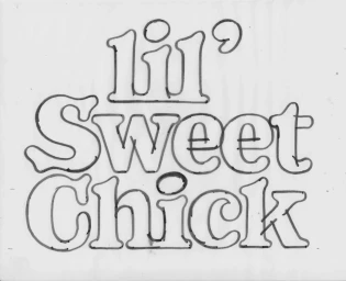
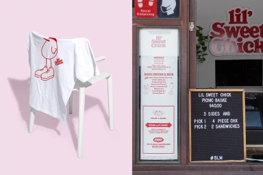
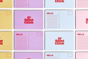
Saint-Urbain developed the brand identity for Lil' Sweet Chick, building a cohesive visual system across custom packaging, signage, and merchandise. The design project leans into bold typography and playful character illustration, establishing a distinct presence for the fast-food brand. The identity relies on a vibrant red and pastel color palette, applied to elements ranging from branded coffee cups and chicken sandwich wrappers to apparel. Clean graphic execution and minimalist layouts ensure visual consistency across both physical storefront assets and digital collateral.
Style
Horizontal, Commercial, Clean
Techniques
Typography
Color
Crimson
Pure White
Context
Advertising Campaign
Associated creatives

5000+ creatives to discover
Sign up to gain access to the entire directory. It’s free.
Visie is a curated library of creative professionals.