
Kurz: Brand Identity
Sep 2020
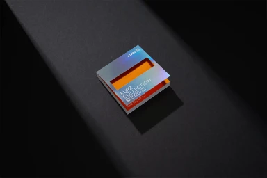
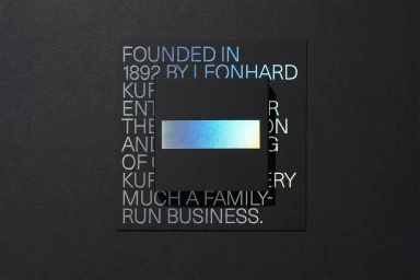
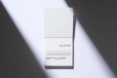
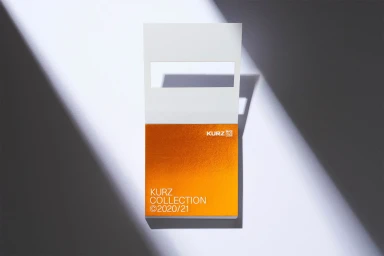
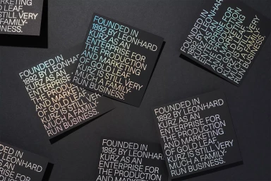
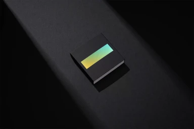
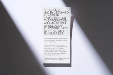
Kurz redefines the landscape of industrial luxury through its latest brand identity, a masterclass in material-focused design that elevates the corporate aesthetic into the realm of fine art. By leaning into the company's rich heritage dating back to 1892, the project seamlessly bridges its legacy as a pioneer in gold leaf production with a decidedly modern, minimalist sensibility. The visual language centers on high-contrast compositions and structural precision, where the interplay of light and shadow becomes as critical as the typography itself. Featuring the sophisticated Neue Haas Unica typeface by Toshi Omagari, the branding relies on a meticulous selection of substrates, including Sirio Color and Fedrigoni papers, to provide a tactile foundation for the bold graphic elements. The execution highlights the brilliance of foil stamping, employing iridescent gradients and vibrant metallic finishes to create depth against matte, neutral-toned surfaces. Techniques such as emboss and deboss are utilized with surgical accuracy, transforming simple promotional cards and packaging into architectural objects. This commercial and corporate identity project demonstrates how deliberate negative space and sharp, directional lighting can transform functional design into an evocative narrative. Every element, from the iridescent holographic gradients to the crisp sans-serif typography, speaks to the precision of a family-run business that has mastered the balance between industrial tradition and contemporary creative innovation.
Commercial, Clean, Minimalist
Emboss & Deboss
Advertising Campaign


