
Narcissus Arts
Brand Identity
Nov 2017
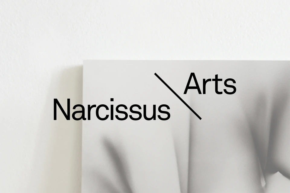
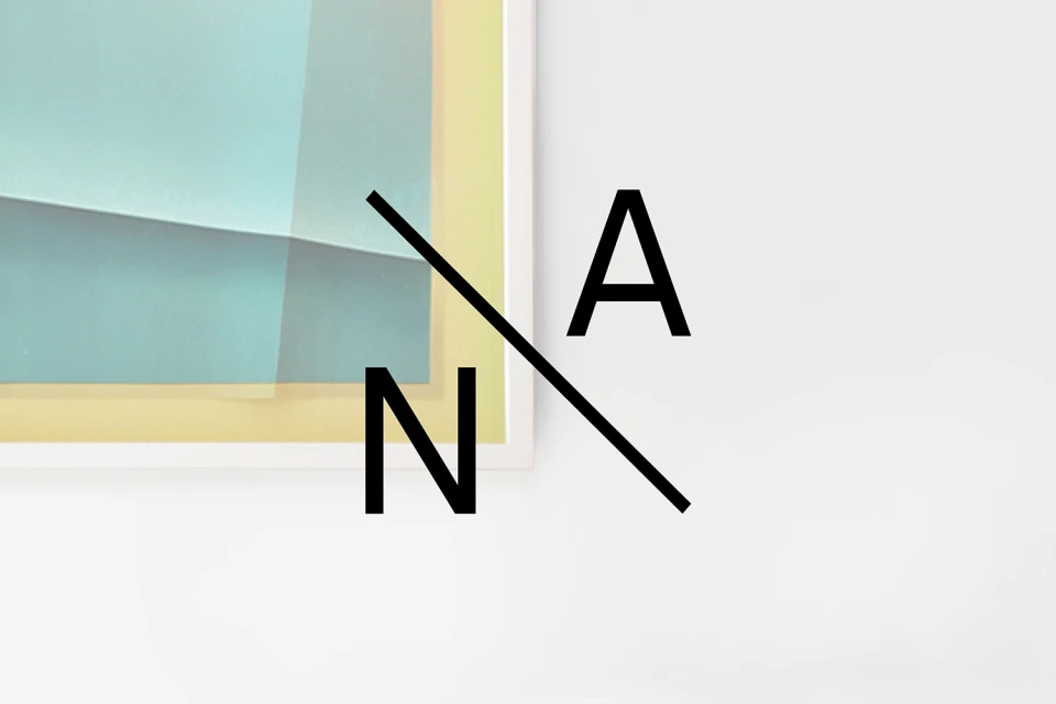
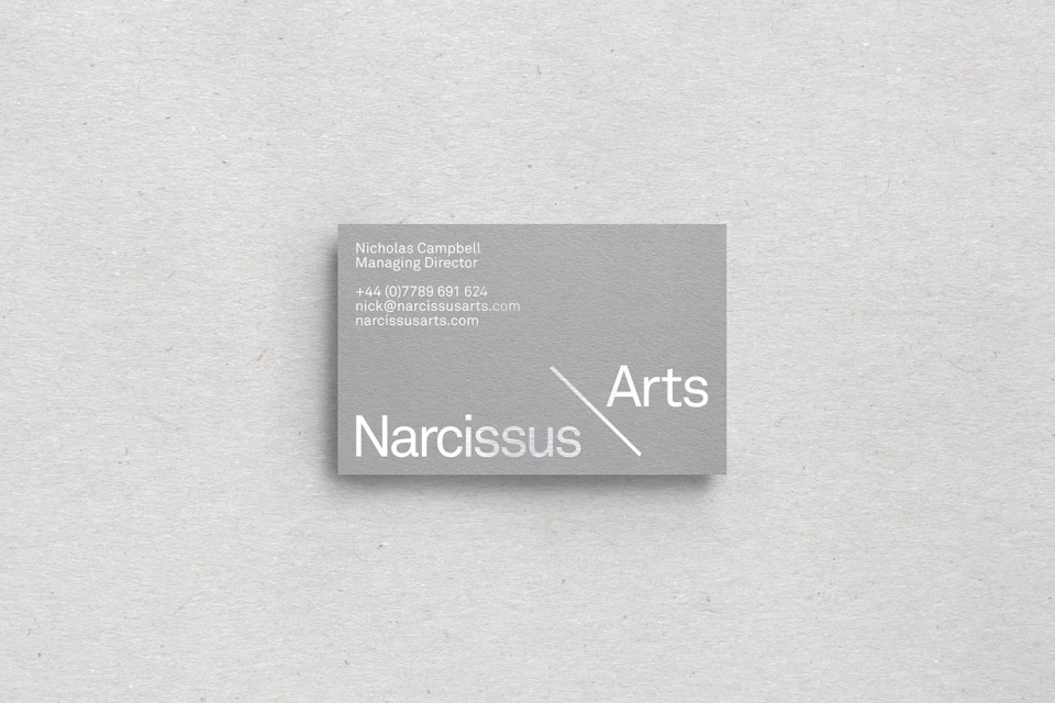
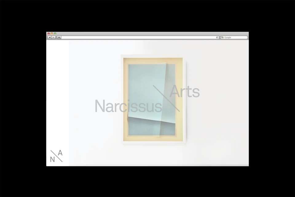
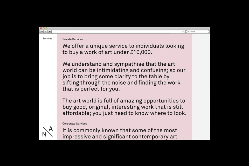
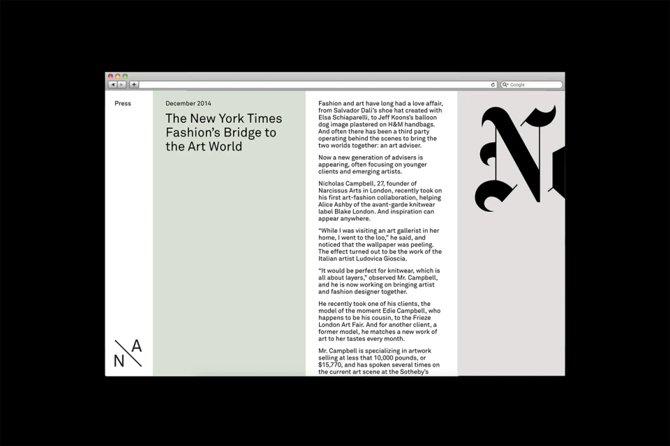
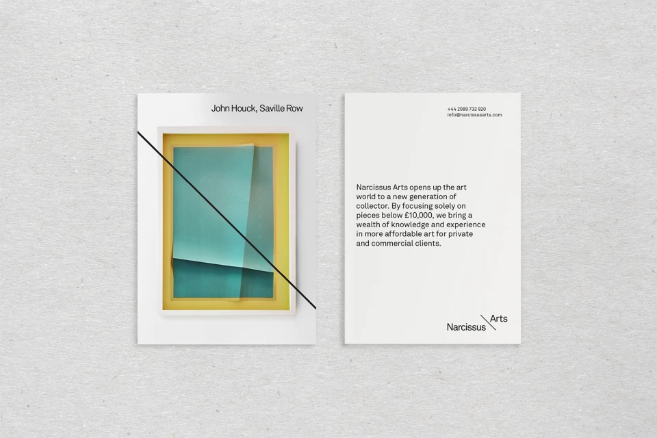
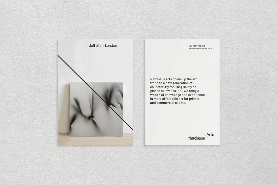
The brand identity for Narcissus Arts, meticulously crafted by graphic designer TM, serves as a masterclass in editorial minimalism and professional corporate branding. Operating at the intersection of Digital Media and Entertainment, the project establishes a sophisticated visual language that prioritizes negative space and sharp graphic legibility. The identity leans into a monochromatic palette, punctuated by deliberate geometric interventions such as a signature diagonal line that divides the brand name, grounding the aesthetic in a modern, structured frame. Across various collateral, from high-quality business cards featuring tactile, textured paper stocks to a clean, UI-focused browser interface, the design maintains a consistent, high-key lighting approach that enhances its professional appeal. The use of bold, sans-serif typography paired with soft, abstract paper layers creates a sense of depth and nuance that feels both contemporary and timeless. By integrating these visual assets into an editorial framework, the project successfully bridges the gap between commercial service and artistic consultancy. The result is a polished, highly functional system that translates seamlessly from print to digital, utilizing a refined use of vector elements and balanced, uncluttered layouts to command attention while remaining understated. This cohesive strategy reflects a deep understanding of corporate identity, ensuring that every touchpoint reinforces the authority and clarity of Narcissus Arts within the competitive landscape of art acquisition and media consulting.
Horizontal, Clean, Minimalist, Commercial
Typography
Website / Web
