
Brand
ProjectBrand Identity
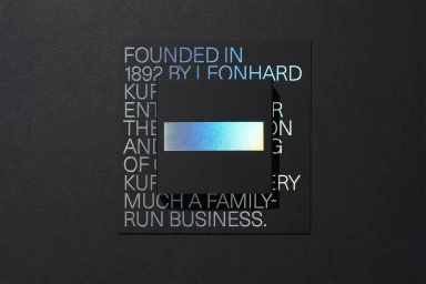
Kurz Brand Identity 2020
Associated creatives


Tags
Description
This piece showcases the brand identity for Kurz, featuring layered dark paper cards arranged in a flat-lay composition against a dark textured background. The central black card displays a horizontal iridescent foil bar reflecting cool blue and golden tones, while the underlying square card reveals embossed typography rendered in a similar metallic foil finish. The typography reads text about the company's founding in 1892. Clean geometric alignment and careful lighting highlight the tactile qualities of the specialty paper and the precision of the foil stamping technique.