
Hill St
Brand Identity





Jul 2018
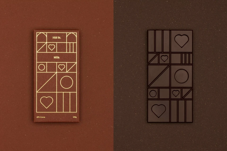
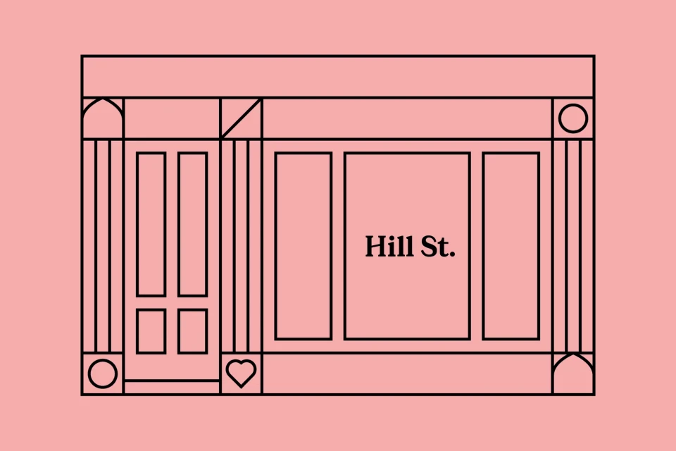
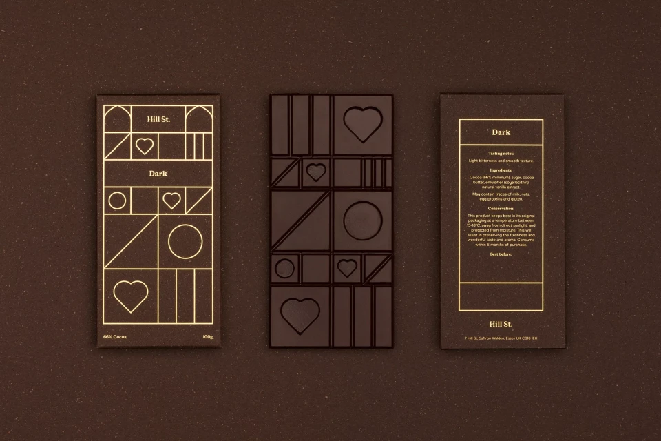
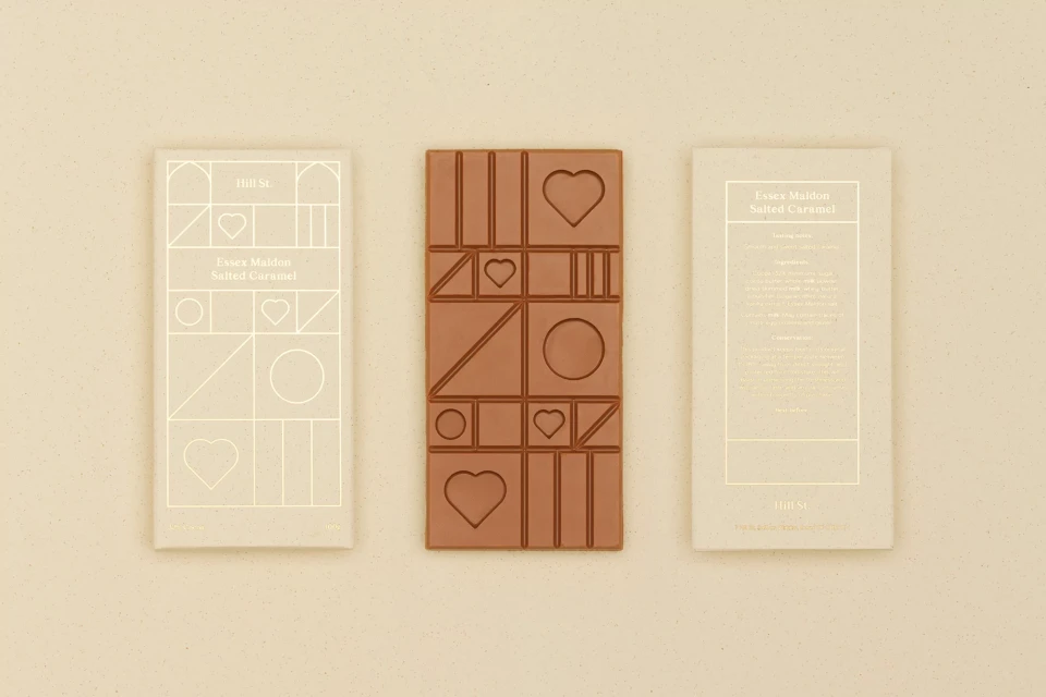
The brand identity for Hill St, executed by the design studio OMSE, masterfully bridges the gap between artisanal food and high-end visual communication. This CPG project centers on a sophisticated design language that leans into editorial minimalism, utilizing a recurring motif of geometric shapes—triangles, circles, and hearts—that appear as gold foil line art on packaging and as precise embossed details directly on the chocolate surface. The visual identity avoids the typical clutter of the food and beverage industry, opting instead for a deliberate, balanced composition that emphasizes texture and hierarchy. By pairing a restrained monochromatic brown palette with vibrant pops of pastel pink and salmon, the work elevates the brand to a premium, lifestyle-focused status. The execution relies heavily on natural light to reveal the subtle interplay between matte paper, reflective gold foil, and molded chocolate. Whether through exterior signage that anchors the brand in a physical space or clean product photography that showcases the attention to typography, the project maintains a consistent, modern aesthetic. Every element, from the minimalist storefront illustrations to the structured flat lay compositions, serves to reinforce a cohesive corporate identity. By prioritizing symmetry and a clean grid-based approach, OMSE has created a distinct, memorable visual system that feels both tactile and thoughtfully composed for the modern consumer.
Commercial, Clean, Horizontal, Minimalist
Typography
CPG / Packaged Food
Advertising Campaign
