
Hackney Church: Brand Identity







Oct 2020
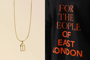
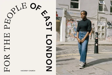
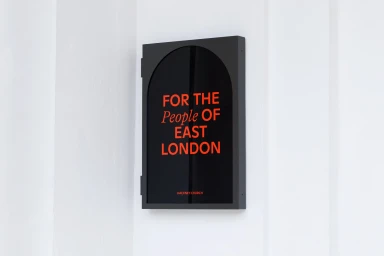
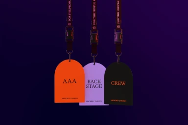
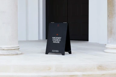
The brand identity for Hackney Church is a comprehensive visual system centered on a recurring arched window motif, reflecting the building's architectural heritage. Created by OMSE, the design framework balances a clean, minimalist aesthetic with bold typography and vibrant, narrative-driven illustrations. The identity is applied across an expansive range of touchpoints, including environmental signage, custom apparel, and beverage packaging. Illustrators Jay Cover, Joe Melhuish, and Thomas Hedger contributed character-based artwork that introduces a whimsical, graphic quality to the system. By pairing stark, high-contrast layouts with vector-based icons and naturalistic photography, the project establishes a cohesive presence that transitions between artistic social media content and practical, functional wayfinding.
Commercial, Clean
Advertising Campaign


