
Peddlers Gin Co.: Brand Identity






Dec 2020
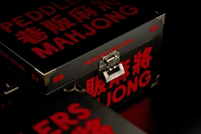
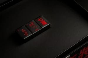
The brand identity for Peddlers Gin Co. centres on a fusion of industrial precision and traditional iconography. The design system explores a moody, high-contrast aesthetic, utilising a palette of deep green and matte black punctuated by vibrant red wax seals and embossed metallic typography. The visual language extends from bottle design to bespoke presentation cases, incorporating botanical illustrations and Mahjong-inspired motifs. Developed as a comprehensive packaging and brand identity project, the work includes technical orthographic projections alongside 3D rendered assets that highlight tactile finishes like debossed labels and intricate metallic hardware. The identity leans into a clean, minimalist approach to convey craftsmanship, utilising both natural light photography and polished 3D CGI to showcase the product's physical details. Key contributors to the project include OMSE for graphic design, Graeme Kennedy for photography, Where Giants Roam for 3D work, and Think Packaging for packaging design.
Horizontal, Commercial, Clean
E-commerce / Product


