
Sproutl: Brand Identity
Mar 2022
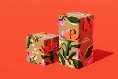
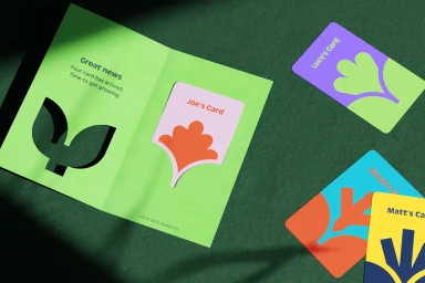
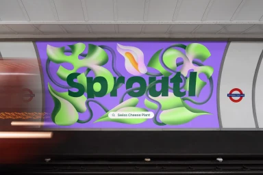
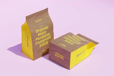
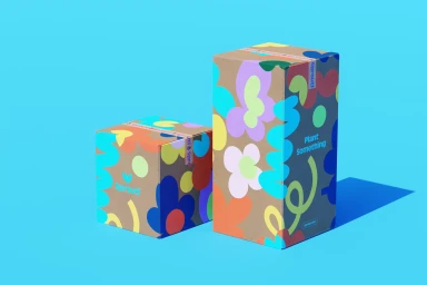
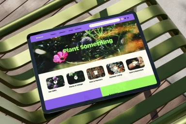
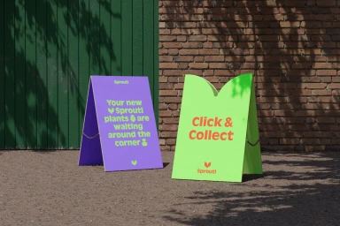
Sproutl’s brand identity centers on a vibrant, botanical-focused visual system designed to elevate the gardening experience. Developed by OMSE, the project synthesizes bold typography with playful organic illustrations, utilizing a high-contrast palette of purple, lime green, and floral accents to establish a distinct market presence. The identity extends across diverse touchpoints, from tactile compost packaging and printed collateral to large-scale out-of-home billboard displays. The execution relies on a minimalist graphic design framework that accommodates both static print applications and dynamic motion graphics. These animations feature fluid 3D renders and playful vector movements that bring the plant platform’s core messaging to life. Illustration contributions from An Chen, Micke Lindebergh, Milena Bucholz, and Thomas Hedger add layers of texture and character to the visual system. By combining clean UI elements with energetic, abstract floral forms, the work maintains a cohesive identity across digital and physical environments.
Horizontal, Commercial, Clean


