
itsu: Brand Identity


Jun 2018
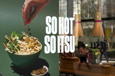
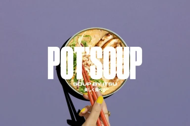
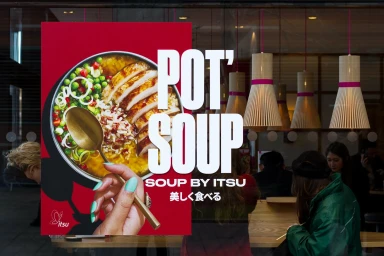
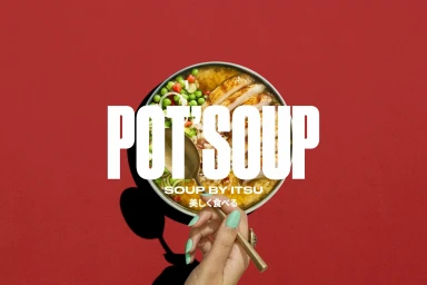
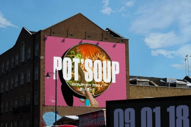
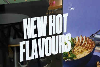
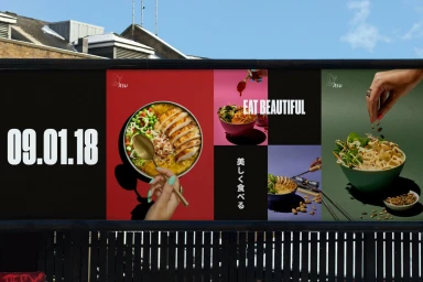
The latest brand identity project for Itsu effectively recalibrates the restaurant chain’s presence within the competitive food and beverage landscape through a masterclass in commercial graphic design. Developed with meticulous graphic design input from OMSE, the project leans into a minimalist aesthetic characterized by bold colour blocking and striking typography. By utilizing vibrant, solid-toned backgrounds in magenta, purple, and green, the visual campaign creates a sharp, graphic quality that feels both contemporary and high-energy. The photography captures the essence of the brand through a cinematic, live-action technique, frequently employing top-down perspectives that emphasize the texture of fresh ingredients while maintaining a clean, editorial feel. Central to this visual narrative is the interplay between the human element and the food itself, with manicured hands interacting with bowls of ramen and salads to inject personality into the scenes. The deliberate use of hard, directional lighting alongside soft light configurations creates a dynamic tension, ensuring the food remains the hero of every frame. Whether presented as intimate studio shots or expansive outdoor advertising, the identity remains cohesive. By integrating Japanese script alongside bold, white sans-serif overlays, the brand successfully leans into its culinary roots while modernizing its market position, resulting in a distinct, coherent visual language that feels fresh, accessible, and unmistakably Itsu.
Horizontal, Commercial, Clean, Graphic
Typography
Advertising Campaign
