
Estrid: Brand Identity





Oct 2025
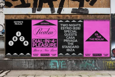
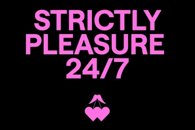
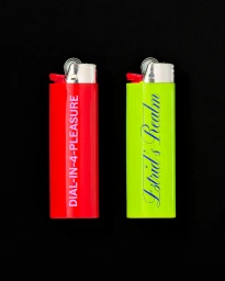
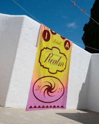
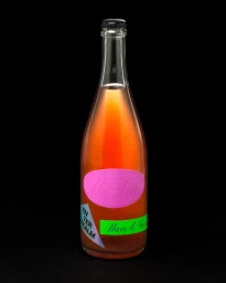
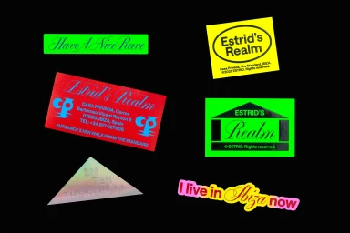
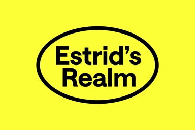
Estrid’s brand identity project, developed by design studio OMSE, establishes a vivid and expansive visual language that spans print, packaging, and merchandise. The system leans into bold colour blocking and high-contrast typography to create a sense of playful, contemporary energy. The identity features recurring motifs of bright pink, neon green, and saturated yellow, applied across a wide range of collateral including graphic posters, custom lighters, apparel, and vinyl record sleeves. Clean, modern sans-serif and italicised serif typefaces serve as the anchor for the brand’s messaging, consistently paired with graphic elements like dual hearts and geometric house icons. Execution focuses on a diverse range of surfaces, from urban concrete walls and outdoor masonry to reflective metal and textured textiles. By utilizing natural light and high-contrast graphic treatments, the project maintains a consistent aesthetic across varied formats, bridging the gap between editorial imagery and commercial product design.
Commercial, Clean, Vertical
Advertising Campaign
