
Gruff: Brand Identity
Jul 2019
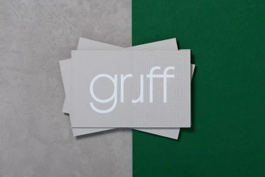
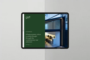
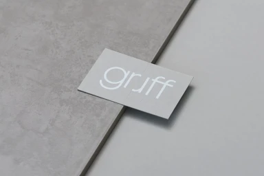
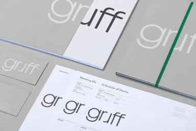
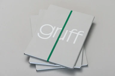
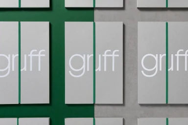
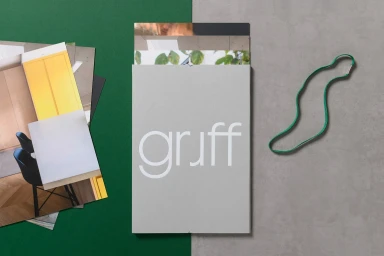
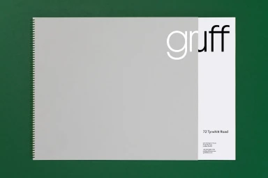
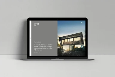
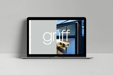
The brand identity for Gruff is a masterclass in restrained, architectural precision, successfully positioning the firm as a contemporary leader in the design and construction space. Orchestrated by TM, the graphic design identity leans into a sophisticated, monochromatic palette of light grey and forest green, punctuated by utilitarian pops of vibrant color via elastic bands and precise paper applications. Across the comprehensive suite of collateral, the project captures an ethos of structural minimalism, blending high-end stationery with seamless corporate digital touchpoints. By employing clean, sans-serif typography, the design creates a cohesive visual language that feels both functional and intentionally curated. The imagery utilizes soft light and natural light to emphasize the tactile quality of the materials, while the UI illustration components demonstrate a seamless transition from physical brand assets to a digital landscape. Through consistent application of geometric, square, and grid-based layouts, the work effectively mirrors the clean lines of the residential architecture it represents. Whether showcased through professional flat-lay stationery photography or sleek web interface renderings, the identity maintains a distinct sense of clarity. By prioritizing a reductive, high-end design language, the branding establishes Gruff as a firm that values clarity, modern structure, and a highly disciplined approach to professional identity, ensuring a lasting, refined impression within the competitive architecture and commercial design industry.
Horizontal, Commercial, Clean, Minimalist
Typography
