
DKNY
Brand Identity


Feb 2016
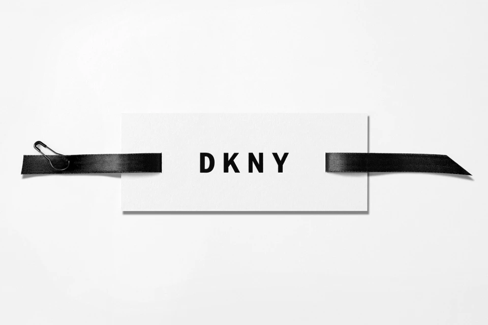
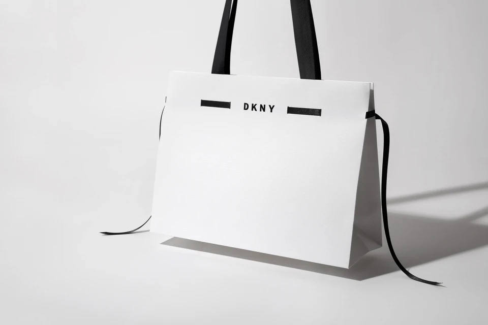
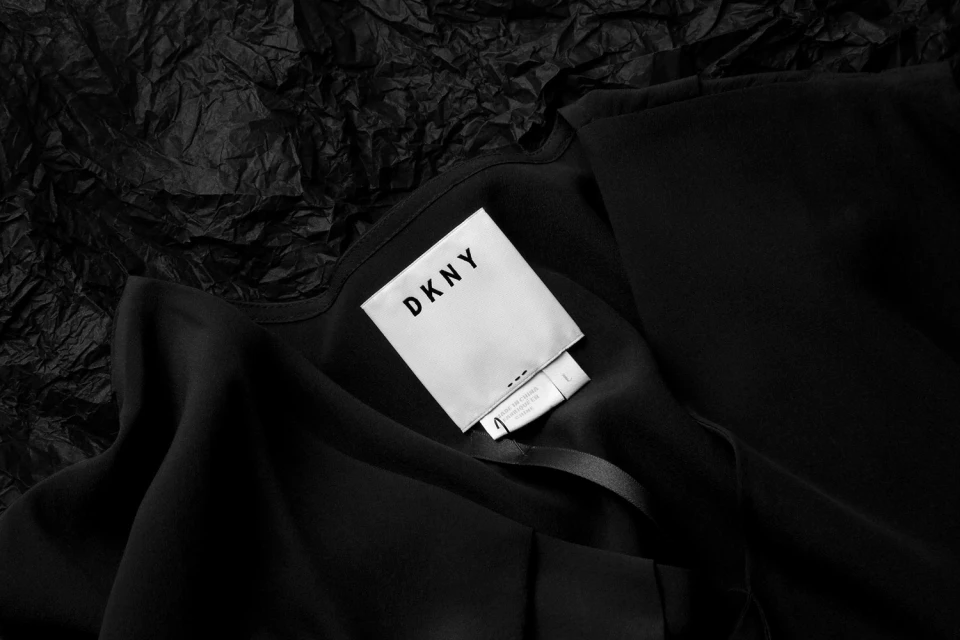
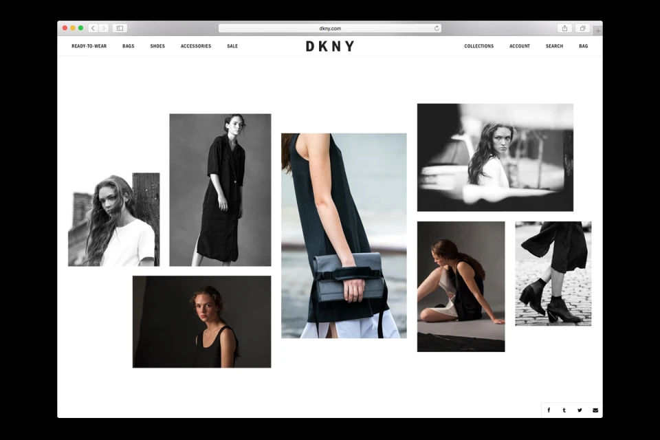
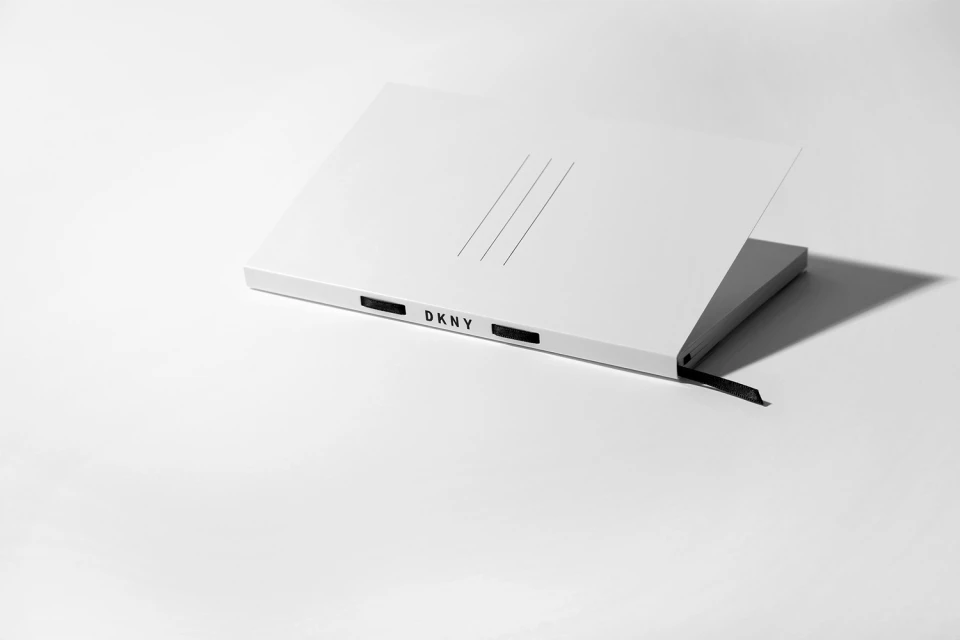
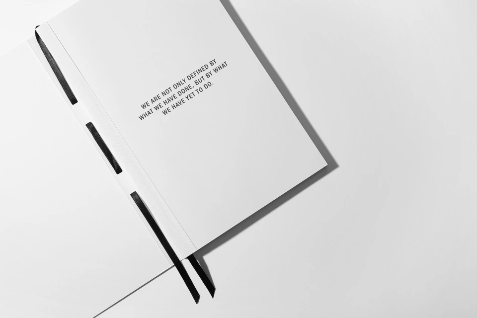
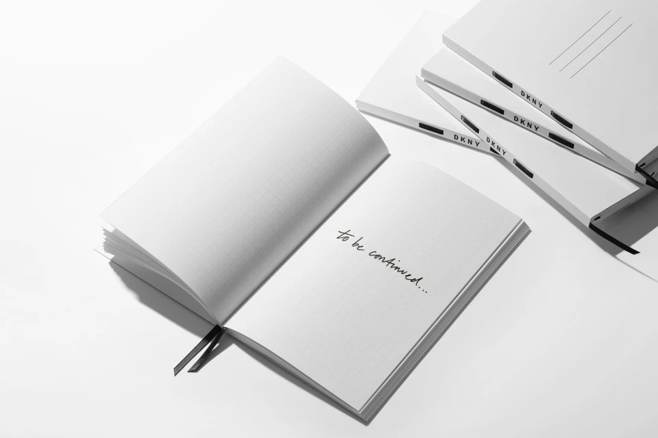
The latest brand identity project for DKNY serves as a masterclass in editorial minimalism, stripping back the noise to prioritize a sharp, monochromatic visual language. By grounding the brand in a high-contrast palette of crisp white and matte black, the identity work creates a cohesive narrative that spans across diverse collateral, from physical retail packaging to the digital interface. The project utilizes a sophisticated blend of studio strobe photography and macro techniques to elevate everyday items, such as shopping bags and stationery, into tactile symbols of modern style. Each piece of the identity, whether it is a high-key notebook composition or a detailed garment tag, emphasizes clean lines and geometric clarity. Beyond the product photography, the work extends into a broader editorial lifestyle scope, where digital collages and UI illustrations piece together a portrait of the brand as both accessible and aspirational. Under the meticulous graphic design of the team at COMMISSION, the DKNY identity channels a sense of intentionality, where every element—from the sans-serif typography to the deliberate use of ribbon detailing—feels curated and precise. This project successfully reinterprets the house codes for a contemporary audience, proving that when handled with a focused, minimalist eye, a consistent graphic identity can transform the simplest brand assets into a powerful and recognizable story of refined, high-end fashion e-commerce.
Horizontal, Commercial, Clean, Minimalist
Typography
Luxury Fashion Houses
White Seamless
