
Back Market: Brand Identity


Mar 2020
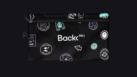
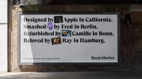
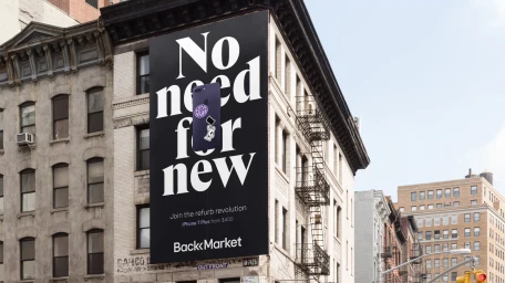
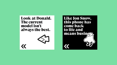
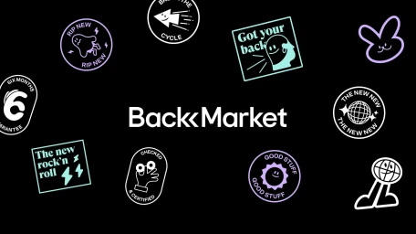
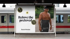
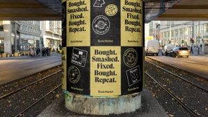
Back Market has redefined the aesthetic language of the circular economy through a bold brand identity that eschews the sterility often associated with refurbished electronics. By leaning into a high-contrast palette of monochromatic black and white accented by playful pastel motifs, the project establishes a visual system that feels both subversive and remarkably approachable. The creative execution, developed with design leadership from Koto, masterfully blends commercial typography with an irreverent, sticker-inspired design vocabulary that channels a counter-cultural spirit. Across a diverse range of touchpoints, the identity maintains a consistent, minimalist rigor that proves sustainable tech doesn't need to sacrifice style for substance. The work successfully navigates the intersection of e-commerce platforms and physical retail, utilizing natural light to ground its outdoor billboard installations within the gritty, textured reality of urban environments. From vertical transit advertisements to intricate UI illustrations for social media, the brand identity remains cohesive, utilizing a clean, vector-based approach that speaks directly to a generation of conscious consumers. The result is a vibrant, unmistakable presence that transforms the narrative of second-hand devices into an essential fashion statement, effectively positioning the brand as a leader in the refurb revolution while maintaining a sharp, irreverent edge in its communication.
Horizontal, Commercial, Clean
