
Away Days Brewing Co: Brand Identity


Mar 2020
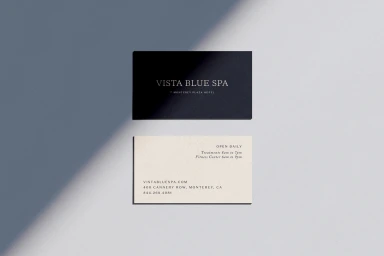
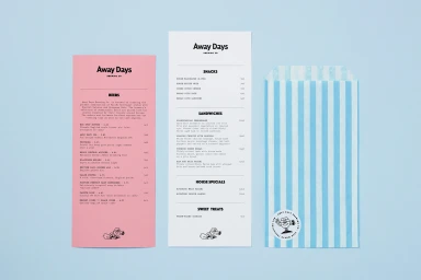
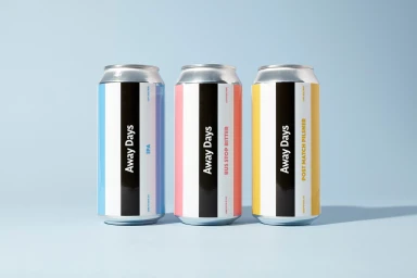
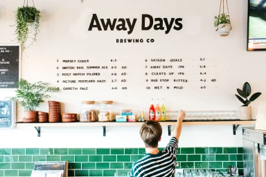
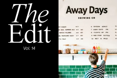
The brand identity for Away Days Brewing Co represents a masterclass in modern hospitality design, blending minimalist precision with a warm, inviting atmosphere. By prioritizing clean lines and a thoughtful color palette of pastel pinks, soft blues, and muted yellows, the project effectively captures the intersection of contemporary craft beverage culture and accessible social spaces. The visual system relies heavily on refined typography to establish hierarchy across diverse touchpoints, from the graphic, stripe-labeled beer cans to the expansive, wall-mounted menu boards that anchor the interior experience. Utilizing commercial photography techniques, the identity leans into a high-end product presentation that feels both curated and organic. Whether through the structured, orderly arrangement of packaging or the soft, natural light captured within the brewery's physical environment, the work emphasizes consistency and professional polish. The inclusion of subtle, graphic mascot iconography provides a playful personality that balances the serious, modernist design approach. Executed with a focus on editorial minimalism and high-contrast visual storytelling, this brand identity functions as a cohesive toolkit, ensuring that every element—from business cards to functional product labels—speaks with the same intentional, graphic voice. This comprehensive branding project, led by the creative teams at Land of Plenty, PARSONS, By Futura, By North, and Rachael Gibilterra, successfully transforms a functional hospitality space into a lifestyle-forward visual experience.
Horizontal, Commercial, Clean


