Good Pair Days: Brand Identity


Dec 2019
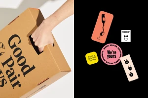
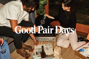
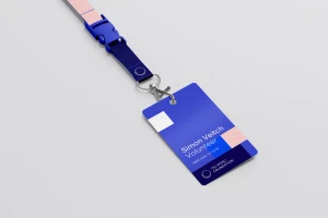
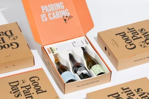
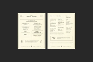
The brand identity overhaul for Good Pair Days establishes a compelling visual narrative that expertly bridges the gap between functional subscription logistics and an elevated, lifestyle-driven experience. Across a diverse range of deliverables, the project leans into a clean, minimalist aesthetic that utilizes bold typography and stark, high-contrast graphic design to anchor the brand's presence. Whether through the recursive, infinite tunnel effect featured in the outdoor digital billboard campaign or the tactile, whimsical elements found in their bespoke packaging design, the work maintains a cohesive, premium feel. The inclusion of candid lifestyle photography, illuminated by soft natural light, further humanizes the wine delivery service, positioning it as an integral companion to shared leisure and sophisticated social consumption. By integrating elements of vector-based illustration and intentional product staging, the branding successfully balances professional clarity with an artistic, editorial sensibility. From the structured, refined layouts of the French Market menu panels to the technical precision of the corporate ID sets created with 3D rendering, the identity is unified by a rigorous commitment to legibility and modern serif-to-sans-serif typographic shifts. This project serves as an masterclass in building brand equity, demonstrating how a modular design system can feel both playful in its manifesto-style messaging and disciplined in its commercial execution, ultimately ensuring that every touchpoint resonates with contemporary, design-conscious consumers.
Clean, Horizontal, Commercial, Minimalist
Advertising Campaign