
Brand
ProjectBrand Identity
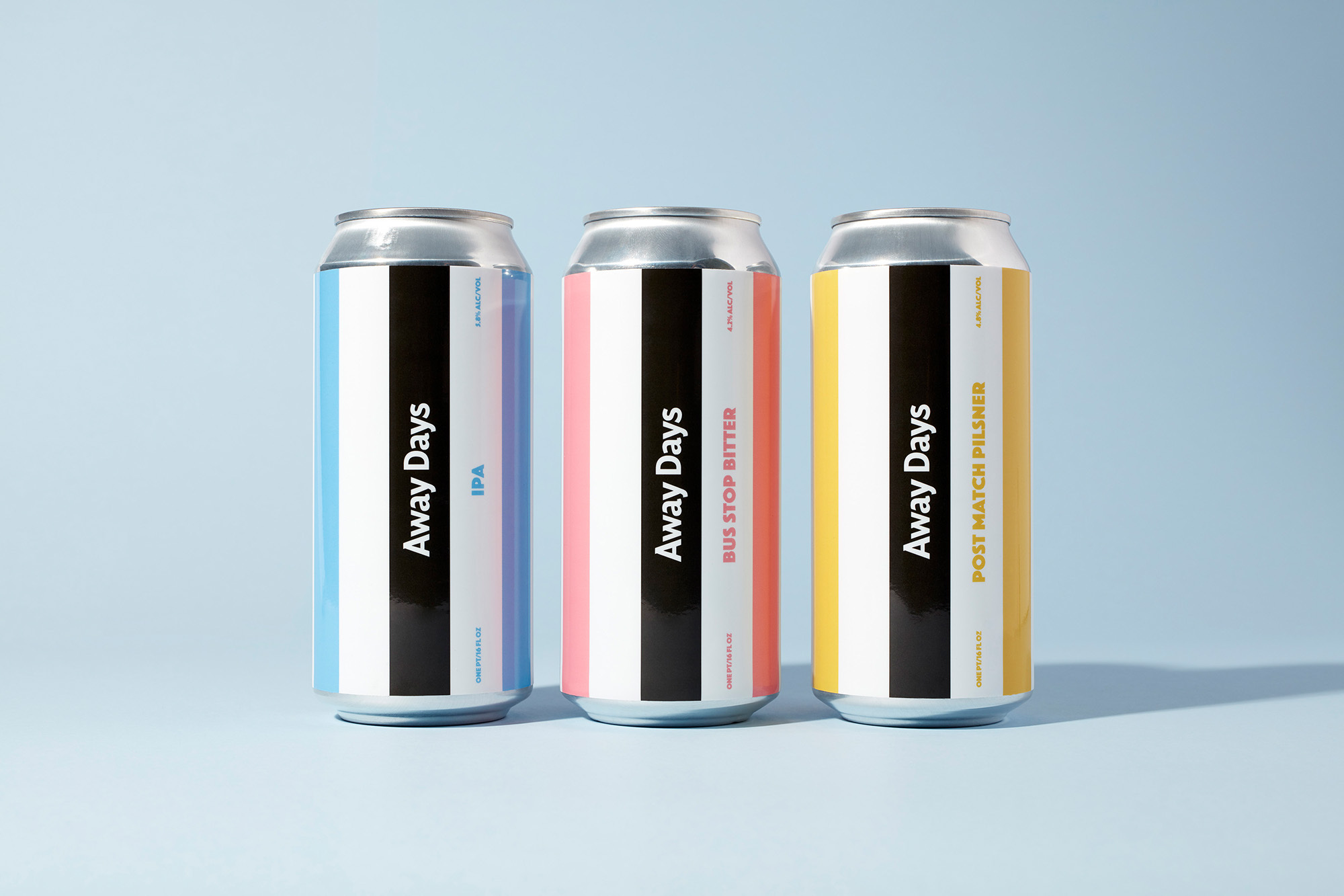
Away Days Brewing Co Brand Identity 2020
Associated creatives


Tags
Description
Three aluminum beer cans from Away Days Brewing Co stand upright in a neat row against a clean, pale blue seamless studio background. Each can features a distinct striped label design with bold vertical bands of colour and prominent black central branding with white typography. Soft directional lighting creates subtle shadows extending to the right of each can on the horizontal surface. The cans represent three different beverage varieties with clean, minimalist graphic styling.