
Brand
ProjectBrand Identity
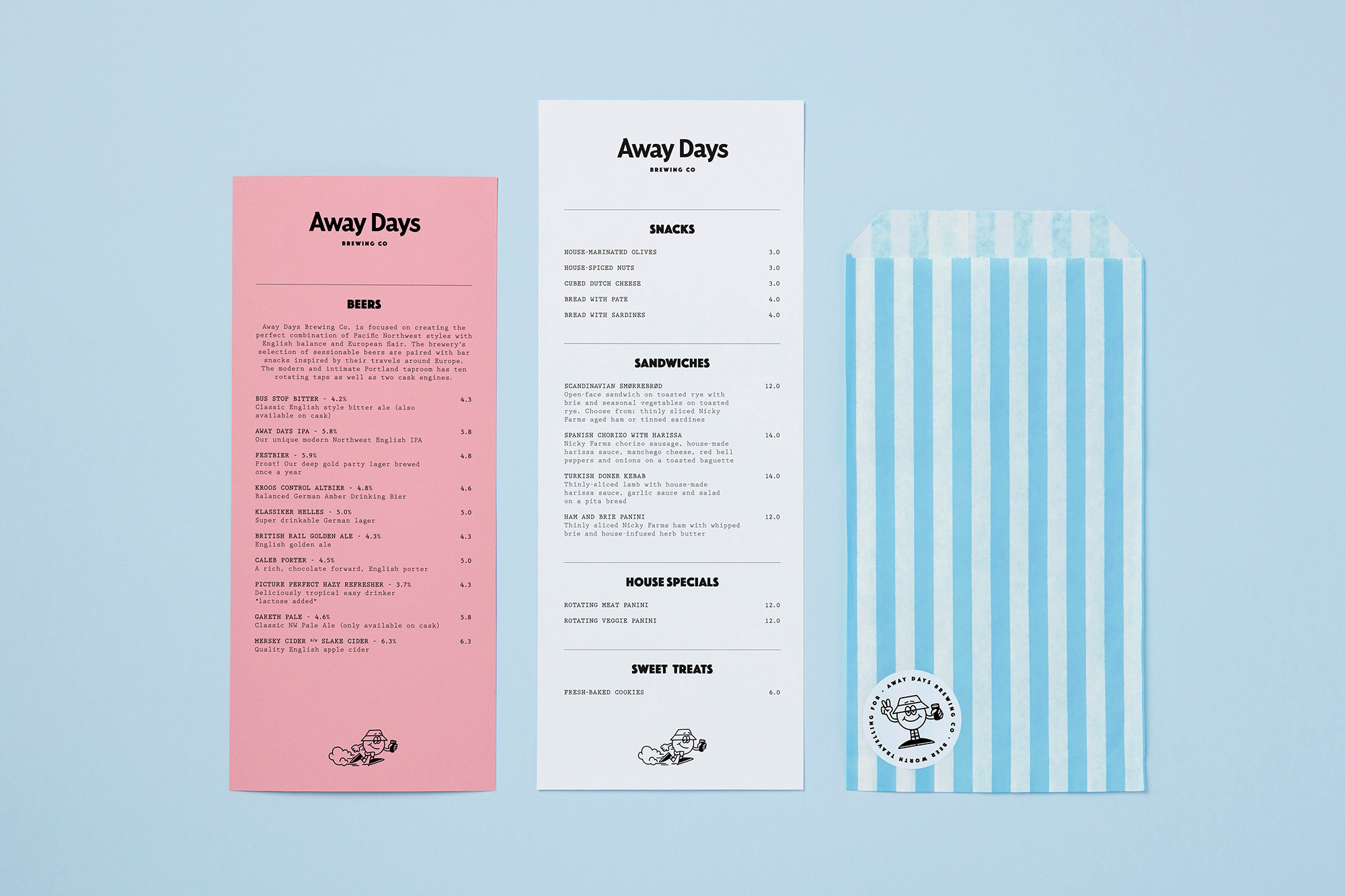
Away Days Brewing Co Brand Identity 2020
Associated creatives


Tags
Description
This flat lay composition showcases brand identity elements for Away Days Brewing Co against a solid light blue background. The arrangement features two tall, narrow printed menus—one on a pink stock and one on white—detailing beer selections, snacks, sandwiches, and house specials with minimalist typography. To the right, a blue and white striped paper bag features a circular branded sticker depicting an illustrated character. The clean, top-down perspective highlights the graphic system, paper textures, and restrained color palette.