
HERO: Brand Identity



Sep 2021
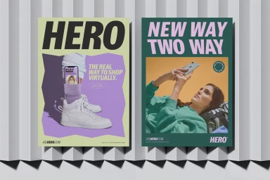
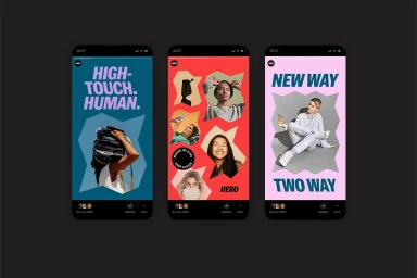
HERO develops its brand identity through a cohesive suite of digital and print assets, positioning the platform at the intersection of ecommerce and human interaction. The visual language utilizes a vibrant, saturated color palette paired with bold, clean typography to convey a modern digital-first aesthetic. Collaborating on the graphic design and motion elements, PARSONS and Studio Gummi have developed an identity that leans into a mix of collage-style cutouts, graphic posters, and motion graphics. The project integrates UI illustration and vector-based typography across mobile app interfaces, environmental print, and branded collateral, maintaining a minimalist studio focus throughout.
Commercial, Clean, Horizontal, Graphic
Solid Colour

