
Brand
ProjectBrand Identity
Away Days Brewing Co Brand Identity 2020
Associated creatives


Tags
Description
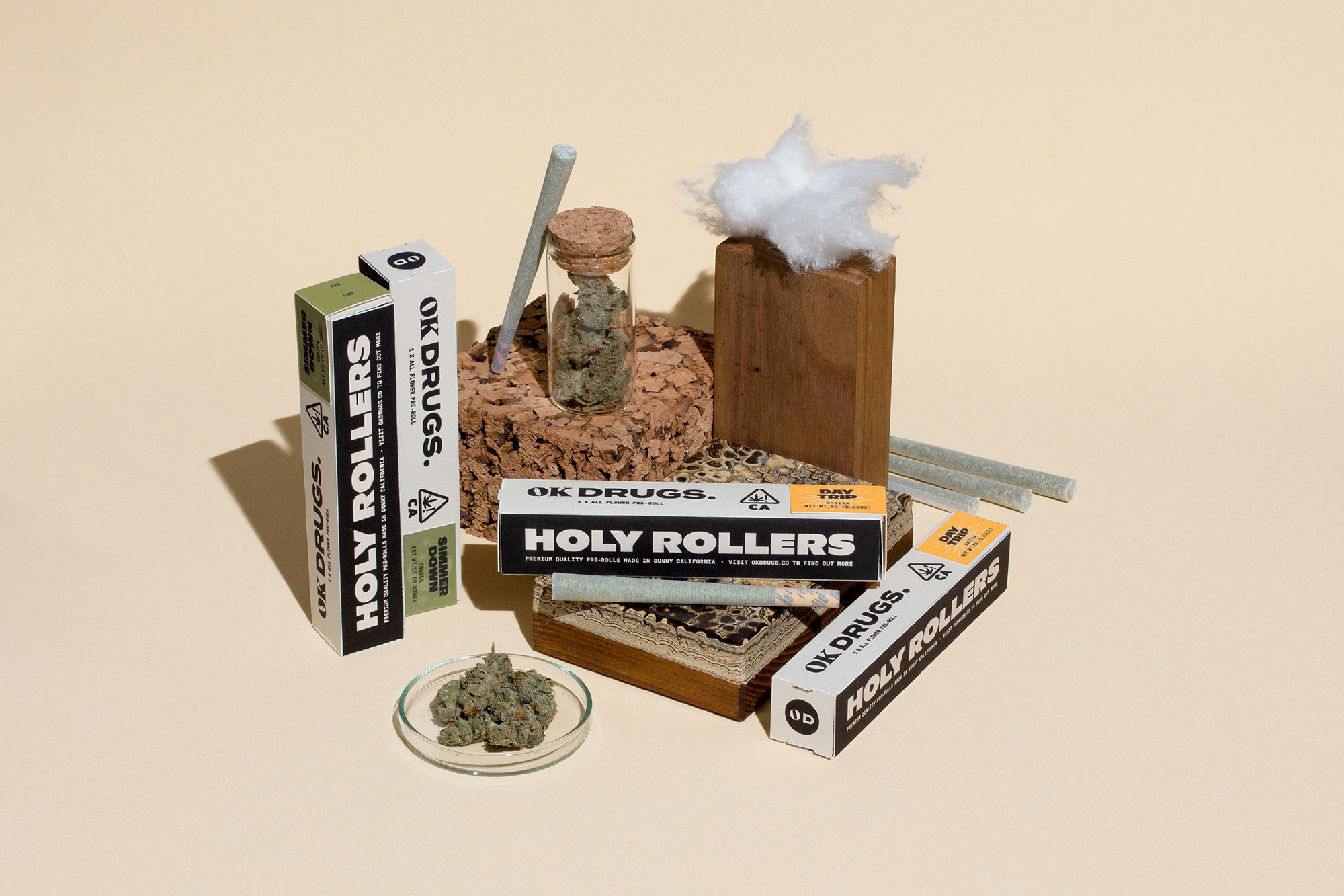
This product packaging arrangement for the Away Days Brewing Co Brand Identity project showcases various cannabis-related items styled on a clean beige seamless background. Prominent elements include branded rectangular boxes featuring bold typographic layouts, loose pre-rolls, a glass storage jar with a cork stopper, and green botanical material displayed in a small glass petri dish. Natural textures are introduced through a textured cork block, stacked patterned tiles, and an upright wooden block topped with a soft, white fibrous tuft. The studio lighting casts soft shadows beneath the objects, creating a clean, structured product composition.