
Brand
ProjectBrand Identity
Away Days Brewing Co Brand Identity 2020
Associated creatives


Tags
Description
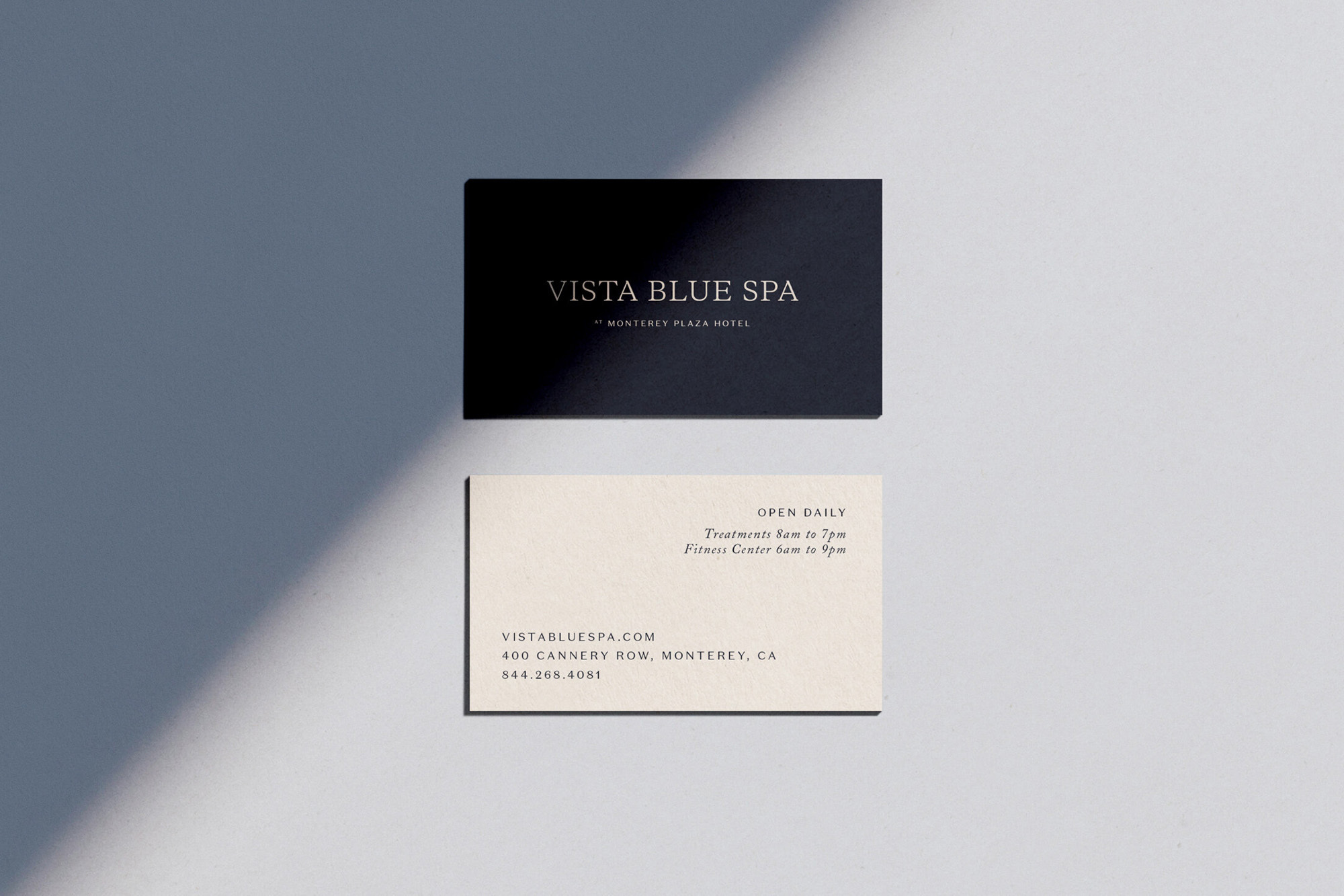
This project showcase presents two contrasting business cards for Away Days Brewing Co, laid out flat on a pale grey surface. The top card is a deep black with minimalist typography, while the lower card is a textured cream stock featuring clean serif text. A sharp diagonal shadow cuts across the composition, creating subtle depth and clean architectural lines. The arrangement highlights modern stationery design and considered typography within a corporate branding system.