
Bits&Pretzels: Brand Identity
Jun 2020
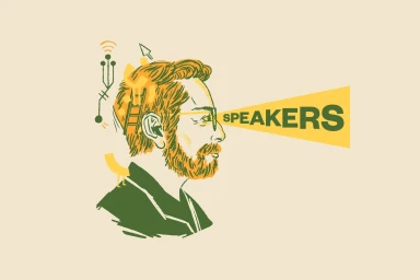
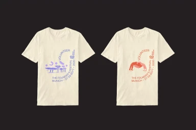
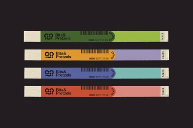
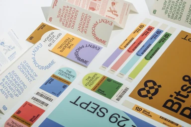
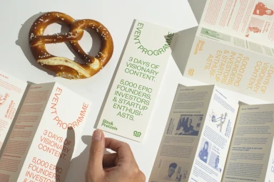
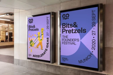
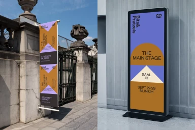
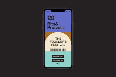
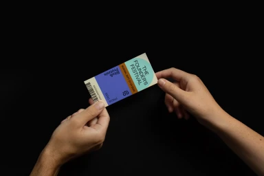
The brand identity for Bits&Pretzels effectively channels a vibrant and modular design system that defines the visual landscape of their major startup festival. Anchored by the creative expertise of PARSONS in graphic design, the project leans into a bold, minimalist aesthetic that translates seamlessly across diverse touchpoints. From the rhythmic use of vector illustrations on promotional apparel to the precise, corporate-facing application of typography on event wristbands and admission collateral, the design language remains consistently sharp. The identity utilizes a distinctive palette of mustard yellow, deep violet, and mint green, which is elevated through the clever integration of abstract icons and sans-serif typography. This cohesive system extends into environmental branding, where digital kiosks and vertical banners bridge the gap between abstract graphic design and functional wayfinding. The approach is particularly successful in its digital-first orientation, seen in a mobile interface that prioritizes clean UI illustration and structured geometry for user interaction. Whether displayed on high-key editorial photography featuring natural light or presented as practical event credentials, the branding feels intentional and energized. By blending playful artistic elements with rigid corporate clarity, the system provides a robust framework that reflects the innovative spirit of a Munich-based founder festival. This work serves as an exemplary case study in how a unified graphic philosophy can scale across both physical and digital environments.
Horizontal, Commercial, Clean
Typography
Advertising Campaign
